


ggplot2 error bars : Quick start guide - R software and data visualization
This tutorial describes how to create a graph with error bars using R software and ggplot2 package. There are different types of error bars which can be created using the functions below :
- geom_errorbar()
- geom_linerange()
- geom_pointrange()
- geom_crossbar()
- geom_errorbarh()
Add error bars to a bar and line plots
Prepare the data
ToothGrowth data is used. It describes the effect of Vitamin C on tooth growth in Guinea pigs. Three dose levels of Vitamin C (0.5, 1, and 2 mg) with each of two delivery methods [orange juice (OJ) or ascorbic acid (VC)] are used :
library(ggplot2)
df <- ToothGrowth
df$dose <- as.factor(df$dose)
head(df)
## len supp dose
## 1 4.2 VC 0.5
## 2 11.5 VC 0.5
## 3 7.3 VC 0.5
## 4 5.8 VC 0.5
## 5 6.4 VC 0.5
## 6 10.0 VC 0.5- len : Tooth length
- dose : Dose in milligrams (0.5, 1, 2)
- supp : Supplement type (VC or OJ)
In the example below, we’ll plot the mean value of Tooth length in each group. The standard deviation is used to draw the error bars on the graph.
First, the helper function below will be used to calculate the mean and the standard deviation, for the variable of interest, in each group :
#+++++++++++++++++++++++++
# Function to calculate the mean and the standard deviation
  # for each group
#+++++++++++++++++++++++++
# data : a data frame
# varname : the name of a column containing the variable
  #to be summariezed
# groupnames : vector of column names to be used as
  # grouping variables
data_summary <- function(data, varname, groupnames){
  require(plyr)
  summary_func <- function(x, col){
    c(mean = mean(x[[col]], na.rm=TRUE),
      sd = sd(x[[col]], na.rm=TRUE))
  }
  data_sum<-ddply(data, groupnames, .fun=summary_func,
                  varname)
  data_sum <- rename(data_sum, c("mean" = varname))
 return(data_sum)
}
Summarize the data :
df2 <- data_summary(ToothGrowth, varname="len",
                    groupnames=c("supp", "dose"))
# Convert dose to a factor variable
df2$dose=as.factor(df2$dose)
head(df2)
## supp dose len sd
## 1 OJ 0.5 13.23 4.459709
## 2 OJ 1 22.70 3.910953
## 3 OJ 2 26.06 2.655058
## 4 VC 0.5 7.98 2.746634
## 5 VC 1 16.77 2.515309
## 6 VC 2 26.14 4.797731Barplot with error bars
The function geom_errorbar() can be used to produce the error bars :
library(ggplot2)
# Default bar plot
p<- ggplot(df2, aes(x=dose, y=len, fill=supp)) +
geom_bar(stat="identity", color="black",
position=position_dodge()) +
geom_errorbar(aes(ymin=len-sd, ymax=len+sd), width=.2,
position=position_dodge(.9))
print(p)
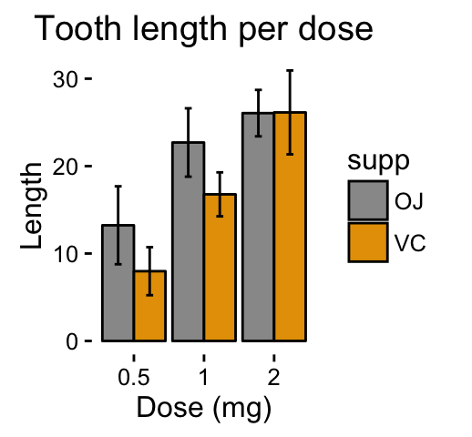
# Finished bar plot
p+labs(title="Tooth length per dose", x="Dose (mg)", y = "Length")+
theme_classic() +
scale_fill_manual(values=c('#999999','#E69F00'))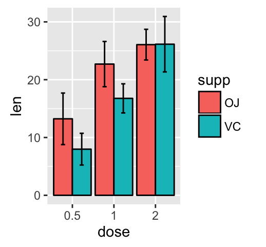
Note that, you can chose to keep only the upper error bars
# Keep only upper error bars
 ggplot(df2, aes(x=dose, y=len, fill=supp)) +
  geom_bar(stat="identity", color="black", position=position_dodge()) +
  geom_errorbar(aes(ymin=len, ymax=len+sd), width=.2,
position=position_dodge(.9)) 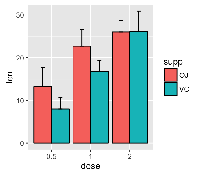
Read more on ggplot2 bar graphs : ggplot2 bar graphs
Line plot with error bars
# Default line plot
p<- ggplot(df2, aes(x=dose, y=len, group=supp, color=supp)) +
geom_line() +
geom_point()+
geom_errorbar(aes(ymin=len-sd, ymax=len+sd), width=.2,
position=position_dodge(0.05))
print(p)
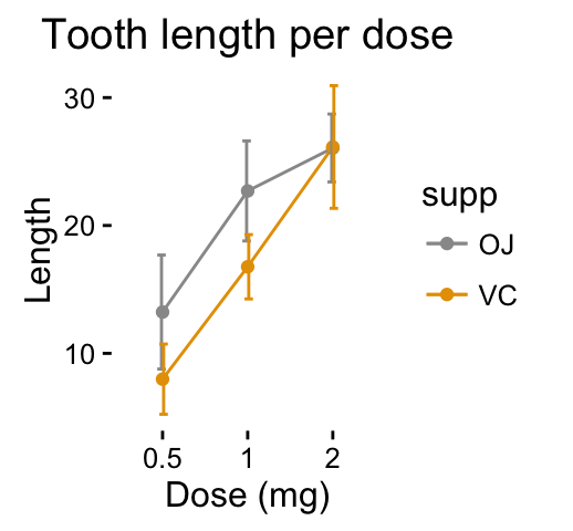
# Finished line plot
p+labs(title="Tooth length per dose", x="Dose (mg)", y = "Length")+
theme_classic() +
scale_color_manual(values=c('#999999','#E69F00'))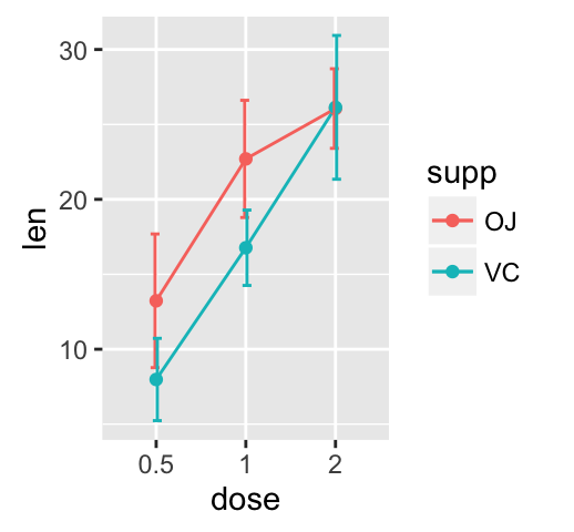
You can also use the functions geom_pointrange() or geom_linerange() instead of using geom_errorbar()
# Use geom_pointrange
ggplot(df2, aes(x=dose, y=len, group=supp, color=supp)) +
geom_pointrange(aes(ymin=len-sd, ymax=len+sd))
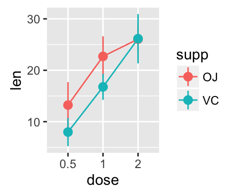
# Use geom_line()+geom_pointrange()
ggplot(df2, aes(x=dose, y=len, group=supp, color=supp)) +
geom_line()+
geom_pointrange(aes(ymin=len-sd, ymax=len+sd))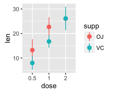
Read more on ggplot2 line plots : ggplot2 line plots
Dot plot with mean point and error bars
The functions geom_dotplot() and stat_summary() are used :
The mean +/- SD can be added as a crossbar , a error bar or a pointrange :
p <- ggplot(df, aes(x=dose, y=len)) +
geom_dotplot(binaxis='y', stackdir='center')
# use geom_crossbar()
p + stat_summary(fun.data="mean_sdl", fun.args = list(mult=1),
geom="crossbar", width=0.5)
# Use geom_errorbar()
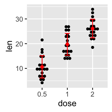
p + stat_summary(fun.data=mean_sdl, fun.args = list(mult=1),
geom="errorbar", color="red", width=0.2) +
stat_summary(fun.y=mean, geom="point", color="red")
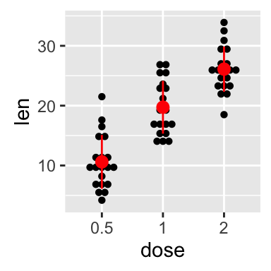
# Use geom_pointrange()
p + stat_summary(fun.data=mean_sdl, fun.args = list(mult=1),
geom="pointrange", color="red")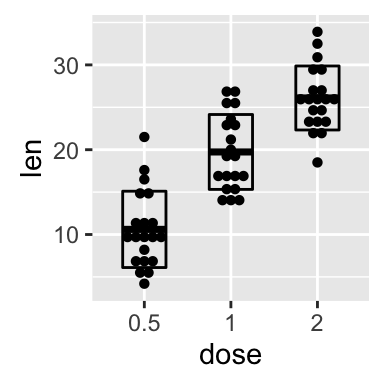
Read more on ggplot2 dot plots : ggplot2 dot plot
Infos
This analysis has been performed using R software (ver. 3.2.4) and ggplot2 (ver. 2.1.0)
Show me some love with the like buttons below... Thank you and please don't forget to share and comment below!!
Montrez-moi un peu d'amour avec les like ci-dessous ... Merci et n'oubliez pas, s'il vous plaît, de partager et de commenter ci-dessous!
Recommended for You!


Recommended for you
This section contains best data science and self-development resources to help you on your path.
Coursera - Online Courses and Specialization
Data science
- Course: Machine Learning: Master the Fundamentals by Standford
- Specialization: Data Science by Johns Hopkins University
- Specialization: Python for Everybody by University of Michigan
- Courses: Build Skills for a Top Job in any Industry by Coursera
- Specialization: Master Machine Learning Fundamentals by University of Washington
- Specialization: Statistics with R by Duke University
- Specialization: Software Development in R by Johns Hopkins University
- Specialization: Genomic Data Science by Johns Hopkins University
Popular Courses Launched in 2020
- Google IT Automation with Python by Google
- AI for Medicine by deeplearning.ai
- Epidemiology in Public Health Practice by Johns Hopkins University
- AWS Fundamentals by Amazon Web Services
Trending Courses
- The Science of Well-Being by Yale University
- Google IT Support Professional by Google
- Python for Everybody by University of Michigan
- IBM Data Science Professional Certificate by IBM
- Business Foundations by University of Pennsylvania
- Introduction to Psychology by Yale University
- Excel Skills for Business by Macquarie University
- Psychological First Aid by Johns Hopkins University
- Graphic Design by Cal Arts
Books - Data Science
Our Books
- Practical Guide to Cluster Analysis in R by A. Kassambara (Datanovia)
- Practical Guide To Principal Component Methods in R by A. Kassambara (Datanovia)
- Machine Learning Essentials: Practical Guide in R by A. Kassambara (Datanovia)
- R Graphics Essentials for Great Data Visualization by A. Kassambara (Datanovia)
- GGPlot2 Essentials for Great Data Visualization in R by A. Kassambara (Datanovia)
- Network Analysis and Visualization in R by A. Kassambara (Datanovia)
- Practical Statistics in R for Comparing Groups: Numerical Variables by A. Kassambara (Datanovia)
- Inter-Rater Reliability Essentials: Practical Guide in R by A. Kassambara (Datanovia)
Others
- R for Data Science: Import, Tidy, Transform, Visualize, and Model Data by Hadley Wickham & Garrett Grolemund
- Hands-On Machine Learning with Scikit-Learn, Keras, and TensorFlow: Concepts, Tools, and Techniques to Build Intelligent Systems by Aurelien Géron
- Practical Statistics for Data Scientists: 50 Essential Concepts by Peter Bruce & Andrew Bruce
- Hands-On Programming with R: Write Your Own Functions And Simulations by Garrett Grolemund & Hadley Wickham
- An Introduction to Statistical Learning: with Applications in R by Gareth James et al.
- Deep Learning with R by François Chollet & J.J. Allaire
- Deep Learning with Python by François Chollet