


survminer R package: Survival Data Analysis and Visualization
Survival analysis focuses on the expected duration of time until occurrence of an event of interest. However, this failure time may not be observed within the study time period, producing the so-called censored observations.
The R package survival fits and plots survival curves using R base graphs. There are also several R packages/functions for drawing survival curves using ggplot2 system:
These packages/functions are limited:
The default graph generated with the R package survival is ugly and it requires programming skills for drawing a nice looking survival curves. There is no option for displaying the ‘number at risk’ table.
- GGally and ggfortify don’t contain any option for drawing the ‘number at risk’ table. You need also some knowledge in ggplot2 plotting system for drawing a ready-to-publish survival curves.
Here, we developed and present the survminer R package for facilitating survival analysis and visualization.
survminer - Main features
The current version contains the function ggsurvplot() for easily drawing beautiful and ready-to-publish survival curves using ggplot2. ggsurvplot() includes also some options for displaying the p-value and the ‘number at risk’ table, under the survival curves.
Installation and loading
Install from CRAN:
install.packages("survminer")Or, install the latest version from GitHub:
# Install
if(!require(devtools)) install.packages("devtools")
devtools::install_github("kassambara/survminer")
# Loading
library("survminer")Getting started
The R package survival is required for fitting survival curves.
Draw survival curves without grouping
# Fit survival curves
require("survival")
fit <- survfit(Surv(time, status) ~ 1, data = lung)
# Drawing curves
ggsurvplot(fit, color = "#2E9FDF")
Draw survival curves with two groups
Basic plots
# Fit survival curves
require("survival")
fit<- survfit(Surv(time, status) ~ sex, data = lung)
# Drawing survival curves
ggsurvplot(fit)
Change font size, style and color
# Change font style, size and color
#++++++++++++++++++++++++++++++++++++
# Change only font size
ggsurvplot(fit, main = "Survival curve",
   font.main = 18,
   font.x =  16,
   font.y = 16,
   font.tickslab = 14)
# Change font size, style and color at the same time
ggsurvplot(fit, main = "Survival curve",
   font.main = c(16, "bold", "darkblue"),
   font.x = c(14, "bold.italic", "red"),
   font.y = c(14, "bold.italic", "darkred"),
   font.tickslab = c(12, "plain", "darkgreen"))
Change legend title, labels and position
# Change the legend title and labels
ggsurvplot(fit, legend = "bottom",
           legend.title = "Sex",
           legend.labs = c("Male", "Female"))
# Specify legend position by its coordinates
ggsurvplot(fit, legend = c(0.2, 0.2))
Change line types and color palettes
# change line size --> 1
# Change line types by groups (i.e. "strata")
# and change color palette
ggsurvplot(fit,  size = 1,  # change line size
           linetype = "strata", # change line type by groups
           break.time.by = 250, # break time axis by 250
           palette = c("#E7B800", "#2E9FDF"), # custom color palette
           conf.int = TRUE, # Add confidence interval
           pval = TRUE # Add p-value
           )
# Use brewer color palette "Dark2"
ggsurvplot(fit, linetype = "strata",
           conf.int = TRUE, pval = TRUE,
           palette = "Dark2")
# Use grey palette
ggsurvplot(fit, linetype = "strata",
           conf.int = TRUE, pval = TRUE,
           palette = "grey")
Add number at risk table
# Add risk table
# and change risk table y text colors by strata
ggsurvplot(fit, pval = TRUE, conf.int = TRUE,
           risk.table = TRUE, risk.table.y.text.col = TRUE)
# Customize the output and then print
res <- ggsurvplot(fit, pval = TRUE, conf.int = TRUE,
           risk.table = TRUE)
res$table <- res$table + theme(axis.line = element_blank())
res$plot <- res$plot + labs(title = "Survival Curves")
print(res)
# Change color, linetype by strata, risk.table color by strata
ggsurvplot(fit,
           pval = TRUE, conf.int = TRUE,
           risk.table = TRUE, # Add risk table
           risk.table.col = "strata", # Change risk table color by groups
           linetype = "strata", # Change line type by groups
           ggtheme = theme_bw(), # Change ggplot2 theme
           palette = c("#E7B800", "#2E9FDF"))
Change x axis limits
# Change x axis limits (xlim)
#++++++++++++++++++++++++++++++++++++
# One would like to cut axes at a specific time point
ggsurvplot(fit,
           pval = TRUE, conf.int = TRUE,
           risk.table = TRUE, # Add risk table
           risk.table.col = "strata", # Change risk table color by groups
           ggtheme = theme_bw(), # Change ggplot2 theme
           palette = "Dark2",
           xlim = c(0, 600))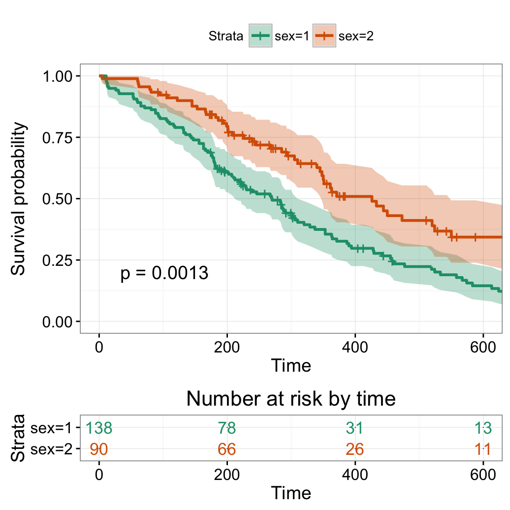
Transform survival curves: plot cumulative events and hazard function
# Plot cumulative events
ggsurvplot(fit, conf.int = TRUE,
           palette = c("#FF9E29", "#86AA00"),
           risk.table = TRUE, risk.table.col = "strata",
fun = "event")![]()
# Plot the cumulative hazard function
ggsurvplot(fit, conf.int = TRUE,
           palette = c("#FF9E29", "#86AA00"),
           risk.table = TRUE, risk.table.col = "strata",
fun = "cumhaz")![]()
# Arbitrary function
ggsurvplot(fit, conf.int = TRUE,
          palette = c("#FF9E29", "#86AA00"),
           risk.table = TRUE, risk.table.col = "strata",
           pval = TRUE,
fun = function(y) y*100)![]()
Survival curves with multiple groups
# Fit (complexe) survival curves
#++++++++++++++++++++++++++++++++++++
require("survival")
fit2 <- survfit( Surv(time, status) ~ rx + adhere,
    data = colon )
# Visualize
#++++++++++++++++++++++++++++++++++++
# Visualize: add p-value, chang y limits
# change color using brewer palette
ggsurvplot(fit2, pval = TRUE,
           break.time.by = 800,
           risk.table = TRUE,
           risk.table.height = 0.5#Useful when you have multiple groups
           )
# Adjust risk table and survival plot heights
# ++++++++++++++++++++++++++++++++++++
# Risk table height
ggsurvplot(fit2, pval = TRUE,
          break.time.by = 800,
          risk.table = TRUE,
          risk.table.col = "strata",
          risk.table.height = 0.5,
          palette = "Dark2")
# Change legend labels
# ++++++++++++++++++++++++++++++++++++
ggsurvplot(fit2, pval = TRUE,
           break.time.by = 800,
           risk.table = TRUE,
           risk.table.col = "strata",
           risk.table.height = 0.5,
           ggtheme = theme_bw(),
           legend.labs = c("A", "B", "C", "D", "E", "F"))
Infos
This article was built with:
##  setting  value
##  version  R version 3.2.3 (2015-12-10)
##  system   x86_64, darwin13.4.0
##  ui       X11
##  language (EN)
##  collate  fr_FR.UTF-8
##  tz       Europe/Paris
##  date     2016-02-21
##
##  package      * version date       source
##  colorspace     1.2-6   2015-03-11 CRAN (R 3.2.0)
##  dichromat      2.0-0   2013-01-24 CRAN (R 3.2.0)
##  digest         0.6.9   2016-01-08 CRAN (R 3.2.3)
##  ggplot2      * 2.0.0   2015-12-18 CRAN (R 3.2.3)
##  gridExtra      2.0.0   2015-07-14 CRAN (R 3.2.0)
##  gtable         0.1.2   2012-12-05 CRAN (R 3.2.0)
##  labeling       0.3     2014-08-23 CRAN (R 3.2.0)
##  magrittr       1.5     2014-11-22 CRAN (R 3.2.0)
##  MASS           7.3-45  2015-11-10 CRAN (R 3.2.3)
##  munsell        0.4.3   2016-02-13 CRAN (R 3.2.3)
##  plyr           1.8.3   2015-06-12 CRAN (R 3.2.0)
##  RColorBrewer   1.1-2   2014-12-07 CRAN (R 3.2.0)
##  Rcpp           0.12.3  2016-01-10 CRAN (R 3.2.3)
##  reshape2       1.4.1   2014-12-06 CRAN (R 3.2.0)
##  scales         0.3.0   2015-08-25 CRAN (R 3.2.0)
##  stringi        1.0-1   2015-10-22 CRAN (R 3.2.0)
##  stringr        1.0.0   2015-04-30 CRAN (R 3.2.0)
##  survival     * 2.38-3  2015-07-02 CRAN (R 3.2.3)
## survminer * 0.2.0 2016-02-18 CRAN (R 3.2.3)Show me some love with the like buttons below... Thank you and please don't forget to share and comment below!!
Montrez-moi un peu d'amour avec les like ci-dessous ... Merci et n'oubliez pas, s'il vous plaît, de partager et de commenter ci-dessous!
Recommended for You!


Recommended for you
This section contains best data science and self-development resources to help you on your path.
Coursera - Online Courses and Specialization
Data science
- Course: Machine Learning: Master the Fundamentals by Standford
- Specialization: Data Science by Johns Hopkins University
- Specialization: Python for Everybody by University of Michigan
- Courses: Build Skills for a Top Job in any Industry by Coursera
- Specialization: Master Machine Learning Fundamentals by University of Washington
- Specialization: Statistics with R by Duke University
- Specialization: Software Development in R by Johns Hopkins University
- Specialization: Genomic Data Science by Johns Hopkins University
Popular Courses Launched in 2020
- Google IT Automation with Python by Google
- AI for Medicine by deeplearning.ai
- Epidemiology in Public Health Practice by Johns Hopkins University
- AWS Fundamentals by Amazon Web Services
Trending Courses
- The Science of Well-Being by Yale University
- Google IT Support Professional by Google
- Python for Everybody by University of Michigan
- IBM Data Science Professional Certificate by IBM
- Business Foundations by University of Pennsylvania
- Introduction to Psychology by Yale University
- Excel Skills for Business by Macquarie University
- Psychological First Aid by Johns Hopkins University
- Graphic Design by Cal Arts
Books - Data Science
Our Books
- Practical Guide to Cluster Analysis in R by A. Kassambara (Datanovia)
- Practical Guide To Principal Component Methods in R by A. Kassambara (Datanovia)
- Machine Learning Essentials: Practical Guide in R by A. Kassambara (Datanovia)
- R Graphics Essentials for Great Data Visualization by A. Kassambara (Datanovia)
- GGPlot2 Essentials for Great Data Visualization in R by A. Kassambara (Datanovia)
- Network Analysis and Visualization in R by A. Kassambara (Datanovia)
- Practical Statistics in R for Comparing Groups: Numerical Variables by A. Kassambara (Datanovia)
- Inter-Rater Reliability Essentials: Practical Guide in R by A. Kassambara (Datanovia)
Others
- R for Data Science: Import, Tidy, Transform, Visualize, and Model Data by Hadley Wickham & Garrett Grolemund
- Hands-On Machine Learning with Scikit-Learn, Keras, and TensorFlow: Concepts, Tools, and Techniques to Build Intelligent Systems by Aurelien Géron
- Practical Statistics for Data Scientists: 50 Essential Concepts by Peter Bruce & Andrew Bruce
- Hands-On Programming with R: Write Your Own Functions And Simulations by Garrett Grolemund & Hadley Wickham
- An Introduction to Statistical Learning: with Applications in R by Gareth James et al.
- Deep Learning with R by François Chollet & J.J. Allaire
- Deep Learning with Python by François Chollet
Click to follow us on Facebook and Google+ :
Comment this article by clicking on "Discussion" button (top-right position of this page)
Articles contained by this category :
survminer 0.2.4
survminer 0.3.0
Survminer Cheatsheet to Create Easily Survival Plots