


ggplot2 dot plot : Quick start guide - R software and data visualization
This R tutorial describes how to create a dot plot using R software and ggplot2 package.
The function geom_dotplot() is used.
![]()
Prepare the data
ToothGrowth data sets are used :
# Convert the variable dose from a numeric to a factor variable
ToothGrowth$dose <- as.factor(ToothGrowth$dose)
head(ToothGrowth)
## len supp dose
## 1 4.2 VC 0.5
## 2 11.5 VC 0.5
## 3 7.3 VC 0.5
## 4 5.8 VC 0.5
## 5 6.4 VC 0.5
## 6 10.0 VC 0.5Make sure that the variable dose is converted as a factor variable using the above R script.
Basic dot plots
library(ggplot2)
# Basic dot plot
p<-ggplot(ToothGrowth, aes(x=dose, y=len)) +
geom_dotplot(binaxis='y', stackdir='center')
p
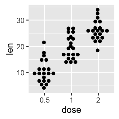
# Change dotsize and stack ratio
ggplot(ToothGrowth, aes(x=dose, y=len)) +
geom_dotplot(binaxis='y', stackdir='center',
stackratio=1.5, dotsize=1.2)
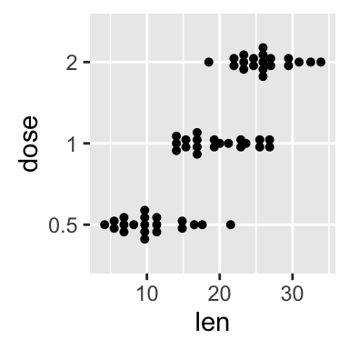
# Rotate the dot plot
p + coord_flip()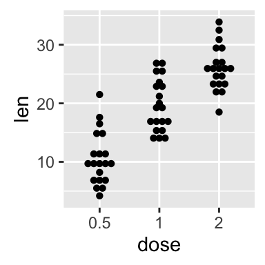
Choose which items to display :
p + scale_x_discrete(limits=c("0.5", "2"))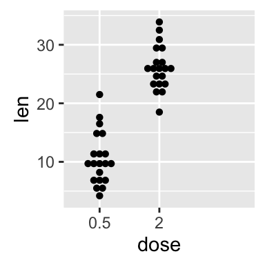
Add summary statistics on a dot plot
The function stat_summary() can be used to add mean/median points and more to a dot plot.
Add mean and median points
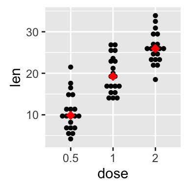
# dot plot with mean points
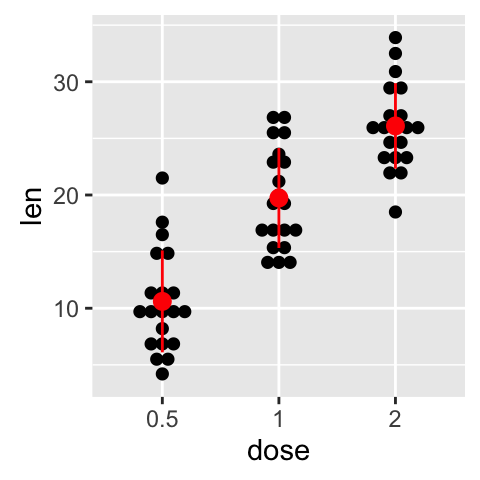
p + stat_summary(fun.y=mean, geom="point", shape=18,
size=3, color="red")
# dot plot with median points
p + stat_summary(fun.y=median, geom="point", shape=18,
size=3, color="red")
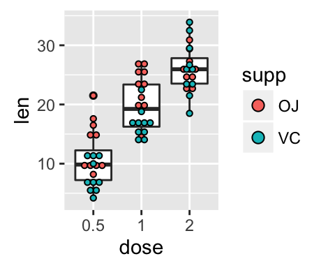
Dot plot with box plot and violin plot
# Add basic box plot
ggplot(ToothGrowth, aes(x=dose, y=len)) +
geom_boxplot()+
geom_dotplot(binaxis='y', stackdir='center')
# Add notched box plot
ggplot(ToothGrowth, aes(x=dose, y=len)) +
geom_boxplot(notch = TRUE)+
geom_dotplot(binaxis='y', stackdir='center')
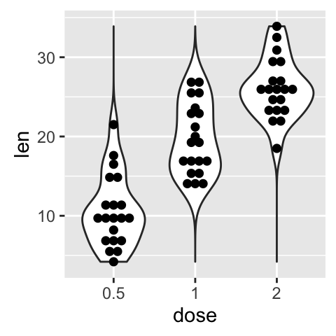
# Add violin plot
ggplot(ToothGrowth, aes(x=dose, y=len)) +
geom_violin(trim = FALSE)+
geom_dotplot(binaxis='y', stackdir='center')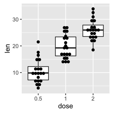

Read more on box plot : ggplot2 box plot
Read more on violin plot : ggplot2 violin plot
Add mean and standard deviation
The function mean_sdl is used. mean_sdl computes the mean plus or minus a constant times the standard deviation.
In the R code below, the constant is specified using the argument mult (mult = 1). By default mult = 2.
The mean +/- SD can be added as a crossbar or a pointrange :
p <- ggplot(ToothGrowth, aes(x=dose, y=len)) +
    geom_dotplot(binaxis='y', stackdir='center')
p + stat_summary(fun.data="mean_sdl", fun.args = list(mult=1),
                 geom="crossbar", width=0.5)
p + stat_summary(fun.data=mean_sdl, fun.args = list(mult=1),
                 geom="pointrange", color="red")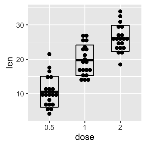
Note that, you can also define a custom function to produce summary statistics as follow.
# Function to produce summary statistics (mean and +/- sd)
data_summary <- function(x) {
   m <- mean(x)
   ymin <- m-sd(x)
   ymax <- m+sd(x)
   return(c(y=m,ymin=ymin,ymax=ymax))
}
Use a custom summary function :
p + stat_summary(fun.data=data_summary, color="blue")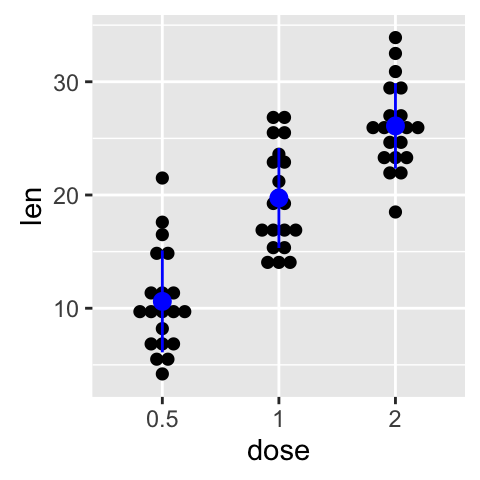
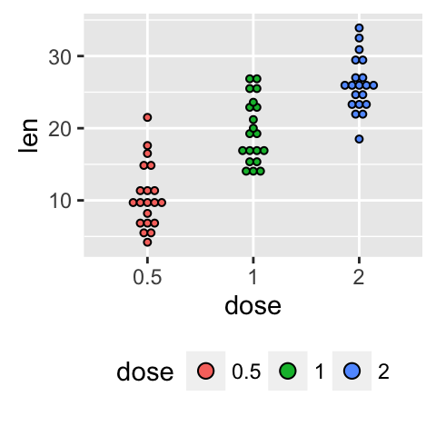
Change dot plot colors by groups
In the R code below, the fill colors of the dot plot are automatically controlled by the levels of dose :
# Use single fill color
ggplot(ToothGrowth, aes(x=dose, y=len)) +
geom_dotplot(binaxis='y', stackdir='center', fill="#FFAAD4")
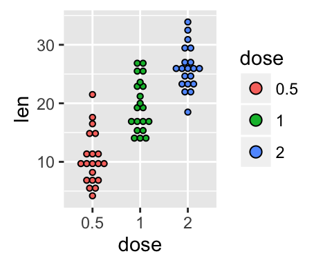
# Change dot plot colors by groups
p<-ggplot(ToothGrowth, aes(x=dose, y=len, fill=dose)) +
geom_dotplot(binaxis='y', stackdir='center')
p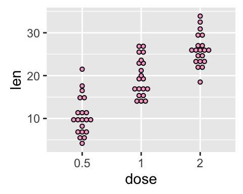
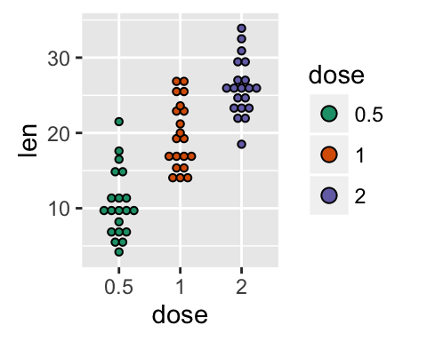
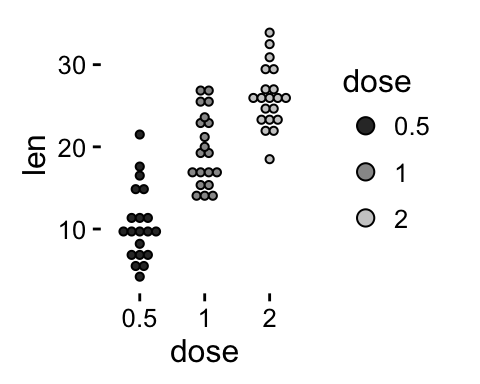
It is also possible to change manually dot plot colors using the functions :
- scale_fill_manual() : to use custom colors
- scale_fill_brewer() : to use color palettes from RColorBrewer package
- scale_fill_grey() : to use grey color palettes
# Use custom color palettes
p+scale_fill_manual(values=c("#999999", "#E69F00", "#56B4E9"))
# Use brewer color palettes
p+scale_fill_brewer(palette="Dark2")
# Use grey scale
p + scale_fill_grey() + theme_classic()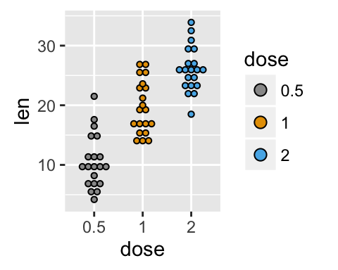
Read more on ggplot2 colors here : ggplot2 colors
Change the legend position
p + theme(legend.position="top")
p + theme(legend.position="bottom")
p + theme(legend.position="none") # Remove legend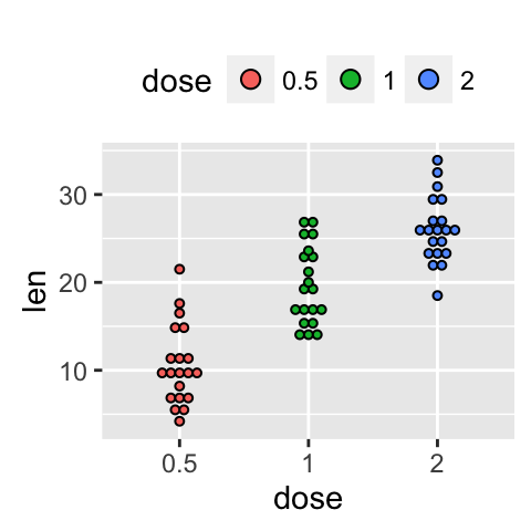
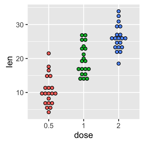
The allowed values for the arguments legend.position are : “left”,“top”, “right”, “bottom”.
Read more on ggplot legends : ggplot2 legend
Change the order of items in the legend
The function scale_x_discrete can be used to change the order of items to “2”, “0.5”, “1” :
p + scale_x_discrete(limits=c("2", "0.5", "1"))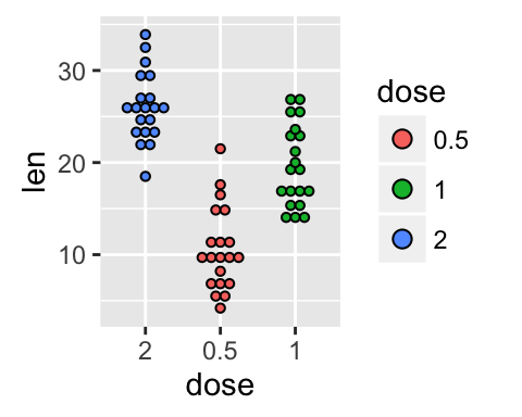
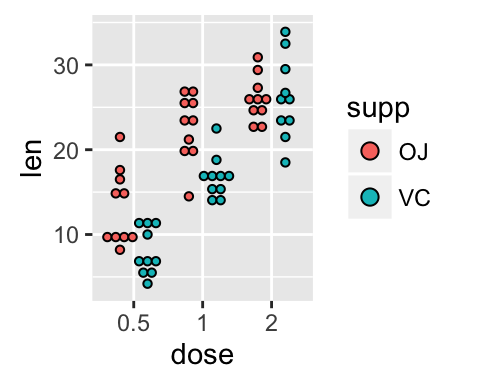
Dot plot with multiple groups
# Change dot plot colors by groups
ggplot(ToothGrowth, aes(x=dose, y=len, fill=supp)) +
  geom_dotplot(binaxis='y', stackdir='center')
# Change the position : interval between dot plot of the same group
p<-ggplot(ToothGrowth, aes(x=dose, y=len, fill=supp)) +
  geom_dotplot(binaxis='y', stackdir='center',
               position=position_dodge(0.8))
p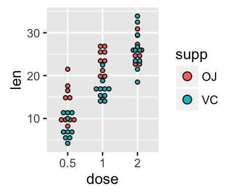
Change dot plot colors and add box plots :
# Change colors
p+scale_fill_manual(values=c("#999999", "#E69F00", "#56B4E9"))
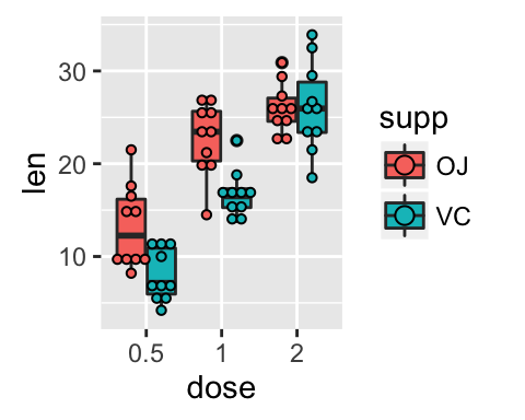
# Add box plots
ggplot(ToothGrowth, aes(x=dose, y=len, fill=supp)) +
geom_boxplot(fill="white")+
geom_dotplot(binaxis='y', stackdir='center')
# Change the position
ggplot(ToothGrowth, aes(x=dose, y=len, fill=supp)) +
geom_boxplot(position=position_dodge(0.8))+
geom_dotplot(binaxis='y', stackdir='center',
position=position_dodge(0.8))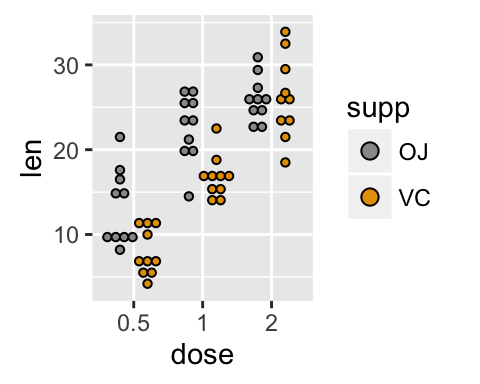
Customized dot plots
# Basic dot plot
ggplot(ToothGrowth, aes(x=dose, y=len)) +
geom_boxplot()+
geom_dotplot(binaxis='y', stackdir='center')+
labs(title="Plot of length by dose",x="Dose (mg)", y = "Length")+
theme_classic()
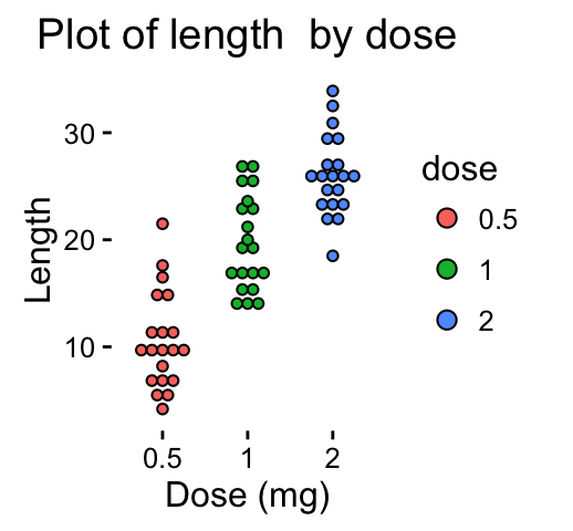
# Change color by groups
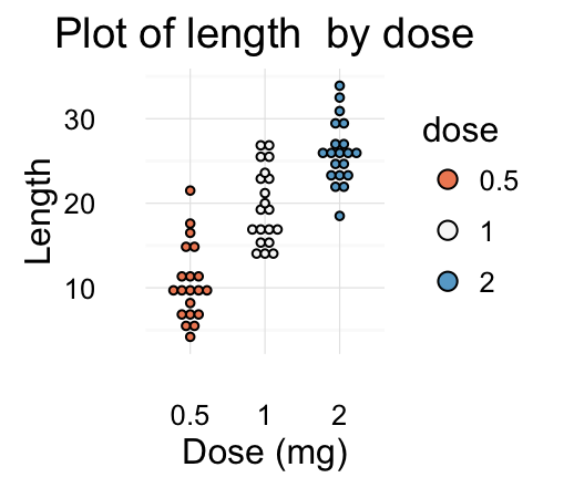
dp <-ggplot(ToothGrowth, aes(x=dose, y=len, fill=dose)) +
geom_dotplot(binaxis='y', stackdir='center')+
labs(title="Plot of length by dose",x="Dose (mg)", y = "Length")
dp + theme_classic()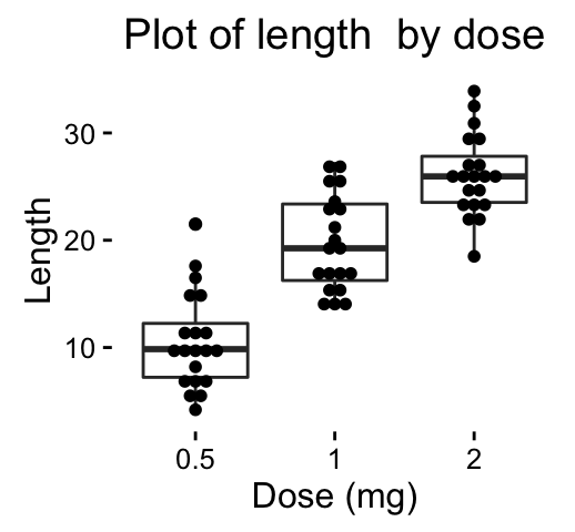
Change fill colors manually :
# Continuous colors
dp + scale_fill_brewer(palette="Blues") + theme_classic()
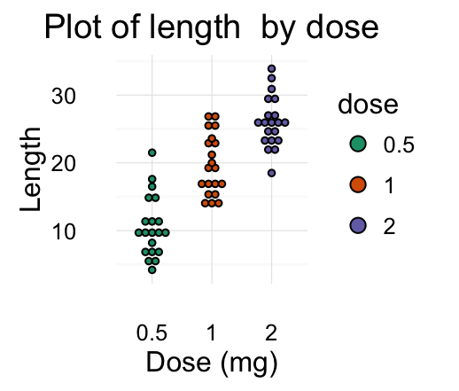
# Discrete colors
dp + scale_fill_brewer(palette="Dark2") + theme_minimal()
# Gradient colors
dp + scale_fill_brewer(palette="RdBu") + theme_minimal()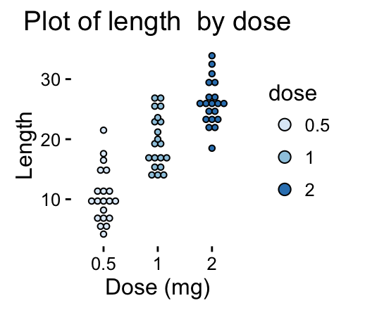
Read more on ggplot2 colors here : ggplot2 colors
Infos
This analysis has been performed using R software (ver. 3.2.4) and ggplot2 (ver. 2.1.0)
<!-- END HTML -->
Show me some love with the like buttons below... Thank you and please don't forget to share and comment below!!
Montrez-moi un peu d'amour avec les like ci-dessous ... Merci et n'oubliez pas, s'il vous plaît, de partager et de commenter ci-dessous!
Recommended for You!


Recommended for you
This section contains best data science and self-development resources to help you on your path.
Coursera - Online Courses and Specialization
Data science
- Course: Machine Learning: Master the Fundamentals by Standford
- Specialization: Data Science by Johns Hopkins University
- Specialization: Python for Everybody by University of Michigan
- Courses: Build Skills for a Top Job in any Industry by Coursera
- Specialization: Master Machine Learning Fundamentals by University of Washington
- Specialization: Statistics with R by Duke University
- Specialization: Software Development in R by Johns Hopkins University
- Specialization: Genomic Data Science by Johns Hopkins University
Popular Courses Launched in 2020
- Google IT Automation with Python by Google
- AI for Medicine by deeplearning.ai
- Epidemiology in Public Health Practice by Johns Hopkins University
- AWS Fundamentals by Amazon Web Services
Trending Courses
- The Science of Well-Being by Yale University
- Google IT Support Professional by Google
- Python for Everybody by University of Michigan
- IBM Data Science Professional Certificate by IBM
- Business Foundations by University of Pennsylvania
- Introduction to Psychology by Yale University
- Excel Skills for Business by Macquarie University
- Psychological First Aid by Johns Hopkins University
- Graphic Design by Cal Arts
Books - Data Science
Our Books
- Practical Guide to Cluster Analysis in R by A. Kassambara (Datanovia)
- Practical Guide To Principal Component Methods in R by A. Kassambara (Datanovia)
- Machine Learning Essentials: Practical Guide in R by A. Kassambara (Datanovia)
- R Graphics Essentials for Great Data Visualization by A. Kassambara (Datanovia)
- GGPlot2 Essentials for Great Data Visualization in R by A. Kassambara (Datanovia)
- Network Analysis and Visualization in R by A. Kassambara (Datanovia)
- Practical Statistics in R for Comparing Groups: Numerical Variables by A. Kassambara (Datanovia)
- Inter-Rater Reliability Essentials: Practical Guide in R by A. Kassambara (Datanovia)
Others
- R for Data Science: Import, Tidy, Transform, Visualize, and Model Data by Hadley Wickham & Garrett Grolemund
- Hands-On Machine Learning with Scikit-Learn, Keras, and TensorFlow: Concepts, Tools, and Techniques to Build Intelligent Systems by Aurelien Géron
- Practical Statistics for Data Scientists: 50 Essential Concepts by Peter Bruce & Andrew Bruce
- Hands-On Programming with R: Write Your Own Functions And Simulations by Garrett Grolemund & Hadley Wickham
- An Introduction to Statistical Learning: with Applications in R by Gareth James et al.
- Deep Learning with R by François Chollet & J.J. Allaire
- Deep Learning with Python by François Chollet