fviz_ca: Quick Correspondence Analysis data visualization using factoextra - R software and data mining
Description
Graph of column/row variables from the output of Correspondence Analysis (CA).
The following functions, from factoextra package are use:
- fviz_ca_row(): Graph of row variables
- fviz_ca_col(): Graph of column variables
- fviz_ca_biplot(): Biplot of row and column variables
- fviz_ca(): An alias of fviz_ca_biplot()
These functions are included in factoextra package.
Install and load factoextra
The package devtools is required for the installation as factoextra is hosted on github.
# install.packages("devtools")
library("devtools")
install_github("kassambara/factoextra")
Load factoextra :
library("factoextra")Usage
# Graph of row variables
fviz_ca_row(X, axes = c(1, 2), shape.row = 19,
  geom = c("point", "text"), label = "all",
  invisible = "none", labelsize = 4, pointsize = 2,
  col.row = "blue", col.row.sup = "darkblue", alpha.row = 1,
  select.row = list(name = NULL, cos2 = NULL, contrib = NULL),
  map = "symmetric",
  jitter = list(what = "label", width = NULL, height = NULL), ...)
# Graph of column variables
fviz_ca_col(X, axes = c(1, 2), shape.col = 17,
  geom = c("point", "text"), label = "all",
  invisible = "none", labelsize = 4, pointsize = 2,
  col.col = "red", col.col.sup = "darkred", alpha.col = 1,
  select.col = list(name = NULL, cos2 = NULL, contrib = NULL),
  map = "symmetric",
 jitter = list(what = "label", width = NULL, height = NULL), ...)
# Biplot of row and column  variables
fviz_ca_biplot(X, axes = c(1, 2), shape.row = 19, shape.col = 17,
  geom = c("point", "text"), label = "all", invisible = "none",
  labelsize = 4, pointsize = 2, col.col = "red",
  col.col.sup = "darkred", alpha.col = 1, col.row = "blue",
  col.row.sup = "darkblue", alpha.row = 1,
  select.col = list(name = NULL, cos2 = NULL, contrib = NULL),
  select.row = list(name = NULL, cos2 = NULL, contrib = NULL),
  map = "symmetric", arrows = c(FALSE, FALSE),
  jitter = list(what = "label", width = NULL, height = NULL), ...)
# An alias of fviz_ca_biplot()
fviz_ca(X, ...)
Arguments
| Argument | Description |
|---|---|
| X | an object of class CA [FactoMineR], ca [ca], coa [ade4]; correspondence [MASS]. |
| axes | a numeric vector of length 2 specifying the dimensions to be plotted. |
| shape.row,shape.col | the point shapes to be used for row/column variables. Default values are 19 for rows and 17 for columns. |
| geom | a text specifying the geometry to be used for the graph. Allowed values are the combination of c(“point”, “arrow”, “text”). Use “point” (to show only points); “text” to show only labels; c(“point”, “text”) or c(“arrow”, “text”) to show both types. |
| label | a character vector specifying the elements to be labelled. Default value is “all”. Allowed values are “none” or the combination of c(“row”, “row.sup”, “col”, “col.sup”). Use “col” to label only active column variables; “col.sup” to label only supplementary columns; etc |
| invisible | a character value specifying the elements to be hidden on the plot. Default value is “none”. Allowed values are the combination of c(“row”, “row.sup”, “col”, col.sup“). |
| labelsize | font size for the labels. |
| pointsize | the size of points. |
| map | character string specifying the map type. Allowed options include: “symmetric”, “rowprincipal”, “colprincipal”, “symbiplot”, “rowgab”, “colgab”, “rowgreen” and “colgreen”. See details |
| **jitter** | a parameter used to jitter the points in order to reduce overplotting. It's a list containing the objects *what, width and height* (Ex.; jitter = list(what, width, height)). **what**: the element to be jittered. Possible values are "point" or "p"; "label" or "l"; "both" or "b". **width**: degree of jitter in x direction (ex: 0.2). **height**: degree of jitter in y direction (ex: 0.2). |
| col.col,col.row | color for column/row points. The default values are “red” and “blue”, respectively. Allowed values include also : “cos2”, “contrib”, “coord”, “x” or “y”. In this case, the colors for row/column variables are automatically controlled by their qualities (“cos2”), contributions (“contrib”), coordinates (x^2 + y^2, “coord”), x values(“x”) or y values(“y”) |
| col.col.sup,col.row.sup | colors for the supplementary column and row points, respectively. |
| **alpha.col,alpha.row** | controls the transparency of colors. The value can variate from 0 (total transparency) to 1 (no transparency). Default value is 1. Allowed values include also : "cos2", "contrib", "coord", "x" or "y" as for the arguments col.col and col.row.. |
| select.col,select.row |
a selection of columns/rows to be drawn. Allowed values are NULL or a list containing the arguments name, cos2 or contrib:
|
| arrows | Vector of two logicals specifying if the plot should contain points (FALSE, default) or arrows (TRUE). First value sets the rows and the second value sets the columns. |
| … | Optional arguments. |
Details
The default plot of CA is a “symmetric” plot in which both rows and columns are in principal coordinates. In this situation, it’s not possible to interpret the distance between row points and column points. To overcome this problem, the simplest way is to make an asymmetric plot. This means that, the column profiles must be presented in row space or vice-versa. The allowed options for the argument map are:
“rowprincipal” or “colprincipal”: asymmetric plots with either rows in principal coordinates and columns in standard coordinates, or vice versa. These plots preserve row metric or column metric respectively.
“symbiplot”: Both rows and columns are scaled to have variances equal to the singular values (square roots of eigenvalues), which gives a symmetric biplot but does not preserve row or column metrics.
“rowgab” or “colgab”: Asymmetric maps, proposed by Gabriel & Odoroff (1990), with rows (respectively, columns) in principal coordinates and columns (respectively, rows) in standard coordinates multiplied by the mass of the corresponding point.
“rowgreen” or “colgreen”: The so-called contribution biplots showing visually the most contributing points (Greenacre 2006b). These are similar to “rowgab” and “colgab” except that the points in standard coordinates are multiplied by the square root of the corresponding masses, giving reconstructions of the standardized residuals.
Value
A ggplot2 plot
Examples
Correspondence Analysis
Correspondence Analysis (CA) is performed using the function CA() [in FactoMineR] and housetasks data [in factoextra]:
# Install and load FactoMineR to compute CA
# install.packages("FactoMineR")
library("FactoMineR")
data(housetasks)
head(housetasks)
Wife Alternating Husband Jointly
Laundry 156 14 2 4
Main_meal 124 20 5 4
Dinner 77 11 7 13
Breakfeast 82 36 15 7
Tidying 53 11 1 57
Dishes 32 24 4 53res.ca <- CA(housetasks, graph=FALSE)fviz_ca_row(): Graph of row variables
# Default plot
fviz_ca_row(res.ca)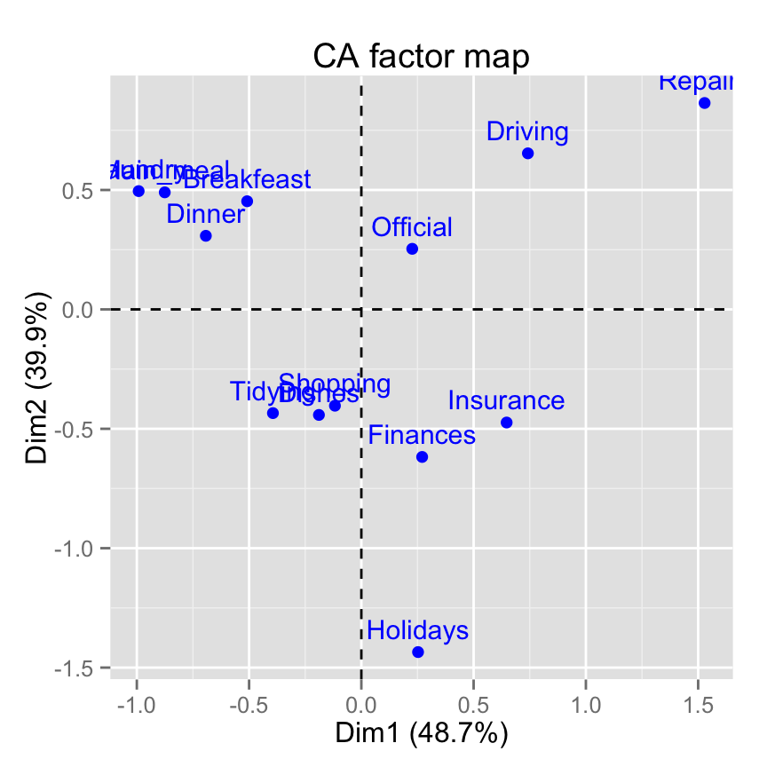
# Change title and axis labels
fviz_ca_row(res.ca) +
 labs(title = "CA", x = "Dim.1", y ="Dim.2" )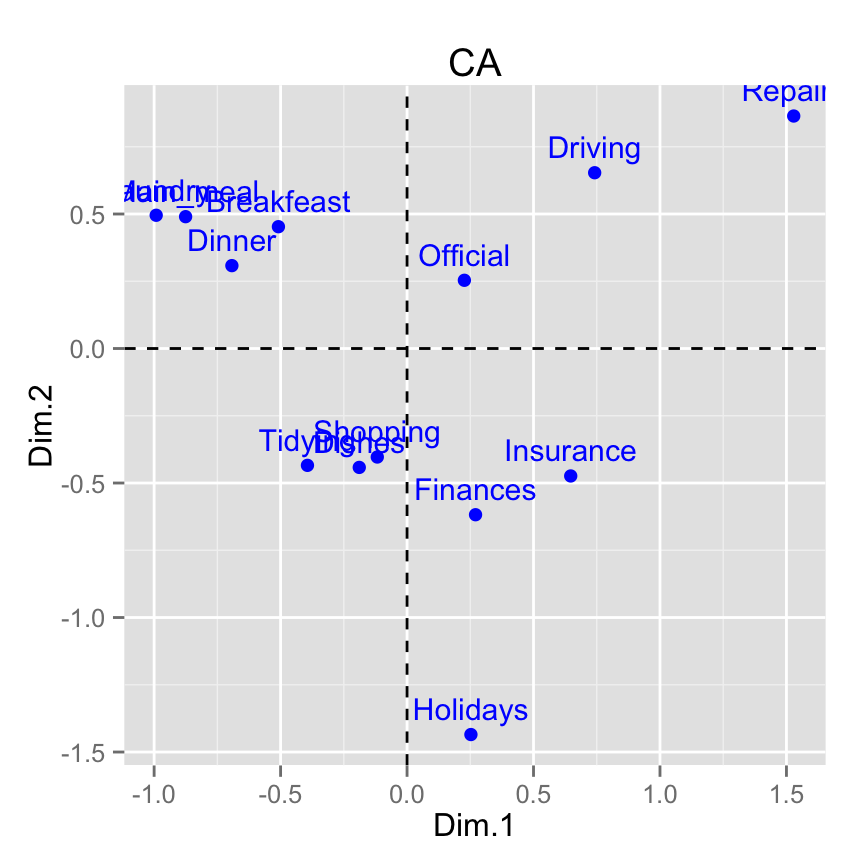
# Change axis limits by specifying the min and max
fviz_ca_row(res.ca) +
   xlim(-1.3, 1.7) + ylim (-1.5, 1)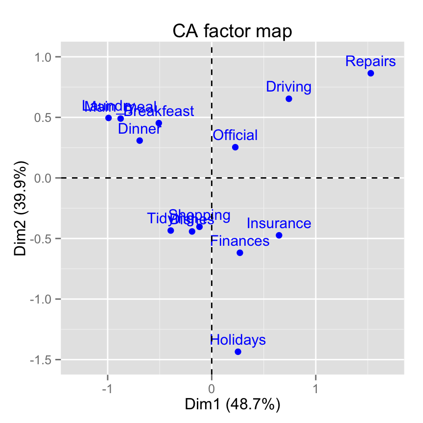
# Use text only
fviz_ca_row(res.ca, geom = "text")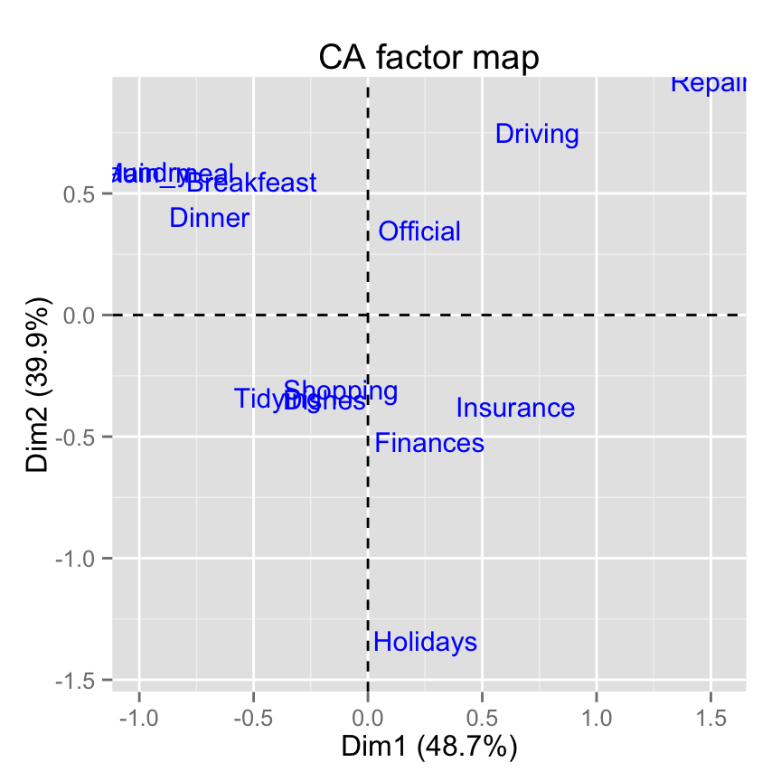
# Use points only
fviz_ca_row(res.ca, geom="point")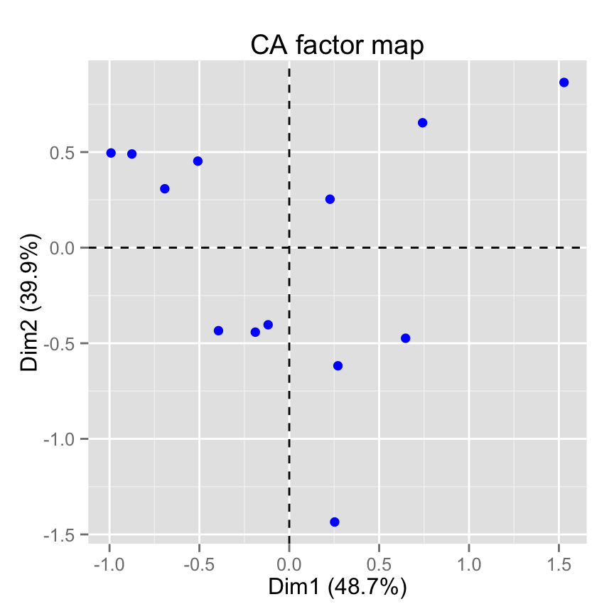
# Change the size of points
fviz_ca_row(res.ca, geom="point", pointsize = 4)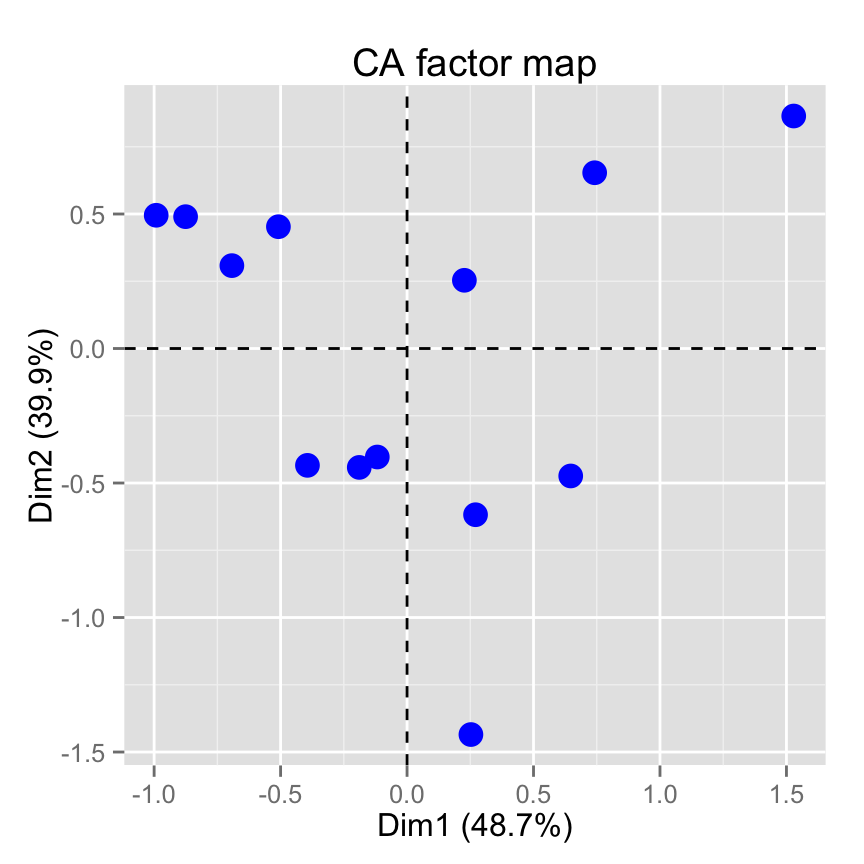
# Change point color and theme
fviz_ca_row(res.ca, col.row = "violet")+
   theme_minimal()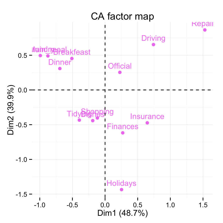
# Control automatically the color of row points
# using the cos2 or the contributions
# cos2 = the quality of the rows on the factor map
fviz_ca_row(res.ca, col.row="cos2")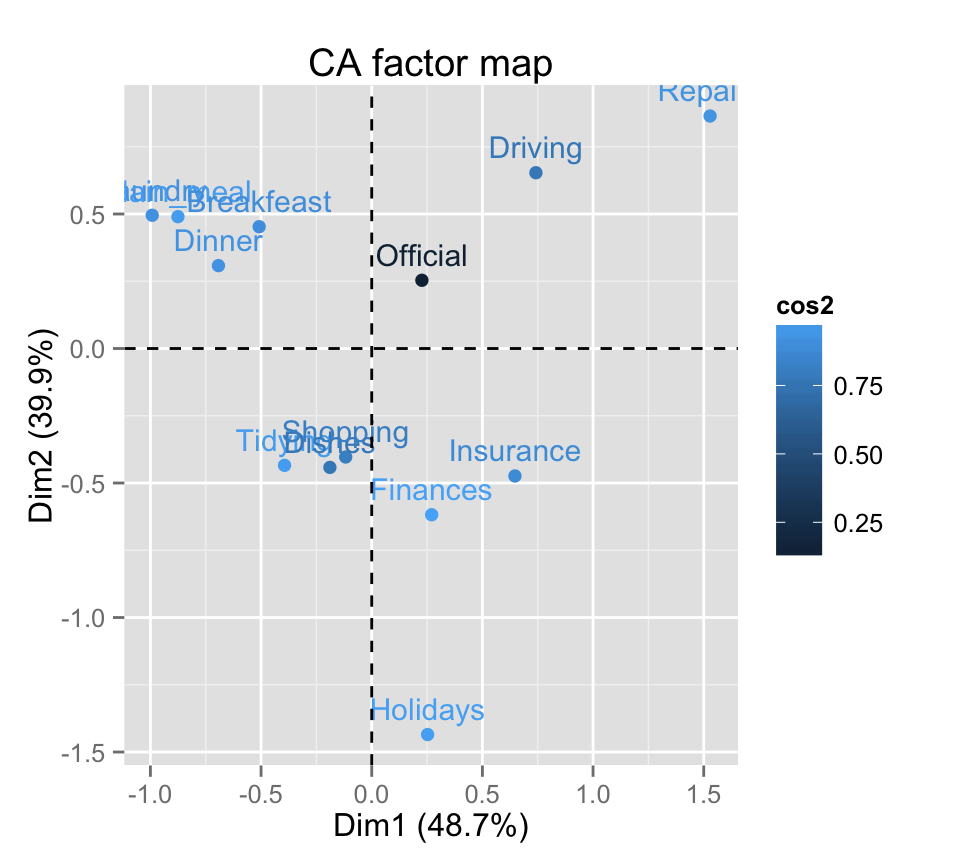
# Gradient color
fviz_ca_row(res.ca, col.row="cos2") +
      scale_color_gradient2(low="white", mid="blue",
      high="red", midpoint=0.5)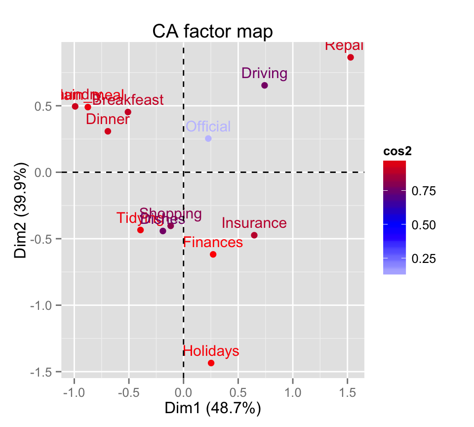
# Change the theme and use only points
fviz_ca_row(res.ca, col.row="cos2", geom = "point") +
      scale_color_gradient2(low="white", mid="blue",
      high="red", midpoint=0.4)+ theme_minimal()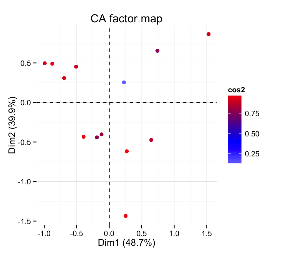
# Color by the contributions
fviz_ca_row(res.ca, col.row="contrib") +
      scale_color_gradient2(low="white", mid="blue",
      high="red", midpoint=10)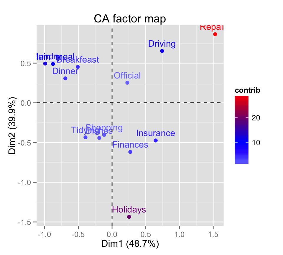
# Control the transparency of the color by the
# contributions
fviz_ca_row(res.ca, alpha.row="contrib") +
     theme_minimal()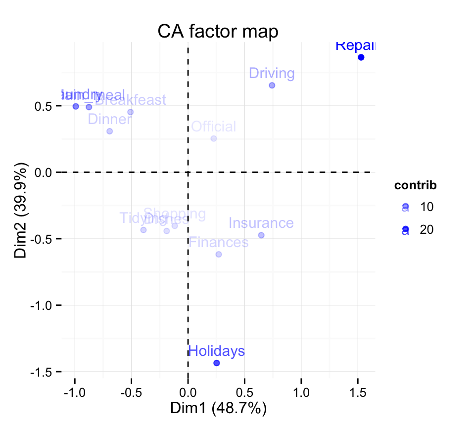
# Select and visualize rows with cos2 > 0.5
fviz_ca_row(res.ca, select.row = list(cos2 = 0.5))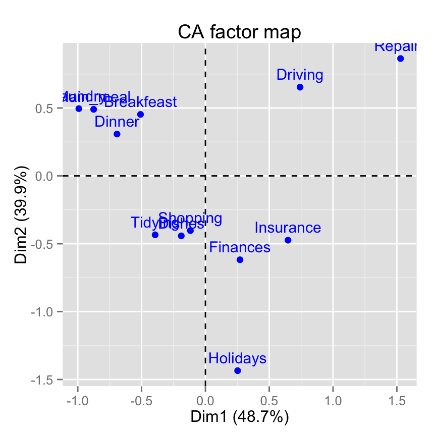
# Select the top 7 according to the cos2
fviz_ca_row(res.ca, select.row = list(cos2 = 7))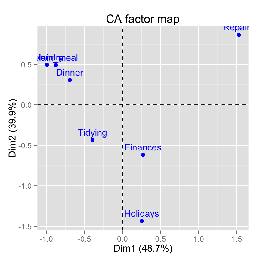
# Select the top 7 contributing rows
fviz_ca_row(res.ca, select.row = list(contrib = 7))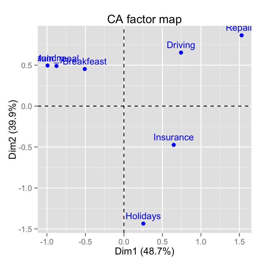
# Select by names
fviz_ca_row(res.ca,
select.row = list(name = c("Breakfeast", "Repairs", "Holidays")))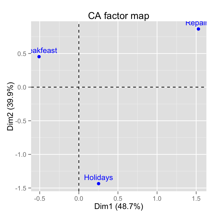
fviz_ca_col(): Graph of column categories
# Default plot
fviz_ca_col(res.ca)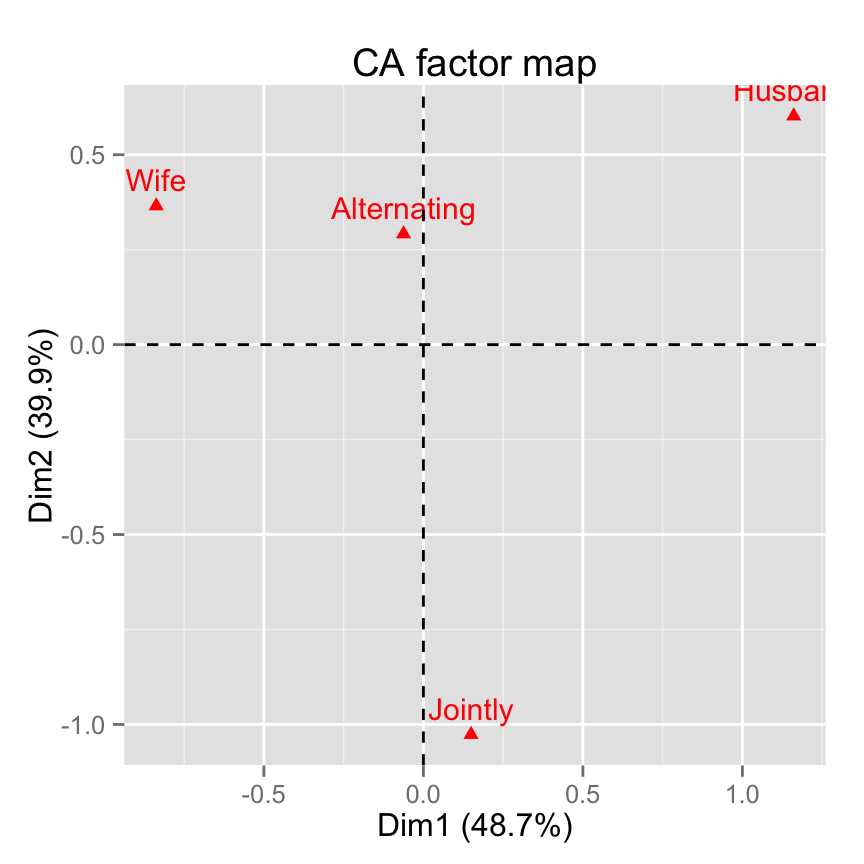
# Change color and theme
fviz_ca_col(res.ca, col.col="steelblue")+
 theme_minimal()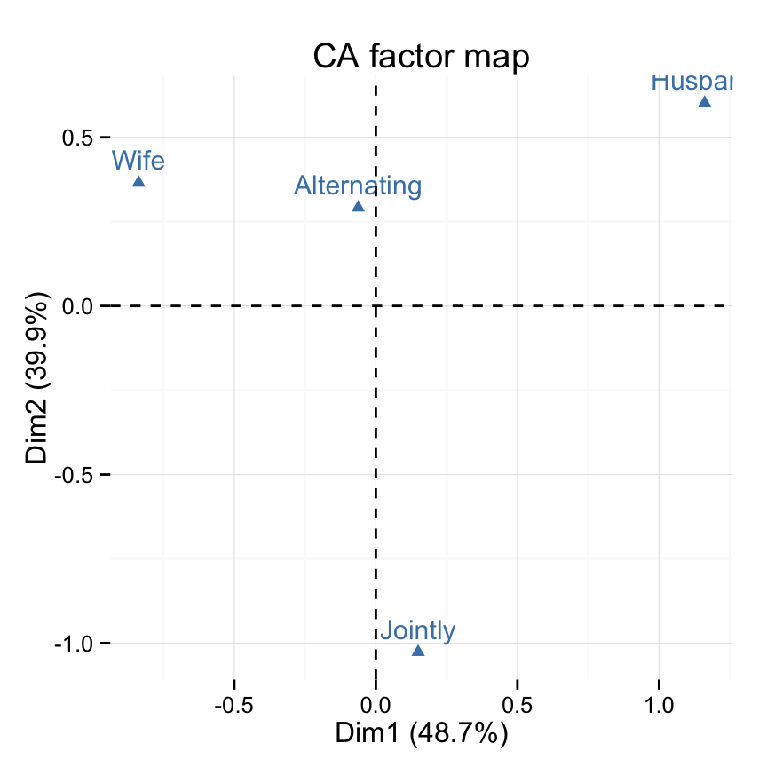
# Control colors using their contributions
fviz_ca_col(res.ca, col.col = "contrib")+
 scale_color_gradient2(low = "white", mid = "blue",
           high = "red", midpoint = 25) +
 theme_minimal()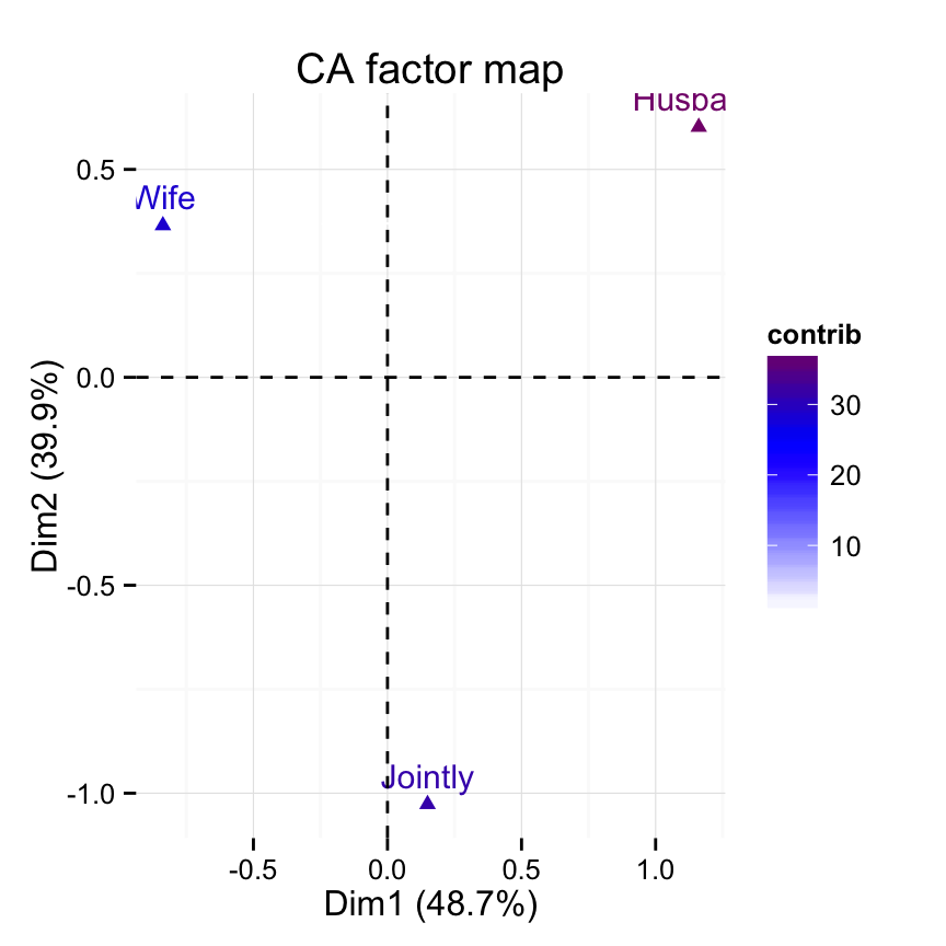
# Control the transparency of variables using their contributions
fviz_ca_col(res.ca, alpha.col = "contrib") +
   theme_minimal()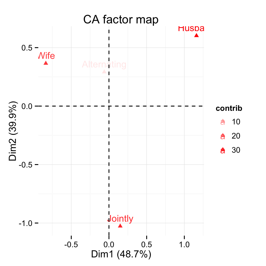
# Select and visualize columns with cos2 >= 0.4
fviz_ca_col(res.ca, select.col = list(cos2 = 0.4))
# Select the top 3 contributing columns
fviz_ca_col(res.ca, select.col = list(contrib = 3))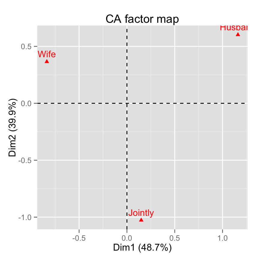
# Select by names
fviz_ca_col(res.ca,
 select.col= list(name = c("Wife", "Husband", "Jointly")))
fviz_ca_biplot(): Biplot of rows and columns
# Symetric Biplot of rows and columns
fviz_ca_biplot(res.ca)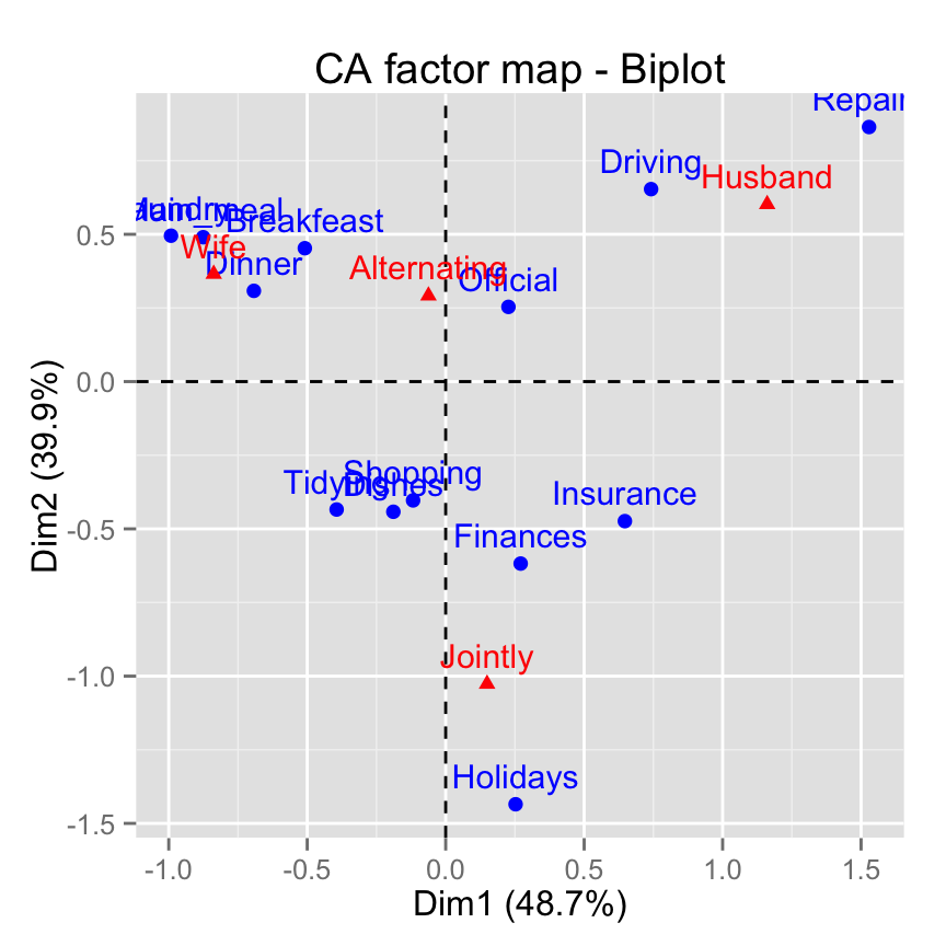
# Asymetric biplot, use arrows for columns
fviz_ca_biplot(res.ca, map ="rowprincipal",
 arrow = c(FALSE, TRUE))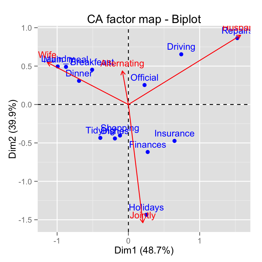
# Keep only the labels for row points
fviz_ca_biplot(res.ca, label ="row")
# Keep only labels for column points
fviz_ca_biplot(res.ca, label ="col")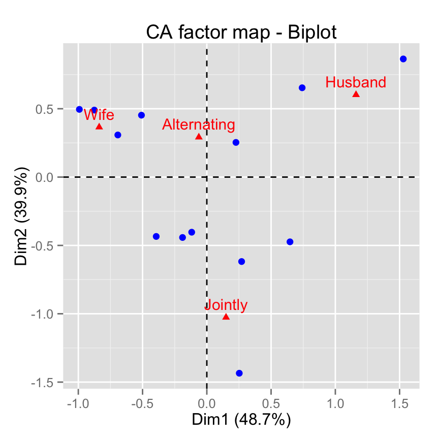
# Hide row points
fviz_ca_biplot(res.ca, invisible ="row")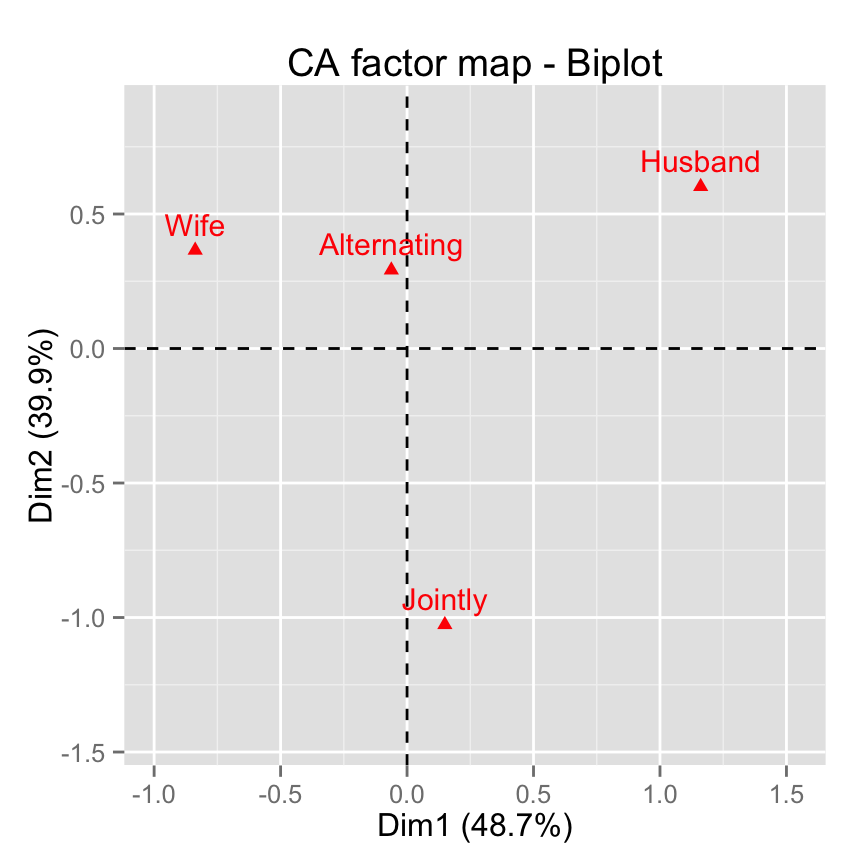
# Hide column points
fviz_ca_biplot(res.ca, invisible ="col")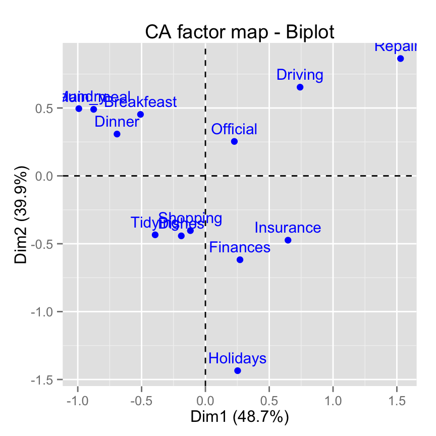
# Control automatically the color of rows using the cos2
fviz_ca_biplot(res.ca, col.row="cos2") +
       theme_minimal()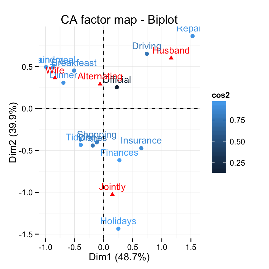
# Select the top 7 contributing rows
# And the top 3 columns
fviz_ca_biplot(res.ca,
               select.row = list(contrib = 7),
               select.col = list(contrib = 3))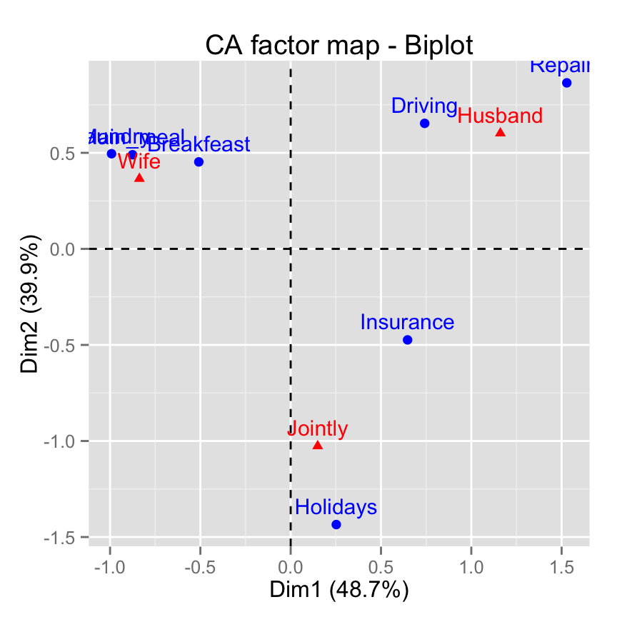
Infos
This analysis has been performed using R software (ver. 3.2.1) and factoextra (ver. 1.0.3)
Show me some love with the like buttons below... Thank you and please don't forget to share and comment below!!
Montrez-moi un peu d'amour avec les like ci-dessous ... Merci et n'oubliez pas, s'il vous plaît, de partager et de commenter ci-dessous!
Recommended for You!
Recommended for you
This section contains best data science and self-development resources to help you on your path.
Coursera - Online Courses and Specialization
Data science
- Course: Machine Learning: Master the Fundamentals by Standford
- Specialization: Data Science by Johns Hopkins University
- Specialization: Python for Everybody by University of Michigan
- Courses: Build Skills for a Top Job in any Industry by Coursera
- Specialization: Master Machine Learning Fundamentals by University of Washington
- Specialization: Statistics with R by Duke University
- Specialization: Software Development in R by Johns Hopkins University
- Specialization: Genomic Data Science by Johns Hopkins University
Popular Courses Launched in 2020
- Google IT Automation with Python by Google
- AI for Medicine by deeplearning.ai
- Epidemiology in Public Health Practice by Johns Hopkins University
- AWS Fundamentals by Amazon Web Services
Trending Courses
- The Science of Well-Being by Yale University
- Google IT Support Professional by Google
- Python for Everybody by University of Michigan
- IBM Data Science Professional Certificate by IBM
- Business Foundations by University of Pennsylvania
- Introduction to Psychology by Yale University
- Excel Skills for Business by Macquarie University
- Psychological First Aid by Johns Hopkins University
- Graphic Design by Cal Arts
Books - Data Science
Our Books
- Practical Guide to Cluster Analysis in R by A. Kassambara (Datanovia)
- Practical Guide To Principal Component Methods in R by A. Kassambara (Datanovia)
- Machine Learning Essentials: Practical Guide in R by A. Kassambara (Datanovia)
- R Graphics Essentials for Great Data Visualization by A. Kassambara (Datanovia)
- GGPlot2 Essentials for Great Data Visualization in R by A. Kassambara (Datanovia)
- Network Analysis and Visualization in R by A. Kassambara (Datanovia)
- Practical Statistics in R for Comparing Groups: Numerical Variables by A. Kassambara (Datanovia)
- Inter-Rater Reliability Essentials: Practical Guide in R by A. Kassambara (Datanovia)
Others
- R for Data Science: Import, Tidy, Transform, Visualize, and Model Data by Hadley Wickham & Garrett Grolemund
- Hands-On Machine Learning with Scikit-Learn, Keras, and TensorFlow: Concepts, Tools, and Techniques to Build Intelligent Systems by Aurelien Géron
- Practical Statistics for Data Scientists: 50 Essential Concepts by Peter Bruce & Andrew Bruce
- Hands-On Programming with R: Write Your Own Functions And Simulations by Garrett Grolemund & Hadley Wickham
- An Introduction to Statistical Learning: with Applications in R by Gareth James et al.
- Deep Learning with R by François Chollet & J.J. Allaire
- Deep Learning with Python by François Chollet


