Exploratory data analysis for next generation sequencing
This analysis was performed using R (ver. 3.1.0).Download data
We’ll use a data from Bottomly et al., sequencing two strains of mouse with many biological replicates. This dataset and a number of other sequencing datasets have been compiled from raw data into read counts tables by Frazee, Langmead, and Leek as part of the ReCount project. These datasets are made publicly available at the following website: http://bowtie-bio.sourceforge.net/recount/.
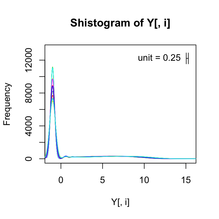
We can make similar figures for NGS to the ones shown in the previous sections for microarray data. However, the log transform does not work because RNAseq data contains many 0s. One quick way to get around this is by adding a constant (for example 0.5) before taking the log. A typical one is 0.5 which gives us a log2 value of -1 for 0s.
#Download data
destfile="~/hubiC/Documents/R/doc/english/genomics/bottomly_eset.RData"
if (!file.exists(destfile)) download.file("http://bowtie-bio.sourceforge.net/recount/ExpressionSets/bottomly_eset.RData", destfile)
#Load the expression eset
load(destfile)
bottomly.eset
## ExpressionSet (storageMode: lockedEnvironment)
## assayData: 36536 features, 21 samples
## element names: exprs
## protocolData: none
## phenoData
## sampleNames: SRX033480 SRX033488 ... SRX033494 (21 total)
## varLabels: sample.id num.tech.reps ... lane.number (5 total)
## varMetadata: labelDescription
## featureData
## featureNames: ENSMUSG00000000001 ENSMUSG00000000003 ...
## ENSMUSG00000090268 (36536 total)
## fvarLabels: gene
## fvarMetadata: labelDescription
## experimentData: use 'experimentData(object)'
## Annotation:#The counts for each sample of reads which align to the first gene.
library("Biobase")
exprs(bottomly.eset)[1,]## SRX033480 SRX033488 SRX033481 SRX033489 SRX033482 SRX033490 SRX033483
## 369 744 287 769 348 803 433
## SRX033476 SRX033478 SRX033479 SRX033472 SRX033473 SRX033474 SRX033475
## 469 585 321 301 461 309 374
## SRX033491 SRX033484 SRX033492 SRX033485 SRX033493 SRX033486 SRX033494
## 781 555 820 294 758 419 857#Phenotypic data
pData(bottomly.eset)## sample.id num.tech.reps strain experiment.number lane.number
## SRX033480 SRX033480 1 C57BL/6J 6 1
## SRX033488 SRX033488 1 C57BL/6J 7 1
## SRX033481 SRX033481 1 C57BL/6J 6 2
## SRX033489 SRX033489 1 C57BL/6J 7 2
## SRX033482 SRX033482 1 C57BL/6J 6 3
## SRX033490 SRX033490 1 C57BL/6J 7 3
## SRX033483 SRX033483 1 C57BL/6J 6 5
## SRX033476 SRX033476 1 C57BL/6J 4 6
## SRX033478 SRX033478 1 C57BL/6J 4 7
## SRX033479 SRX033479 1 C57BL/6J 4 8
## SRX033472 SRX033472 1 DBA/2J 4 1
## SRX033473 SRX033473 1 DBA/2J 4 2
## SRX033474 SRX033474 1 DBA/2J 4 3
## SRX033475 SRX033475 1 DBA/2J 4 5
## SRX033491 SRX033491 1 DBA/2J 7 5
## SRX033484 SRX033484 1 DBA/2J 6 6
## SRX033492 SRX033492 1 DBA/2J 7 6
## SRX033485 SRX033485 1 DBA/2J 6 7
## SRX033493 SRX033493 1 DBA/2J 7 7
## SRX033486 SRX033486 1 DBA/2J 6 8
## SRX033494 SRX033494 1 DBA/2J 7 8Exploratory Data Analysis for NGS
Something which distinguishes the sequencing experiments from the microarray experiments is that in the sequencing datasets we’ll have a number of features which, for a given sample, a value of exactly zero. Meaning that they were zero reads aligning to that feature for that sample.
Histogram
For every sample, I’m going to make a smooth histogram of these log2 plus 1/2 values.
#Log transformation
Y <- log2(exprs(bottomly.eset) + 0.5)
# library(devtools)
# install_github("rafalib","ririzarr")
library("rafalib")
#smooth histogram of the log2 of the counts for each sample
#different color for each line. And the add just says that only create
#a plot for the first sample and then the rest you should add.
for(i in 1:ncol(Y)){
  shist(Y[,i],unit=0.25,col=i,plotHist=FALSE,add=i!=1)
}
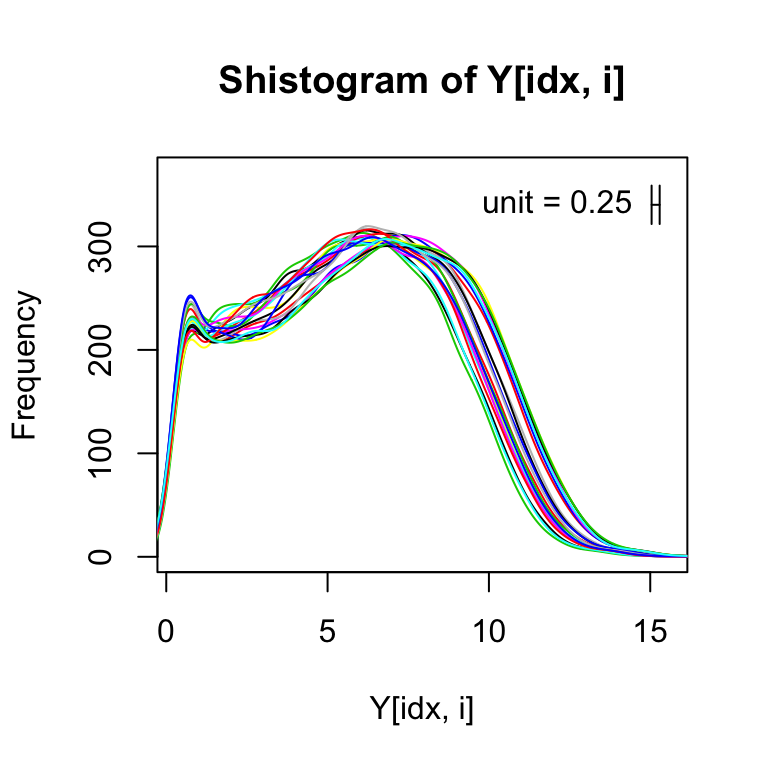
If we get rid of the zeros (i.e., those with log2 value of -1), we can more easily see that shape of the distribution for the expressed genes:
for(i in 1:ncol(Y)){
  idx <- Y[,i] > -1
  shist(Y[idx,i],unit=0.25,col=i,plotHist=FALSE,add=i!=1)
}
Plotting two samples against each other shows the spreading of points at the low end of expression from the log transformation. This can also be seen with randomly generated Poisson data.
#Remove rows with zero value and make the plot
idx <- rowSums(Y[,1:2]) > 0
plot(Y[idx,1], Y[idx,2], cex=.1)
rm <- rowMeans(2^Y[idx,1:2])
simulated1 <- rpois(length(idx), rm)
simulated2 <- rpois(length(idx), rm)
plot(log2(simulated1 + .5), log2(simulated2 + .5), cex=.1)

MA plot
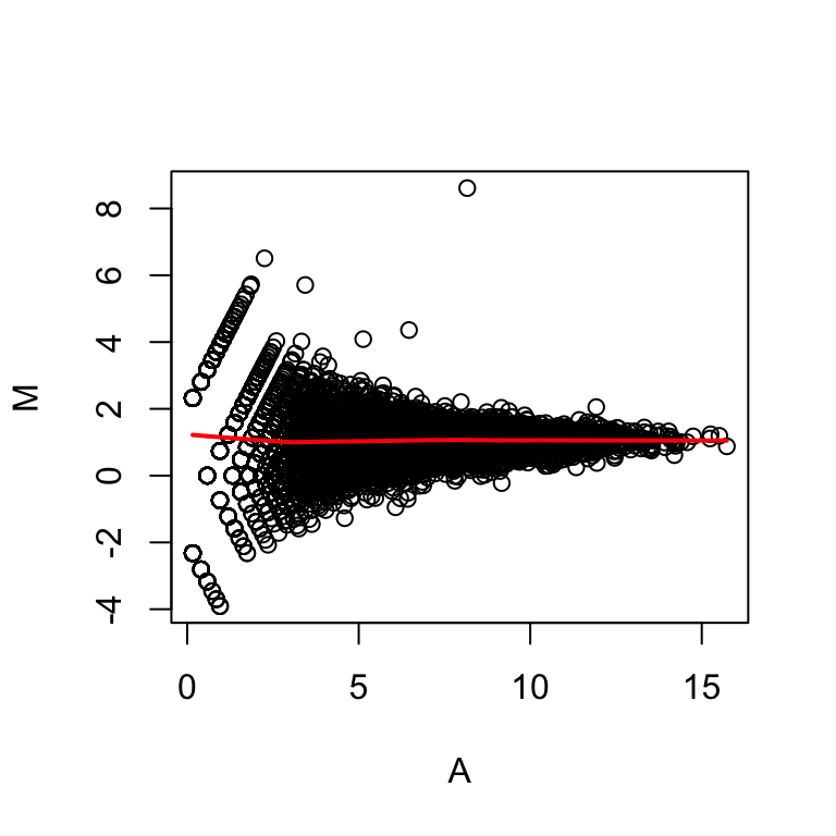
The MA plot is again easier to look at, in that we don’t have to rotate our heads sideways by 45 degrees to see deviations from the diagonal. The MA plot, is the log ratio on the y-axis and the average of the log values on the x-axis. It gives us a lot of the same information as this scatter plot. But it is effectively rotated 45 degrees down.
maplot(Y[idx,1],Y[idx,2])
Licence
References
Show me some love with the like buttons below... Thank you and please don't forget to share and comment below!!
Montrez-moi un peu d'amour avec les like ci-dessous ... Merci et n'oubliez pas, s'il vous plaît, de partager et de commenter ci-dessous!
Recommended for You!
Recommended for you
This section contains best data science and self-development resources to help you on your path.
Coursera - Online Courses and Specialization
Data science
- Course: Machine Learning: Master the Fundamentals by Standford
- Specialization: Data Science by Johns Hopkins University
- Specialization: Python for Everybody by University of Michigan
- Courses: Build Skills for a Top Job in any Industry by Coursera
- Specialization: Master Machine Learning Fundamentals by University of Washington
- Specialization: Statistics with R by Duke University
- Specialization: Software Development in R by Johns Hopkins University
- Specialization: Genomic Data Science by Johns Hopkins University
Popular Courses Launched in 2020
- Google IT Automation with Python by Google
- AI for Medicine by deeplearning.ai
- Epidemiology in Public Health Practice by Johns Hopkins University
- AWS Fundamentals by Amazon Web Services
Trending Courses
- The Science of Well-Being by Yale University
- Google IT Support Professional by Google
- Python for Everybody by University of Michigan
- IBM Data Science Professional Certificate by IBM
- Business Foundations by University of Pennsylvania
- Introduction to Psychology by Yale University
- Excel Skills for Business by Macquarie University
- Psychological First Aid by Johns Hopkins University
- Graphic Design by Cal Arts
Books - Data Science
Our Books
- Practical Guide to Cluster Analysis in R by A. Kassambara (Datanovia)
- Practical Guide To Principal Component Methods in R by A. Kassambara (Datanovia)
- Machine Learning Essentials: Practical Guide in R by A. Kassambara (Datanovia)
- R Graphics Essentials for Great Data Visualization by A. Kassambara (Datanovia)
- GGPlot2 Essentials for Great Data Visualization in R by A. Kassambara (Datanovia)
- Network Analysis and Visualization in R by A. Kassambara (Datanovia)
- Practical Statistics in R for Comparing Groups: Numerical Variables by A. Kassambara (Datanovia)
- Inter-Rater Reliability Essentials: Practical Guide in R by A. Kassambara (Datanovia)
Others
- R for Data Science: Import, Tidy, Transform, Visualize, and Model Data by Hadley Wickham & Garrett Grolemund
- Hands-On Machine Learning with Scikit-Learn, Keras, and TensorFlow: Concepts, Tools, and Techniques to Build Intelligent Systems by Aurelien Géron
- Practical Statistics for Data Scientists: 50 Essential Concepts by Peter Bruce & Andrew Bruce
- Hands-On Programming with R: Write Your Own Functions And Simulations by Garrett Grolemund & Hadley Wickham
- An Introduction to Statistical Learning: with Applications in R by Gareth James et al.
- Deep Learning with R by François Chollet & J.J. Allaire
- Deep Learning with Python by François Chollet


