EDA for microarray data
This analysis was performed using R (ver. 3.1.0).EDA for Microarray data
Exploratory data analysis (EDA) can be used to get an idea of what your data looks like. Here we are analyzing microarray data from 8 samples: two groups of four. A first step in any analysis of genomics data is to learn its general properties and search for problematic samples.
Histogram
By viewing the data from the first sample we immediately notice that over 90% of data is below 1,000 and the remaining 10% spans values up to 40,000. By taking the log we get a better picture of the distribution. We use base 2 because memorizing the powers of 2 is easy. It gives us a friendly range: 4-16.
# library(devtools)
# install_github("dagdata","genomicsclass")
library(dagdata)
#load data
data(SpikeInEDA)
#histogramm of the first array: not very informative in linear scale
hist(int[,1])
#Better picture using log2 scale
hist(log2(int[,1]))

density curves
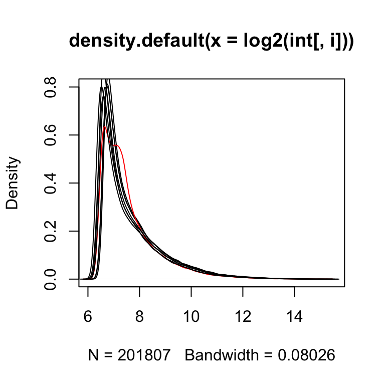
Next we look at all eight histograms simultaneously. To facilitate this we introduce the density estimator or smooth histogram. Basically we create a histogram, draw a smooth curve through the top of the bars, and keep that curve. This permits us to put several histograms on the same page:
for(i in 1:ncol(int))
  if(i==1) plot(density(log2(int[,i])),col=(i==4)+1, main=NULL) else lines(density(log2(int[,i])),col=(i==4)+1)
Note that one histogram (we highlighted it by making it red) looks different: it has a different shape from the rest. Is this sample different from the rest in any significant way? If we compute the correlation between this sample and the rest it is not very different and all very high.Correlation between samples
signif(cor(int),2)## 2353m99hpp_av08 2353n99hpp_av08 2353o99hpp_av08
## 2353m99hpp_av08 1.00 0.99 0.99
## 2353n99hpp_av08 0.99 1.00 0.99
## 2353o99hpp_av08 0.99 0.99 1.00
## 2353p99hpp_av08 0.99 0.99 0.99
## 2353q99hpp_av08 0.98 0.98 0.98
## 2353r99hpp_av08 0.98 0.98 0.98
## 2353s99hpp_av08 0.98 0.98 0.98
## 2353t99hpp_av08 0.98 0.98 0.98
## 2353p99hpp_av08 2353q99hpp_av08 2353r99hpp_av08
## 2353m99hpp_av08 0.99 0.98 0.98
## 2353n99hpp_av08 0.99 0.98 0.98
## 2353o99hpp_av08 0.99 0.98 0.98
## 2353p99hpp_av08 1.00 0.98 0.98
## 2353q99hpp_av08 0.98 1.00 0.99
## 2353r99hpp_av08 0.98 0.99 1.00
## 2353s99hpp_av08 0.98 0.99 0.99
## 2353t99hpp_av08 0.98 0.99 0.99
## 2353s99hpp_av08 2353t99hpp_av08
## 2353m99hpp_av08 0.98 0.98
## 2353n99hpp_av08 0.98 0.98
## 2353o99hpp_av08 0.98 0.98
## 2353p99hpp_av08 0.98 0.98
## 2353q99hpp_av08 0.99 0.99
## 2353r99hpp_av08 0.99 0.99
## 2353s99hpp_av08 1.00 0.99
## 2353t99hpp_av08 0.99 1.00Scatter plot
The problem is not immediately obvious from a scatter plot.
##we don't need to show all the points so we take random samples
#of size 10000
library(rafalib)
splot<-function(x,y,...){
  ind<-sample(length(x),10000)
  x=x[ind];y=y[ind]
  plot(x,y,...)
}
#scatterplot between sample 1 and 2
splot(log2(int[,1]),log2(int[,2]),
      main="sample 1 and 2")
#Scatterplot between sample 1 and 4
splot(log2(int[,1]),log2(int[,4]),
      main="sample 1 and 4")

Note that samples 1 through 4 are replicates and should produce the same values up to measurement error. Scatterplots and correlation are not the best tools to detect problems. For example 1,2,3,4 and 100,200,300,400 two lists with very different values have perfect correlation. A better measure is the differences between the values and therefore a better plot is a rotation of the scatter plot containing the differences (log ratios) on the y-axis and the averages (in the log scale) on the x-axis. This plot is a refereed to as an MA-plot (plot of difference versus the average). MA plot
maplot<- function(x,y,...) splot((x+y)/2,y-x,...)
maplot(log2(int[,1]),log2(int[,2]),xlab="A",ylab="M", main="Sple 1 and 2", ylim=c(-2,2))
maplot(log2(int[,1]),log2(int[,3]),xlab="A",ylab="M",main="Sple 1 and 3",ylim=c(-2,2))
maplot(log2(int[,1]),log2(int[,4]),xlab="A",ylab="M", main="Sple 1 and 4", ylim=c(-2,2))


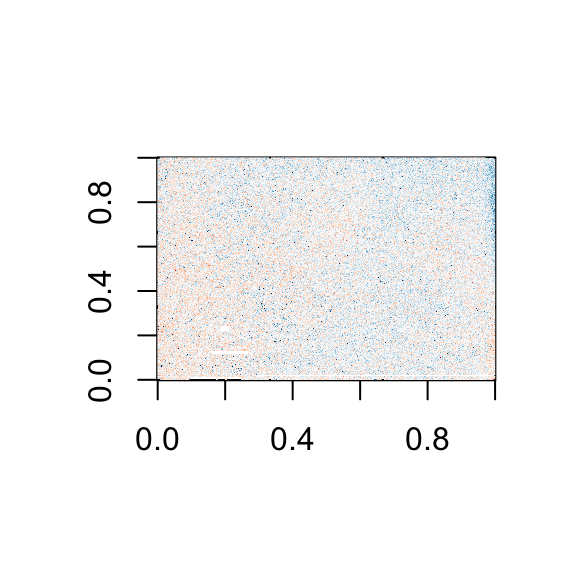
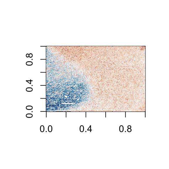
Now the problem is obvious. It turns out this samples comes from an array for which a spatial problem can be detected at the original image level. We actually have the grid locations for these measurements and can recreate the image.##we are doing this for two arrays 1 and 4
library(matrixStats) ##need rowMedians
library(RColorBrewer)
for(i in c(1,4)){
r=log2(int[,i])-rowMedians(log2(int))
## r are residuals from median array
## to avoind outliers taking over colors of image
### define a MAX
MAX<-1
r[r>MAX]<-MAX
r[r< -MAX] <- -MAX
##we now that every other column is skipped
mat=matrix(NA,max(locations[,1]),max(locations[,2]+1)/2)
for(j in 1:nrow(locations)){
mat[locations[j,1],(locations[j,2]+1)/2]<-r[j]
}
image(mat,col=brewer.pal(11,"RdBu"))
}

On the second image we can clearly see the spatial pattern (blue are positive residuals, red are negative)Licence
References
Show me some love with the like buttons below... Thank you and please don't forget to share and comment below!!
Montrez-moi un peu d'amour avec les like ci-dessous ... Merci et n'oubliez pas, s'il vous plaît, de partager et de commenter ci-dessous!
Recommended for You!
Recommended for you
This section contains best data science and self-development resources to help you on your path.
Coursera - Online Courses and Specialization
Data science
- Course: Machine Learning: Master the Fundamentals by Standford
- Specialization: Data Science by Johns Hopkins University
- Specialization: Python for Everybody by University of Michigan
- Courses: Build Skills for a Top Job in any Industry by Coursera
- Specialization: Master Machine Learning Fundamentals by University of Washington
- Specialization: Statistics with R by Duke University
- Specialization: Software Development in R by Johns Hopkins University
- Specialization: Genomic Data Science by Johns Hopkins University
Popular Courses Launched in 2020
- Google IT Automation with Python by Google
- AI for Medicine by deeplearning.ai
- Epidemiology in Public Health Practice by Johns Hopkins University
- AWS Fundamentals by Amazon Web Services
Trending Courses
- The Science of Well-Being by Yale University
- Google IT Support Professional by Google
- Python for Everybody by University of Michigan
- IBM Data Science Professional Certificate by IBM
- Business Foundations by University of Pennsylvania
- Introduction to Psychology by Yale University
- Excel Skills for Business by Macquarie University
- Psychological First Aid by Johns Hopkins University
- Graphic Design by Cal Arts
Books - Data Science
Our Books
- Practical Guide to Cluster Analysis in R by A. Kassambara (Datanovia)
- Practical Guide To Principal Component Methods in R by A. Kassambara (Datanovia)
- Machine Learning Essentials: Practical Guide in R by A. Kassambara (Datanovia)
- R Graphics Essentials for Great Data Visualization by A. Kassambara (Datanovia)
- GGPlot2 Essentials for Great Data Visualization in R by A. Kassambara (Datanovia)
- Network Analysis and Visualization in R by A. Kassambara (Datanovia)
- Practical Statistics in R for Comparing Groups: Numerical Variables by A. Kassambara (Datanovia)
- Inter-Rater Reliability Essentials: Practical Guide in R by A. Kassambara (Datanovia)
Others
- R for Data Science: Import, Tidy, Transform, Visualize, and Model Data by Hadley Wickham & Garrett Grolemund
- Hands-On Machine Learning with Scikit-Learn, Keras, and TensorFlow: Concepts, Tools, and Techniques to Build Intelligent Systems by Aurelien Géron
- Practical Statistics for Data Scientists: 50 Essential Concepts by Peter Bruce & Andrew Bruce
- Hands-On Programming with R: Write Your Own Functions And Simulations by Garrett Grolemund & Hadley Wickham
- An Introduction to Statistical Learning: with Applications in R by Gareth James et al.
- Deep Learning with R by François Chollet & J.J. Allaire
- Deep Learning with Python by François Chollet


