


Plot One Variable: Frequency Graph, Density Distribution and More
To visualize one variable, the type of graphs to use depends on the type of the variable:
- For categorical variables (or grouping variables). You can visualize the count of categories using a bar plot or using a pie chart to show the proportion of each category.
- For continuous variable, you can visualize the distribution of the variable using density plots, histograms and alternatives.
In this R graphics tutorial, you’ll learn how to:
- Visualize the frequency distribution of a categorical variable using bar plots, dot charts and pie charts
- Visualize the distribution of a continuous variable using:
- density and histogram plots,
- other alternatives, such as frequency polygon, area plots, dot plots, box plots, Empirical cumulative distribution function (ECDF) and Quantile-quantile plot (QQ plots).
- Density ridgeline plots, which are useful for visualizing changes in distributions, of a continuous variable, over time or space.
- Bar plot and modern alternatives, including lollipop charts and cleveland’s dot plots.
Contents:

Prerequisites
Load required packages and set the theme function theme_pubr() [in ggpubr] as the default theme:
library(ggplot2)
library(ggpubr)
theme_set(theme_pubr())
One categorical variable
Bar plot of counts
- Plot types: Bar plot of the count of group levels
- Key function:
geom_bar() - Key arguments:
alpha,color,fill,linetypeandsize
Demo data set: diamonds [in ggplot2]. Contains the prices and other attributes of almost 54000 diamonds. The column cut contains the quality of the diamonds cut (Fair, Good, Very Good, Premium, Ideal).
The R code below creates a bar plot visualizing the number of elements in each category of diamonds cut.
ggplot(diamonds, aes(cut)) +
  geom_bar(fill = "#0073C2FF") +
  theme_pubclean()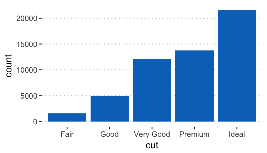
Compute the frequency of each category and add the labels on the bar plot:
dplyrpackage used to summarise the datageom_bar()with optionstat = "identity"is used to create the bar plot of the summary output as it is.geom_text()used to add text labels. Adjust the position of the labels by usinghjust(horizontal justification) andvjust(vertical justification). Values should be in [0, 1].
# Compute the frequency
library(dplyr)
df <- diamonds %>%
  group_by(cut) %>%
  summarise(counts = n())
df
## # A tibble: 5 x 2
## cut counts
##
## 1 Fair 1610
## 2 Good 4906
## 3 Very Good 12082
## 4 Premium 13791
## 5 Ideal 21551 # Create the bar plot. Use theme_pubclean() [in ggpubr]
ggplot(df, aes(x = cut, y = counts)) +
geom_bar(fill = "#0073C2FF", stat = "identity") +
geom_text(aes(label = counts), vjust = -0.3) +
theme_pubclean()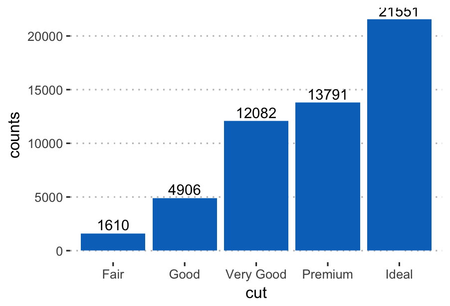
Pie charts
Pie chart is just a stacked bar chart in polar coordinates.
First,
- Arrange the grouping variable (
cut) in descending order. This important to compute the y coordinates of labels. - compute the proportion (counts/total) of each category
- compute the position of the text labels as the cumulative sum of the proportion. To put the labels in the center of pies, we’ll use
cumsum(prop) - 0.5*propas label position.
df <- df %>%
  arrange(desc(cut)) %>%
  mutate(prop = round(counts*100/sum(counts), 1),
         lab.ypos = cumsum(prop) - 0.5*prop)
head(df, 4)
## # A tibble: 4 x 4
## cut counts prop lab.ypos
##
## 1 Ideal 21551 40.0 20.0
## 2 Premium 13791 25.6 52.8
## 3 Very Good 12082 22.4 76.8
## 4 Good 4906 9.1 92.5 - Create the pie charts using ggplot2 verbs. Key function:
coord_polar().
ggplot(df, aes(x = "", y = prop, fill = cut)) +
  geom_bar(width = 1, stat = "identity", color = "white") +
  geom_text(aes(y = lab.ypos, label = prop), color = "white")+
  coord_polar("y", start = 0)+
  ggpubr::fill_palette("jco")+
  theme_void()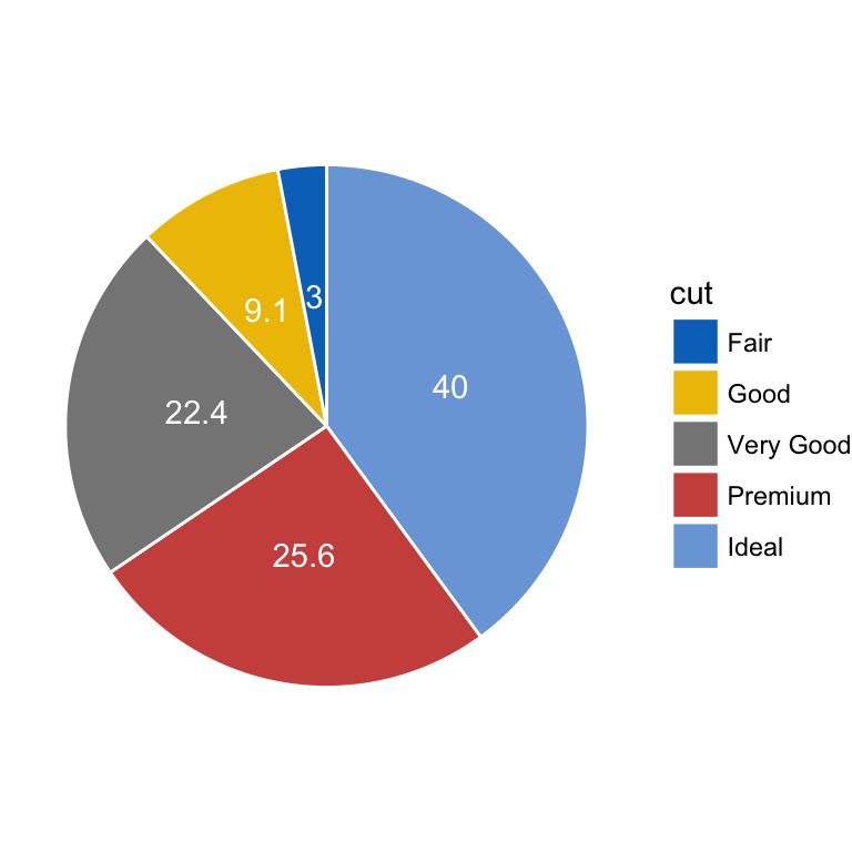
- Alternative solution to easily create a pie chart: use the function
ggpie()[in ggpubr]:
ggpie(
  df, x = "prop", label = "prop",
  lab.pos = "in", lab.font = list(color = "white"),
  fill = "cut", color = "white",
  palette = "jco"
)
Dot charts
Dot chart is an alternative to bar plots. Key functions:
geom_linerange():Creates line segments from x to ymaxgeom_point(): adds dotsggpubr::color_palette(): changes color palette.
ggplot(df, aes(cut, prop)) +
  geom_linerange(
    aes(x = cut, ymin = 0, ymax = prop),
    color = "lightgray", size = 1.5
    )+
  geom_point(aes(color = cut), size = 2)+
  ggpubr::color_palette("jco")+
  theme_pubclean()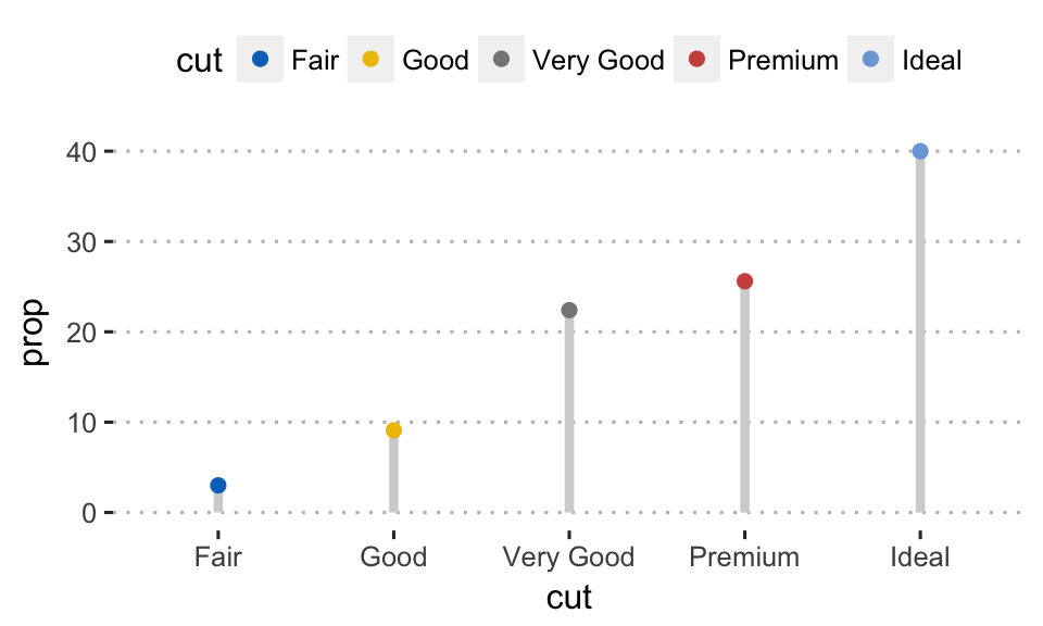
Easy alternative to create a dot chart. Use ggdotchart() [ggpubr]:
ggdotchart(
  df, x = "cut", y = "prop",
  color = "cut", size = 3,      # Points color and size
  add = "segment",              # Add line segments
  add.params = list(size = 2),
  palette = "jco",
  ggtheme = theme_pubclean()
)
One continuous variable
Different types of graphs can be used to visualize the distribution of a continuous variable, including: density and histogram plots.
Data format
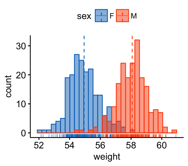
Create some data (wdata) containing the weights by sex (M for male; F for female):
set.seed(1234)
wdata = data.frame(
        sex = factor(rep(c("F", "M"), each=200)),
        weight = c(rnorm(200, 55), rnorm(200, 58))
        )
head(wdata, 4)
## sex weight
## 1 F 53.8
## 2 F 55.3
## 3 F 56.1
## 4 F 52.7Compute the mean weight by sex using the dplyr package. First, the data is grouped by sex and then summarized by computing the mean weight by groups. The operator %>% is used to combine multiple operations:
library("dplyr")
mu <- wdata %>%
  group_by(sex) %>%
  summarise(grp.mean = mean(weight))
mu
## # A tibble: 2 x 2
## sex grp.mean
##
## 1 F 54.9
## 2 M 58.1 Basic plots
We start by creating a plot, named a, that we’ll finish in the next section by adding a layer.
a <- ggplot(wdata, aes(x = weight))Possible layers include: geom_density() (for density plots) and geom_histogram() (for histogram plots).
Key arguments to customize the plots:
color, size, linetype: change the line color, size and type, respectivelyfill: change the areas fill color (for bar plots, histograms and density plots)alpha: create a semi-transparent color.
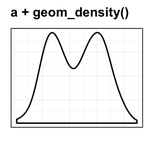
Density plots
Key function: geom_density().
- Create basic density plots. Add a vertical line corresponding to the mean value of the weight variable (
geom_vline()):
# y axis scale = ..density.. (default behaviour)
a + geom_density() +
geom_vline(aes(xintercept = mean(weight)),
linetype = "dashed", size = 0.6)
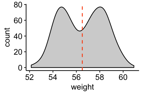
# Change y axis to count instead of density
a + geom_density(aes(y = ..count..), fill = "lightgray") +
geom_vline(aes(xintercept = mean(weight)),
linetype = "dashed", size = 0.6,
color = "#FC4E07")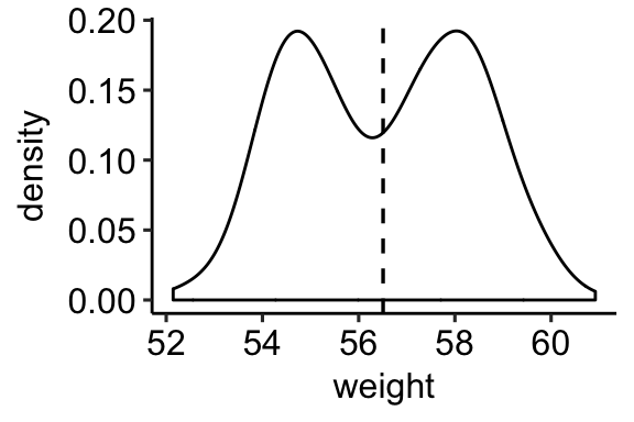
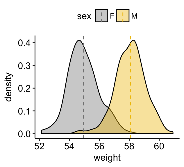
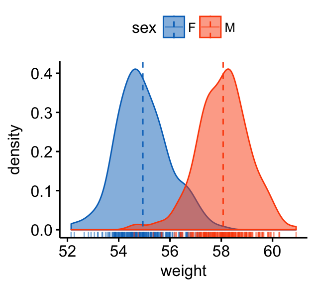
- Change areas fill and add line color by groups (sex):
- Add vertical mean lines using
geom_vline(). Data:mu, which contains the mean values of weights by sex (computed in the previous section). - Change color manually:
- use
scale_color_manual()orscale_colour_manual()for changing line color - use
scale_fill_manual()for changing area fill colors.
- use
# Change line color by sex
a + geom_density(aes(color = sex)) +
  scale_color_manual(values = c("#868686FF", "#EFC000FF"))
# Change fill color by sex and add mean line
# Use semi-transparent fill: alpha = 0.4
a + geom_density(aes(fill = sex), alpha = 0.4) +
      geom_vline(aes(xintercept = grp.mean, color = sex),
             data = mu, linetype = "dashed") +
  scale_color_manual(values = c("#868686FF", "#EFC000FF"))+
  scale_fill_manual(values = c("#868686FF", "#EFC000FF"))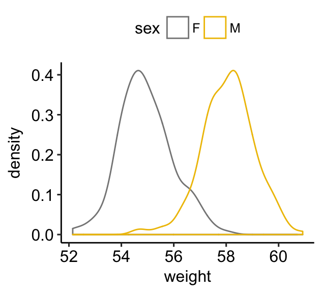
- Simple solution to create a ggplot2-based density plots: use
ggboxplot()[in ggpubr].
library(ggpubr)
# Basic density plot with mean line and marginal rug
ggdensity(wdata, x = "weight",
          fill = "#0073C2FF", color = "#0073C2FF",
          add = "mean", rug = TRUE)

# Change outline and fill colors by groups ("sex")
# Use a custom palette
ggdensity(wdata, x = "weight",
   add = "mean", rug = TRUE,
   color = "sex", fill = "sex",
   palette = c("#0073C2FF", "#FC4E07"))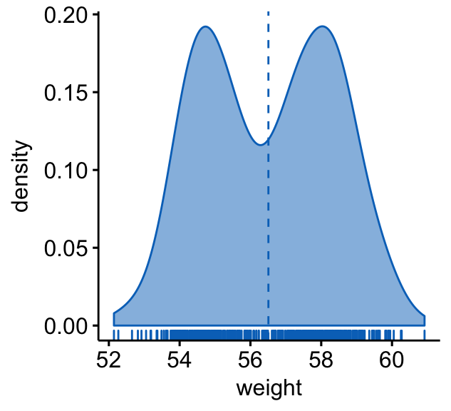
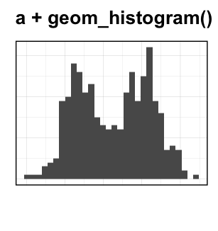
Histogram plots
An alternative to density plots is histograms, which represents the distribution of a continuous variable by dividing into bins and counting the number of observations in each bin.
Key function: geom_histogram(). The basic usage is quite similar to geom_density().
- Create a basic plots. Add a vertical line corresponding to the mean value of the weight variable:
a + geom_histogram(bins = 30, color = "black", fill = "gray") +
  geom_vline(aes(xintercept = mean(weight)),
             linetype = "dashed", size = 0.6)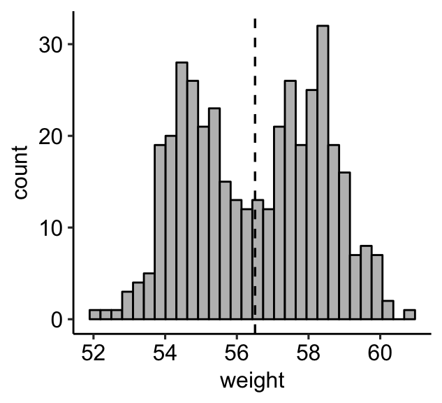
Note that, by default:
-
By default,
geom_histogram()uses 30 bins - this might not be good default. You can change the number of bins (e.g.: bins = 50) or the bin width (e.g.: binwidth = 0.5) -
The y axis corresponds to the count of weight values. If you want to change the plot in order to have the density on y axis, specify the argument
y = ..density..inaes().
- Change areas fill and add line color by groups (sex):
- Add vertical mean lines using
geom_vline(). Data:mu, which contains the mean values of weights by sex. - Change color manually:
- use
scale_color_manual()orscale_colour_manual()for changing line color - use
scale_fill_manual()for changing area fill colors.
- use
- Adjust the position of histogram bars by using the argument
position. Allowed values: “identity”, “stack”, “dodge”. Default value is “stack”.
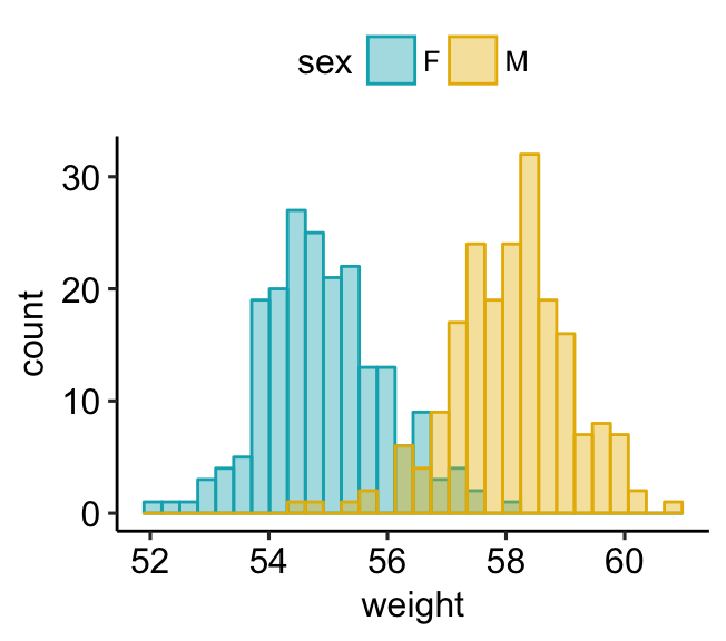
# Change line color by sex
a + geom_histogram(aes(color = sex), fill = "white",
                   position = "identity") +
  scale_color_manual(values = c("#00AFBB", "#E7B800"))
# change fill and outline color manually
a + geom_histogram(aes(color = sex, fill = sex),
                         alpha = 0.4, position = "identity") +
  scale_fill_manual(values = c("#00AFBB", "#E7B800")) +
  scale_color_manual(values = c("#00AFBB", "#E7B800"))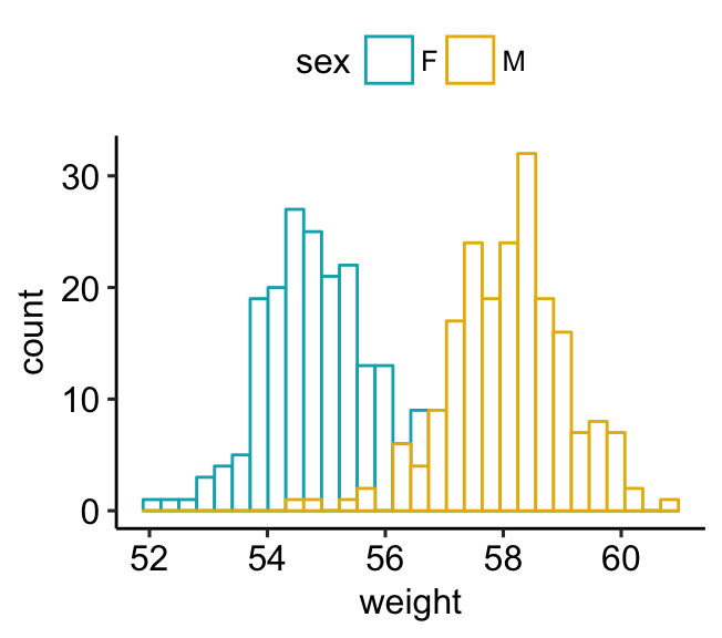
- Combine histogram and density plots:
- Plot histogram with density values on y-axis (instead of count values).
- Add density plot with transparent density plot
# Histogram with density plot
a + geom_histogram(aes(y = ..density..),
colour="black", fill="white") +
geom_density(alpha = 0.2, fill = "#FF6666")
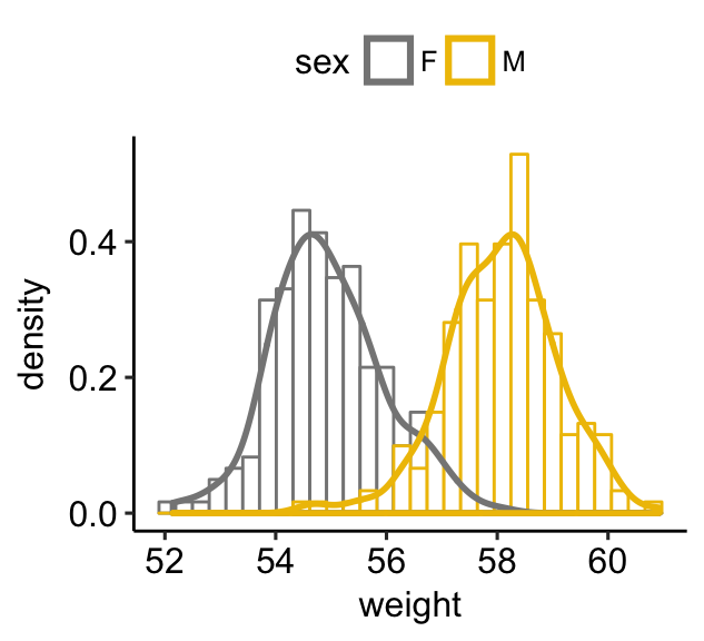
# Color by groups
a + geom_histogram(aes(y = ..density.., color = sex),
fill = "white",
position = "identity")+
geom_density(aes(color = sex), size = 1) +
scale_color_manual(values = c("#868686FF", "#EFC000FF"))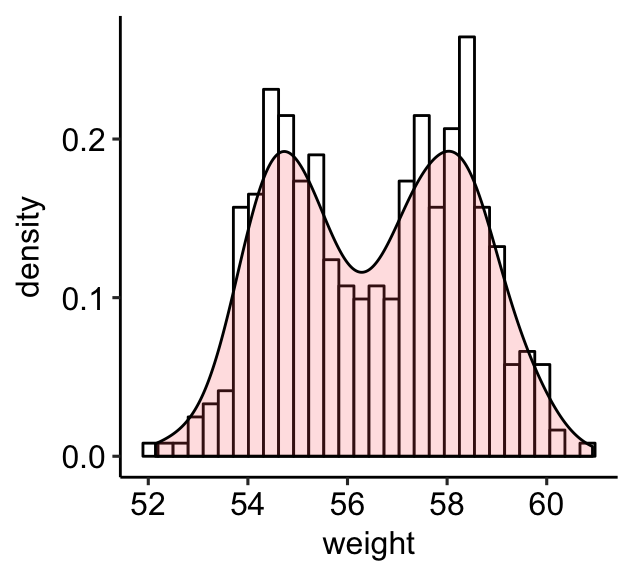
- Simple solution to create a ggplot2-based histogram plots: use
gghistogram()[in ggpubr].
library(ggpubr)
# Basic histogram plot with mean line and marginal rug
gghistogram(wdata, x = "weight", bins = 30,
            fill = "#0073C2FF", color = "#0073C2FF",
            add = "mean", rug = TRUE)

# Change outline and fill colors by groups ("sex")
# Use a custom palette
gghistogram(wdata, x = "weight", bins = 30,
   add = "mean", rug = TRUE,
   color = "sex", fill = "sex",
   palette = c("#0073C2FF", "#FC4E07"))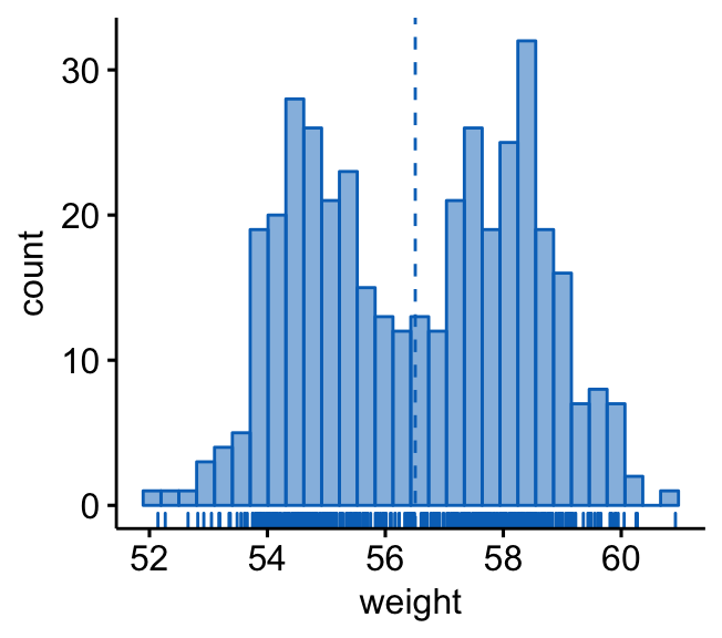
Alternative to density and histogram plots
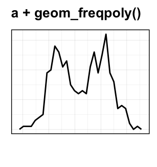
- Frequency polygon. Very close to histogram plots, but it uses lines instead of bars.
- Key function:
geom_freqpoly(). - Key arguments:
color,size,linetype: change, respectively, line color, size and type.
- Key function:
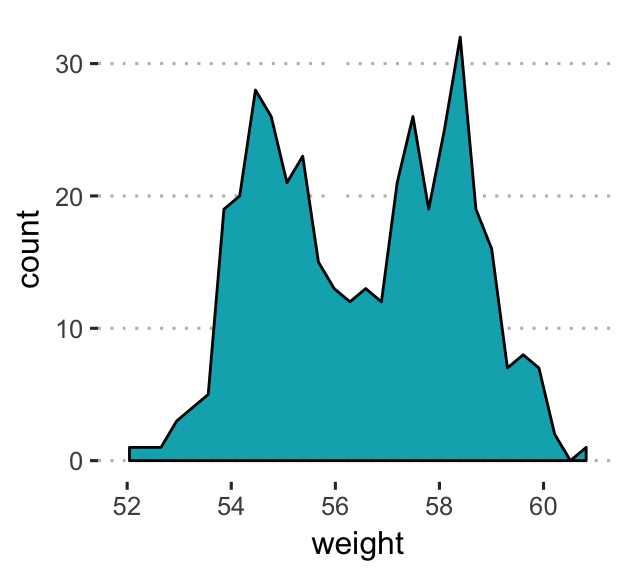
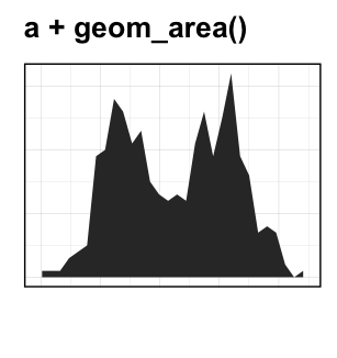
- Area plots. This is a continuous analog of a stacked bar plot.
- Key function:
geom_area(). - Key arguments:
color,size,linetype: change, respectively, line color, size and type.fill: change area fill color.
- Key function:
In this section, we’ll use the theme theme_pubclean() [in ggpubr]. This is a theme without axis lines, to direct more attention to the data. Type this to use the theme:
theme_set(theme_pubclean())- Create a basic frequency polygon and basic area plots:
# Basic frequency polygon
a + geom_freqpoly(bins = 30)
# Basic area plots, which can be filled by color
a + geom_area( stat = "bin", bins = 30,
               color = "black", fill = "#00AFBB")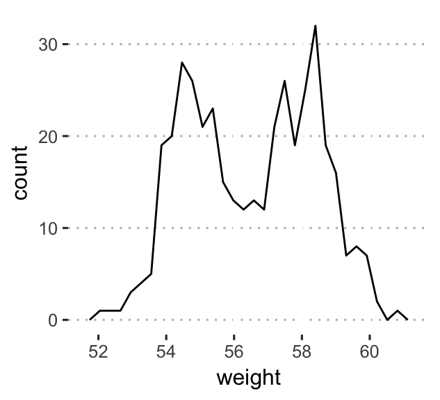
- Change colors by groups (sex):
# Frequency polygon:
# Change line colors and types by groups
a + geom_freqpoly( aes(color = sex, linetype = sex),
                   bins = 30, size = 1.5) +
  scale_color_manual(values = c("#00AFBB", "#E7B800"))
# Area plots: change fill colors by sex
# Create a stacked area plots
a + geom_area(aes(fill = sex), color = "white",
              stat ="bin", bins = 30) +
  scale_fill_manual(values = c("#00AFBB", "#E7B800"))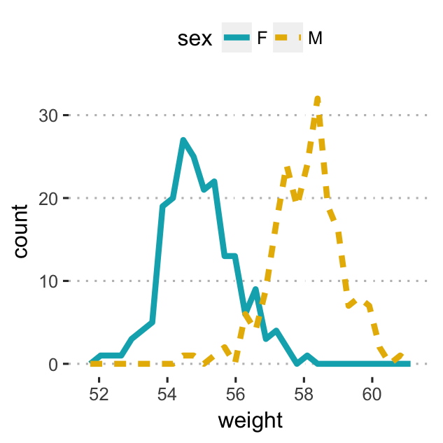
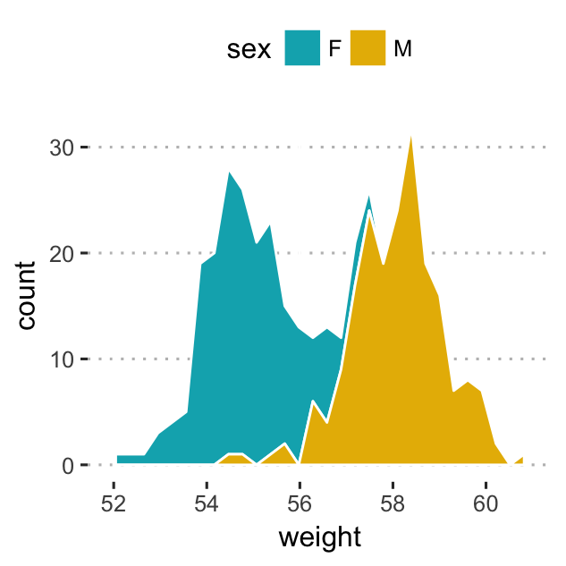
As in histogram plots, the default y values is count. To have density values on y axis, specify y = ..density.. in aes().
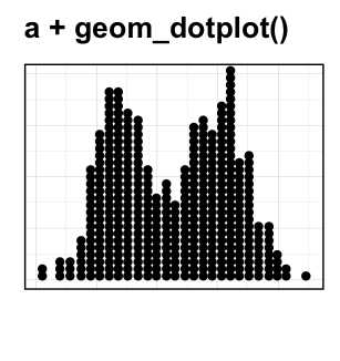
- Dot plots. Represents another alternative to histograms and density plots, that can be used to visualize a continuous variable. Dots are stacked with each dot representing one observation. The width of a dot corresponds to the bin width.
- Key function:
geom_dotplot(). - Key arguments:
alpha,color,fillanddotsize.
Create a dot plot colored by groups (sex):
a + geom_dotplot(aes(fill = sex), binwidth = 1/4) +
  scale_fill_manual(values = c("#00AFBB", "#E7B800"))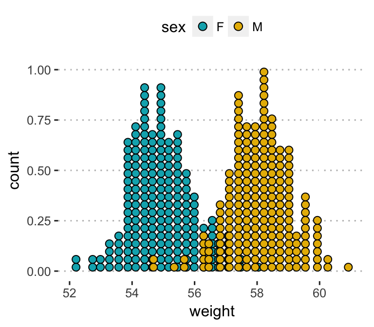
- Box plot:
- Create a box plot of one continuous variable:
geom_boxplot() - Add jittered points, where each point corresponds to an individual observation:
geom_jitter(). Change the color and the shape of points by groups (sex)
- Create a box plot of one continuous variable:
ggplot(wdata, aes(x = factor(1), y = weight)) +
  geom_boxplot(width = 0.4, fill = "white") +
  geom_jitter(aes(color = sex, shape = sex),
              width = 0.1, size = 1) +
  scale_color_manual(values = c("#00AFBB", "#E7B800")) +
  labs(x = NULL)   # Remove x axis label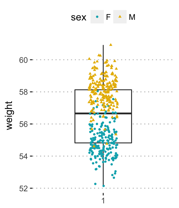
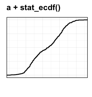
- Empirical cumulative distribution function (ECDF). Provides another alternative visualization of distribution. It reports for any given number the percent of individuals that are below that threshold.
For example, in the following plots, you can see that:
- about 25% of our females are shorter than 50 inches
- about 50% of males are shorter than 58 inches
# Another option for geom = "point"
a + stat_ecdf(aes(color = sex,linetype = sex),
              geom = "step", size = 1.5) +
  scale_color_manual(values = c("#00AFBB", "#E7B800"))+
  labs(y = "f(weight)")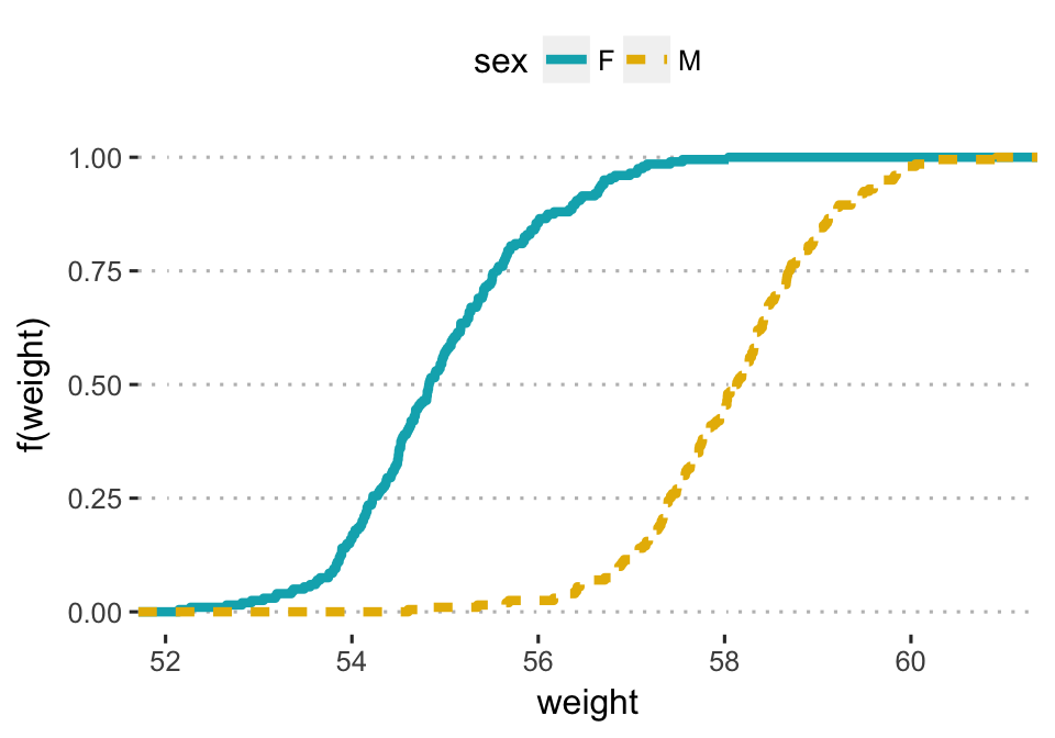
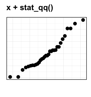
- Quantile-quantile plot (QQ plots). Used to check whether a given data follows normal distribution.
- Key function:
stat_qq(). - Key arguments:
color,shapeandsizeto change point color, shape and size.
Create a qq-plot of weight. Change color by groups (sex)
# Change point shapes by groups
ggplot(wdata, aes(sample = weight)) +
  stat_qq(aes(color = sex)) +
  scale_color_manual(values = c("#00AFBB", "#E7B800"))+
  labs(y = "Weight")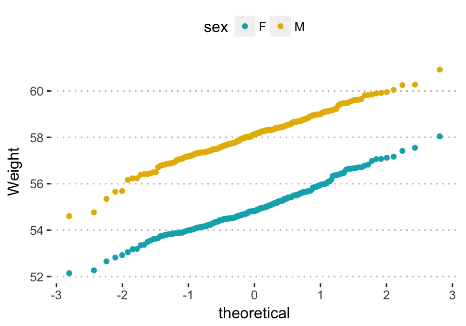
Alternative plot using the function ggqqplot() [in ggpubr]. The 95% confidence band is shown by default.
library(ggpubr)
ggqqplot(wdata, x = "weight",
   color = "sex",
   palette = c("#0073C2FF", "#FC4E07"),
   ggtheme = theme_pubclean())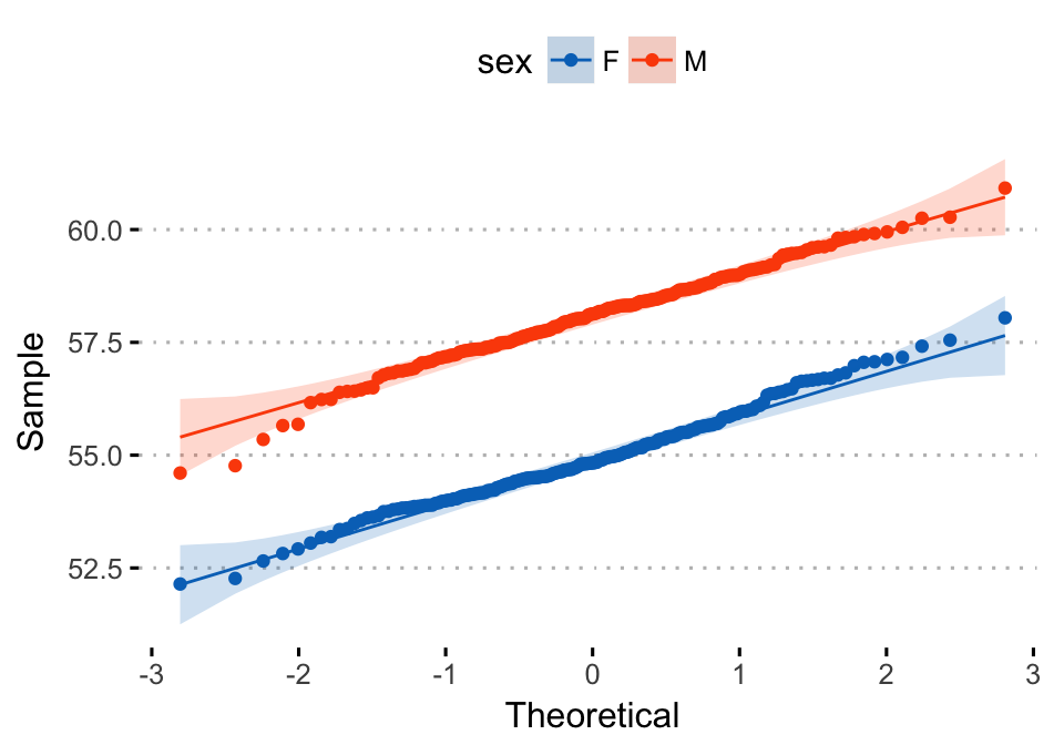
Density ridgeline plots
The density ridgeline plot is an alternative to the standard geom_density() function that can be useful for visualizing changes in distributions, of a continuous variable, over time or space. Ridgeline plots are partially overlapping line plots that create the impression of a mountain range.
This functionality is provided in the R package ggridges (Wilke 2017).
- Installation:
install.packages("ggridges")- Load and set the default theme to
theme_ridges()[in ggridges]:
library(ggplot2)
library(ggridges)
theme_set(theme_ridges())- Example 1: Simple distribution plots by groups. Distribution of Sepal.Length by Species using the
irisdata set. The grouping variable Species will be mapped to the y-axis:
ggplot(iris, aes(x = Sepal.Length, y = Species)) +
  geom_density_ridges(aes(fill = Species)) +
  scale_fill_manual(values = c("#00AFBB", "#E7B800", "#FC4E07"))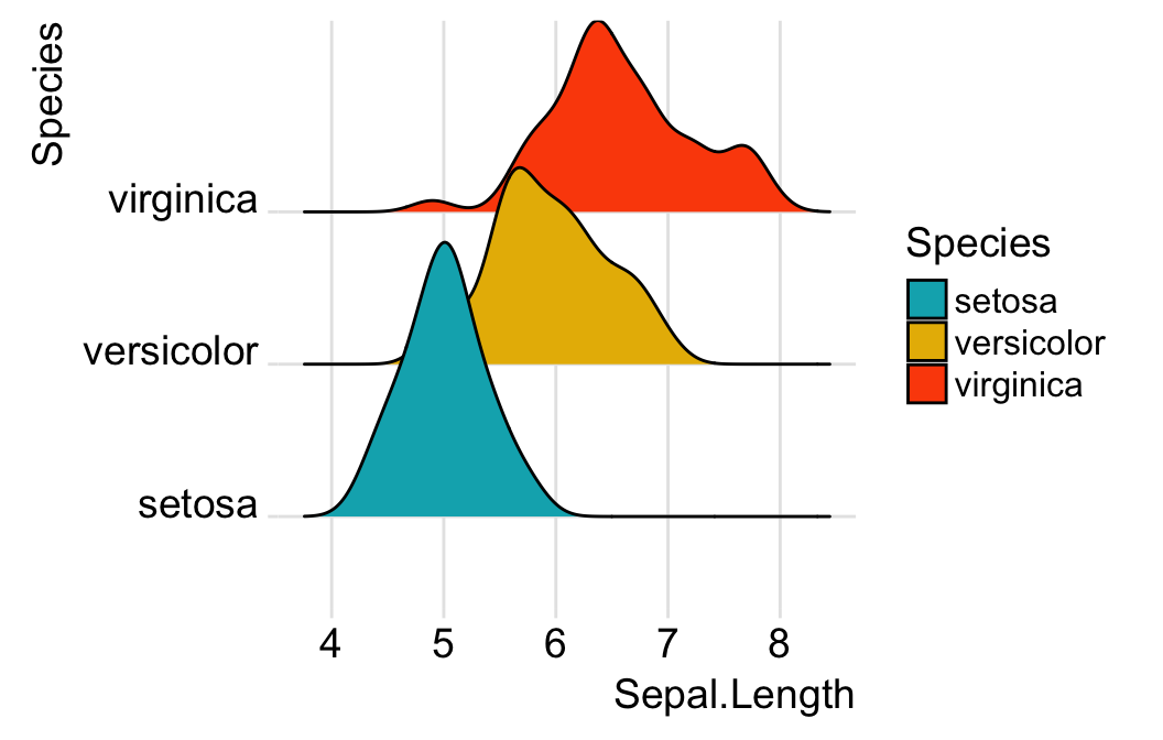
You can control the overlap between the different densities using the scale option. Default value is 1. Smaller values create a separation between the curves, and larger values create more overlap.
ggplot(iris, aes(x = Sepal.Length, y = Species)) +
geom_density_ridges(scale = 0.9) - Example 4: Visualize temperature data.
Data set:
lincoln_weather[in ggridges]. Weather in Lincoln, Nebraska in 2016.Create the density ridge plots of the
Mean TemperaturebyMonthand change the fill color according to the temperature value (on x axis). A gradient color is created using the functiongeom_density_ridges_gradient()
ggplot(
  lincoln_weather,
  aes(x = `Mean Temperature [F]`, y = `Month`)
  ) +
  geom_density_ridges_gradient(
    aes(fill = ..x..), scale = 3, size = 0.3
    ) +
  scale_fill_gradientn(
    colours = c("#0D0887FF", "#CC4678FF", "#F0F921FF"),
    name = "Temp. [F]"
    )+
labs(title = 'Temperatures in Lincoln NE') 
For more examples, type the following R code:
browseVignettes("ggridges")Bar plot and modern alternatives
In this section, we’ll describe how to create easily basic and ordered bar plots using ggplot2 based helper functions available in the ggpubr R package. We’ll also present some modern alternatives to bar plots, including lollipop charts and cleveland’s dot plots.
- Load required packages:
library(ggpubr)- Load and prepare data:
# Load data
dfm <- mtcars
# Convert the cyl variable to a factor
dfm$cyl <- as.factor(dfm$cyl)
# Add the name colums
dfm$name <- rownames(dfm)
# Inspect the data
head(dfm[, c("name", "wt", "mpg", "cyl")])
## name wt mpg cyl
## Mazda RX4 Mazda RX4 2.62 21.0 6
## Mazda RX4 Wag Mazda RX4 Wag 2.88 21.0 6
## Datsun 710 Datsun 710 2.32 22.8 4
## Hornet 4 Drive Hornet 4 Drive 3.21 21.4 6
## Hornet Sportabout Hornet Sportabout 3.44 18.7 8
## Valiant Valiant 3.46 18.1 6- Create an ordered bar plot of the
mpgvariable. Change the fill color by the grouping variable “cyl”. Sorting will be done globally, but not by groups.
ggbarplot(dfm, x = "name", y = "mpg",
          fill = "cyl",               # change fill color by cyl
          color = "white",            # Set bar border colors to white
          palette = "jco",            # jco journal color palett. see ?ggpar
          sort.val = "asc",          # Sort the value in dscending order
          sort.by.groups = TRUE,     # Don't sort inside each group
          x.text.angle = 90,           # Rotate vertically x axis texts
          ggtheme = theme_pubclean()
          )+
  font("x.text", size = 8, vjust = 0.5)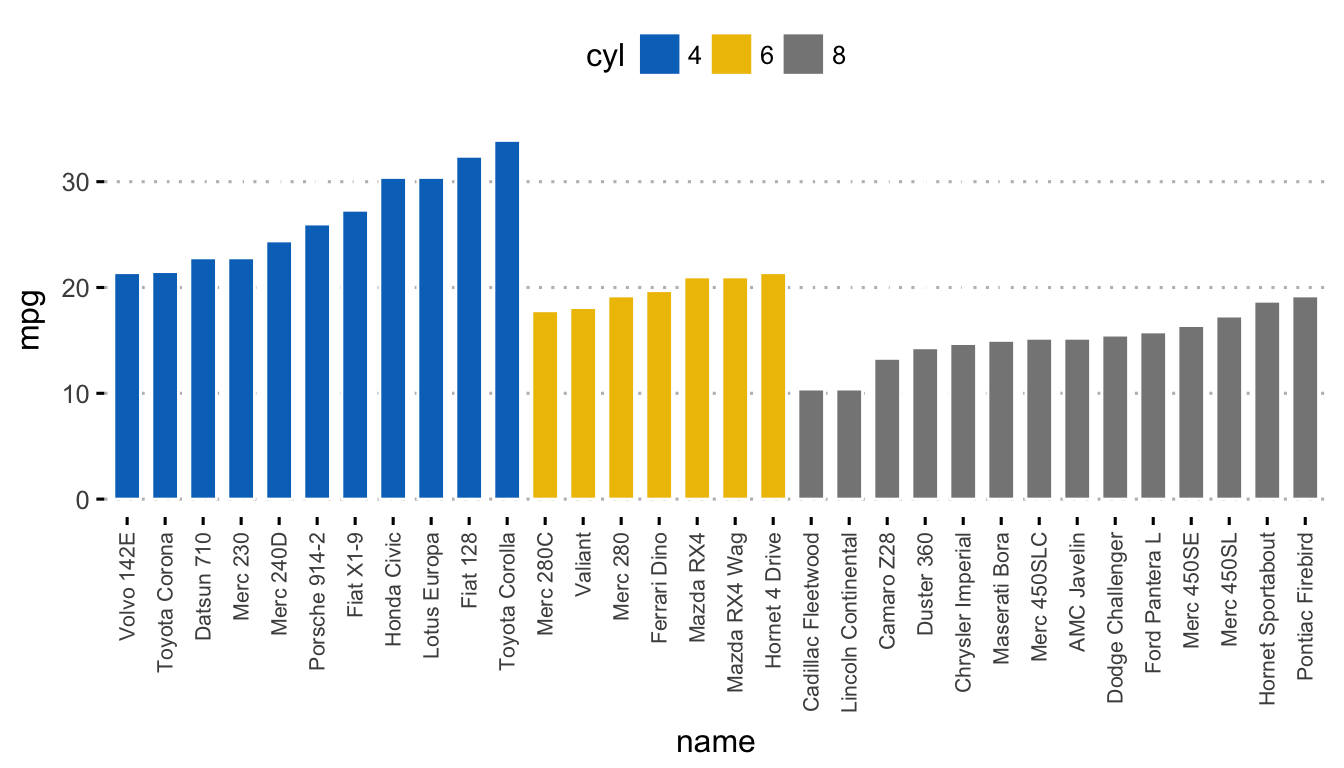
To sort bars inside each group, use the argument sort.by.groups = TRUE
- Create a Lollipop chart:
- Color by groups and set a custom color palette.
- Sort values in ascending order.
- Add segments from y = 0 to dots. Change segment color and size.
ggdotchart(dfm, x = "name", y = "mpg",
           color = "cyl",
           palette = c("#00AFBB", "#E7B800", "#FC4E07"),
           sorting = "asc", sort.by.groups = TRUE,
           add = "segments",
           add.params = list(color = "lightgray", size = 2),
           group = "cyl",
           dot.size = 4,
           ggtheme = theme_pubclean()
           )+
  font("x.text", size = 8, vjust = 0.5)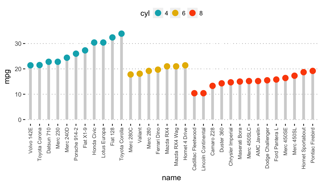
Read more: Bar Plots and Modern Alternatives
Conclusion
- Create a bar plot of a grouping variable:
ggplot(diamonds, aes(cut)) +
  geom_bar(fill = "#0073C2FF") +
theme_minimal()- Visualize a continuous variable:
Start by creating a plot, named a, that we’ll be finished by adding a layer.
a <- ggplot(wdata, aes(x = weight))Possible layers include:
- geom_density(): density plot
- geom_histogram(): histogram plot
- geom_freqpoly(): frequency polygon
- geom_area(): area plot
- geom_dotplot(): dot plot
- stat_ecdf(): empirical cumulative density function
- stat_qq(): quantile - quantile plot
Key arguments to customize the plots:
color, size, linetype: change the line color, size and type, respectivelyfill: change the areas fill color (for bar plots, histograms and density plots)alpha: create a semi-transparent color.
References
Wilke, Claus O. 2017. Ggridges: Ridgeline Plots in ’Ggplot2’. https://CRAN.R-project.org/package=ggridges.