


Plot Grouped Data: Box plot, Bar Plot and More
In this chapter, we’ll show how to plot data grouped by the levels of a categorical variable.
We start by describing how to plot grouped or stacked frequencies of two categorical variables. This can be done using bar plots and dot charts. You’ll also learn how to add labels to dodged and stacked bar plots.
Next we’ll show how to display a continuous variable with multiple groups. In this situation, the grouping variable is used as the x-axis and the continuous variable as the y-axis. You’ll learn, how to:
- Visualize a grouped continuous variable using box plot, violin plots, stripcharts and alternatives.
- Add automatically t-test / wilcoxon test p-values comparing the groups.
- Create mean and median plots of groups with error bars
Contents:

Prerequisites
Load required packages and set the theme function theme_pubclean() [in ggpubr] as the default theme:
library(dplyr)
library(ggplot2)
library(ggpubr)
theme_set(theme_pubclean())
Grouped categorical variables
- Plot types: grouped bar plots of the frequencies of the categories. Key function:
geom_bar(). - Demo dataset:
diamonds[in ggplot2]. The categorical variables to be used in the demo example are:cut: quality of the diamonds cut (Fair, Good, Very Good, Premium, Ideal)color: diamond colour, from J (worst) to D (best).
In our demo example, we’ll plot only a subset of the data (color J and D). The different steps are as follow:
- Filter the data to keep only diamonds which colors are in (“J”, “D”).
- Group the data by the quality of the cut and the diamond color
- Count the number of records by groups
- Create the bar plot
- Filter and count the number of records by groups:
df <- diamonds %>%
  filter(color %in% c("J", "D")) %>%
  group_by(cut, color) %>%
  summarise(counts = n())
head(df, 4)
## # A tibble: 4 x 3
## # Groups: cut [2]
## cut color counts
##
## 1 Fair D 163
## 2 Fair J 119
## 3 Good D 662
## 4 Good J 307 - Creare the grouped bar plots:
- Key function:
geom_bar(). Key argument:stat = "identity"to plot the data as it is. - Use the functions
scale_color_manual()andscale_fill_manual()to set manually the bars border line colors and area fill colors.
- Key function:
# Stacked bar plots of y = counts by x = cut,
# colored by the variable color
ggplot(df, aes(x = cut, y = counts)) +
geom_bar(
aes(color = color, fill = color),
stat = "identity", position = position_stack()
) +
scale_color_manual(values = c("#0073C2FF", "#EFC000FF"))+
scale_fill_manual(values = c("#0073C2FF", "#EFC000FF"))
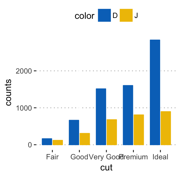
# Use position = position_dodge()
p <- ggplot(df, aes(x = cut, y = counts)) +
geom_bar(
aes(color = color, fill = color),
stat = "identity", position = position_dodge(0.8),
width = 0.7
) +
scale_color_manual(values = c("#0073C2FF", "#EFC000FF"))+
scale_fill_manual(values = c("#0073C2FF", "#EFC000FF"))
p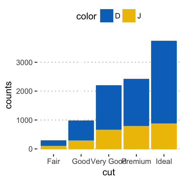
Note that, position_stack() automatically stack values in reverse order of the group aesthetic. This default ensures that bar colors align with the default legend. You can change this behavior by using position = position_stack(reverse = TRUE).
Alternatively, you can easily create a dot chart with the ggpubr package:
ggdotchart(df, x = "cut", y ="counts",
           color = "color", palette = "jco", size = 3,
           add = "segment",
           add.params = list(color = "lightgray", size = 1.5),
           position = position_dodge(0.3),
           ggtheme = theme_pubclean()
           )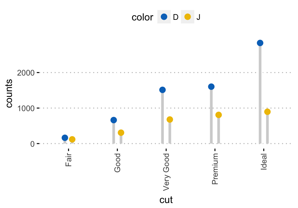
Or, if you prefer the ggplot2 verbs, type this:
ggplot(df, aes(cut, counts)) +
  geom_linerange(
    aes(x = cut, ymin = 0, ymax = counts, group = color),
    color = "lightgray", size = 1.5,
    position = position_dodge(0.3)
    )+
  geom_point(
    aes(color = color),
    position = position_dodge(0.3), size = 3
    )+
  scale_color_manual(values = c("#0073C2FF", "#EFC000FF"))+
theme_pubclean()- Add labels to the dodged bar plots:
p + geom_text(
  aes(label = counts, group = color),
  position = position_dodge(0.8),
  vjust = -0.3, size = 3.5
)
- Add labels to a stacked bar plots. 3 steps required to compute the position of text labels:
- Sort the data by cut and color columns. As
position_stack()reverse the group order,colorcolumn should be sorted in descending order. - Calculate the cumulative sum of counts for each cut category. Used as the y coordinates of labels. To put the label in the middle of the bars, we’ll use
cumsum(counts) - 0.5 * counts. - Create the bar graph and add labels
- Sort the data by cut and color columns. As
# Arrange/sort and compute cumulative summs
 df <- df %>%
  arrange(cut, desc(color)) %>%
  mutate(lab_ypos = cumsum(counts) - 0.5 * counts)
head(df, 4)
## # A tibble: 4 x 4
## # Groups: cut [2]
## cut color counts lab_ypos
##
## 1 Fair J 119 59.5
## 2 Fair D 163 200.5
## 3 Good J 307 153.5
## 4 Good D 662 638.0 # Create stacked bar graphs with labels
ggplot(df, aes(x = cut, y = counts)) +
geom_bar(aes(color = color, fill = color), stat = "identity") +
geom_text(
aes(y = lab_ypos, label = counts, group = color),
color = "white"
) +
scale_color_manual(values = c("#0073C2FF", "#EFC000FF"))+
scale_fill_manual(values = c("#0073C2FF", "#EFC000FF")) 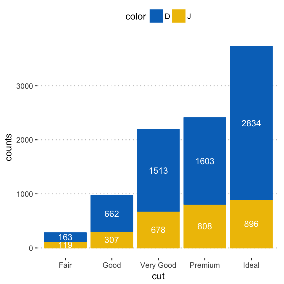
Alternatively, you can easily create the above plot using the function ggbarplot() [in ggpubr]:
ggbarplot(df, x = "cut", y = "counts",
          color = "color", fill = "color",
          palette = c("#0073C2FF", "#EFC000FF"),
          label = TRUE, lab.pos = "in", lab.col = "white",
          ggtheme = theme_pubclean()
)- Alternative to bar plots. Instead of the creating a bar plot of the counts, you can plot two discrete variables with discrete x-axis and discrete y-axis. Each individual points are shown by groups. For a given group, the number of points corresponds to the number of records in that group.
Key function: geom_jitter(). Arguments: alpha, color, fill, shape and size.
In the example below, we’ll plot a small fraction (1/5) of the diamonds dataset.
diamonds.frac <- dplyr::sample_frac(diamonds, 1/5)
ggplot(diamonds.frac, aes(cut, color)) +
  geom_jitter(aes(color = cut), size = 0.3)+
  ggpubr::color_palette("jco")+
  ggpubr::theme_pubclean()
Grouped continuous variables
In this section, we’ll show to plot a grouped continuous variable using box plot, violin plot, strip chart and alternatives.
We’ll also describe how to add automatically p-values comparing groups.
In this section, we’ll set the theme theme_bw() as the default ggplot theme:
theme_set(
  theme_bw()
)
Data format
- Demo dataset:
ToothGrowth- Continuous variable:
len(tooth length). Used on y-axis - Grouping variable:
dose(dose levels of vitamin C: 0.5, 1, and 2 mg/day). Used on x-axis.
- Continuous variable:
First, convert the variable dose from a numeric to a discrete factor variable:
data("ToothGrowth")
ToothGrowth$dose <- as.factor(ToothGrowth$dose)
head(ToothGrowth)
## len supp dose
## 1 4.2 VC 0.5
## 2 11.5 VC 0.5
## 3 7.3 VC 0.5
## 4 5.8 VC 0.5
## 5 6.4 VC 0.5
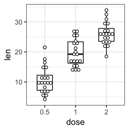
## 6 10.0 VC 0.5Box plots
- Key function:
geom_boxplot() - Key arguments to customize the plot:
width: the width of the box plotnotch: logical. If TRUE, creates a notched box plot. The notch displays a confidence interval around the median which is normally based on themedian +/- 1.58*IQR/sqrt(n). Notches are used to compare groups; if the notches of two boxes do not overlap, this is a strong evidence that the medians differ.color,size,linetype: Border line color, size and typefill: box plot areas fill coloroutlier.colour,outlier.shape,outlier.size: The color, the shape and the size for outlying points.
- Create basic box plots:
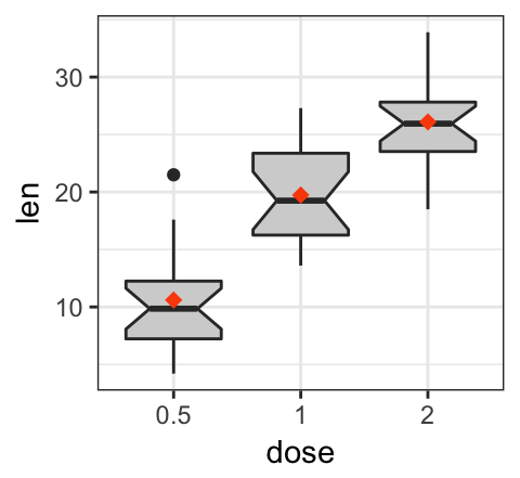
- Standard and notched box plots:
# Default plot
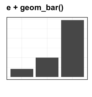
e <- ggplot(ToothGrowth, aes(x = dose, y = len))
e + geom_boxplot()
# Notched box plot with mean points
e + geom_boxplot(notch = TRUE, fill = "lightgray")+
stat_summary(fun.y = mean, geom = "point",
shape = 18, size = 2.5, color = "#FC4E07")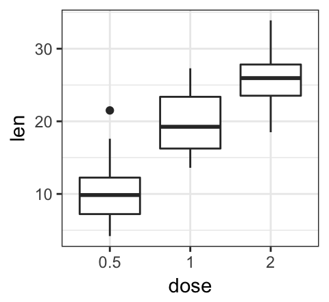
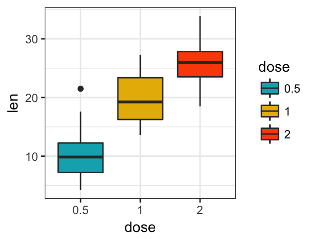
- Change box plot colors by groups:
# Color by group (dose)
e + geom_boxplot(aes(color = dose))+
  scale_color_manual(values = c("#00AFBB", "#E7B800", "#FC4E07"))
# Change fill color by group (dose)
e + geom_boxplot(aes(fill = dose)) +
  scale_fill_manual(values = c("#00AFBB", "#E7B800", "#FC4E07"))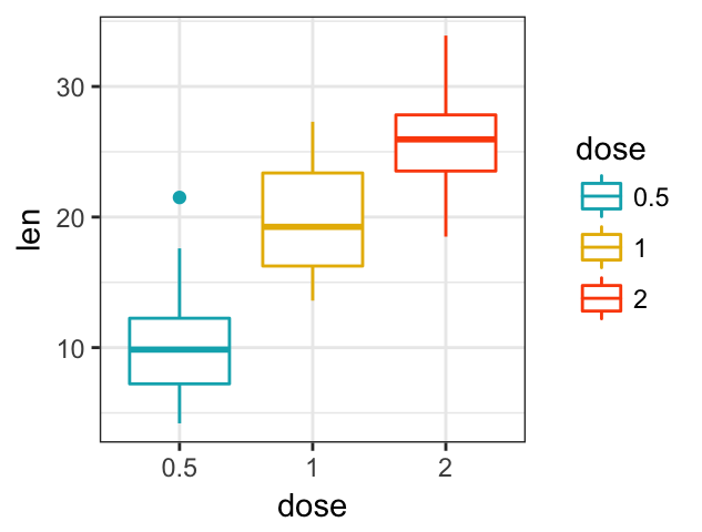
Note that, it’s possible to use the function scale_x_discrete() for:
- choosing which items to display: for example c(“0.5”, “2”),
- changing the order of items: for example from c(“0.5”, “1”, “2”) to c(“2”, “0.5”, “1”)
For example, type this:
# Choose which items to display: group "0.5" and "2"
e + geom_boxplot() +
scale_x_discrete(limits=c("0.5", "2"))
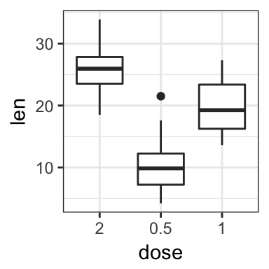
# Change the default order of items
e + geom_boxplot() +
scale_x_discrete(limits=c("2", "0.5", "1"))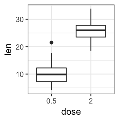
- Create a box plot with multiple groups:
Two different grouping variables are used: dose on x-axis and supp as fill color (legend variable).
The space between the grouped box plots is adjusted using the function position_dodge().
e2 <- e + geom_boxplot(
  aes(fill = supp),
  position = position_dodge(0.9)
  ) +
  scale_fill_manual(values = c("#999999", "#E69F00"))
e2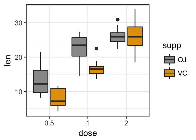
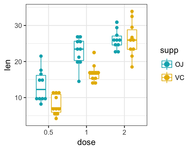
Split the plot into multiple panel. Use the function facet_wrap():
e2 + facet_wrap(~supp)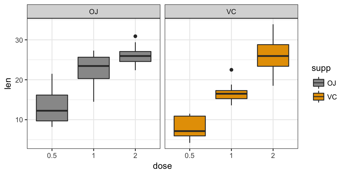
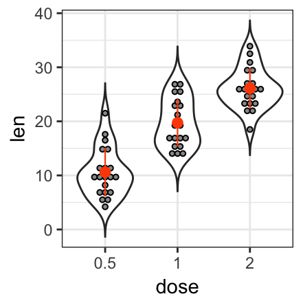
Violin plots
Violin plots are similar to box plots, except that they also show the kernel probability density of the data at different values. Typically, violin plots will include a marker for the median of the data and a box indicating the interquartile range, as in standard box plots.
Key function:
geom_violin(): Creates violin plots. Key arguments:color,size,linetype: Border line color, size and typefill: Areas fill colortrim: logical value. If TRUE (default), trim the tails of the violins to the range of the data. If FALSE, don’t trim the tails.
stat_summary(): Adds summary statistics (mean, median, …) on the violin plots.
- Create basic violin plots with summary statistics:
# Add mean points +/- SD
# Use geom = "pointrange" or geom = "crossbar"
e + geom_violin(trim = FALSE) +
stat_summary(
fun.data = "mean_sdl", fun.args = list(mult = 1),
geom = "pointrange", color = "black"
)
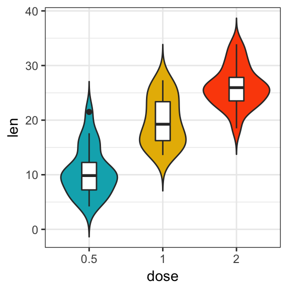
# Combine with box plot to add median and quartiles
# Change color by groups
e + geom_violin(aes(fill = dose), trim = FALSE) +
geom_boxplot(width = 0.2)+
scale_fill_manual(values = c("#00AFBB", "#E7B800", "#FC4E07"))+
theme(legend.position = "none")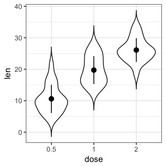
The function mean_sdl is used for adding mean and standard deviation. It computes the mean plus or minus a constant times the standard deviation. In the R code above, the constant is specified using the argument mult (mult = 1). By default mult = 2. The mean +/- SD can be added as a crossbar or a pointrange.
- Create violin plots with multiple groups:
e + geom_violin(
  aes(color = supp), trim = FALSE,
  position = position_dodge(0.9)
  ) +
  geom_boxplot(
    aes(color = supp), width = 0.15,
    position = position_dodge(0.9)
    ) +
  scale_color_manual(values = c("#00AFBB", "#E7B800"))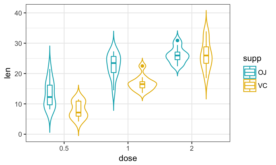
Dot plots
- Key function:
geom_dotplot(). Creates stacked dots, with each dot representing one observation. - Key arguments:
stackdir: which direction to stack the dots. “up” (default), “down”, “center”, “centerwhole” (centered, but with dots aligned).stackratio: how close to stack the dots. Default is 1, where dots just just touch. Use smaller values for closer, overlapping dots.color,fill: Dot border color and area filldotsize: The diameter of the dots relative to binwidth, default 1.
As for violin plots, summary statistics are usually added to dot plots.
- Create basic dot plots:
# Violin plots with mean points +/- SD
e + geom_dotplot(
  binaxis = "y", stackdir = "center",
  fill = "lightgray"
  ) +
  stat_summary(
    fun.data = "mean_sdl", fun.args = list(mult=1),
    geom = "pointrange", color = "red"
    )
# Combine with box plots
e + geom_boxplot(width = 0.5) +
  geom_dotplot(
    binaxis = "y", stackdir = "center",
    fill = "white"
    )
# Dot plot + violin plot + stat summary
e + geom_violin(trim = FALSE) +
  geom_dotplot(
    binaxis='y', stackdir='center',
    color = "black", fill = "#999999"
    ) +
  stat_summary(
    fun.data="mean_sdl",  fun.args = list(mult=1),
    geom = "pointrange", color = "#FC4E07", size = 0.4
    )
- Create dot plots with multiple groups:
# Color dots by groups
e + geom_boxplot(width = 0.5, size = 0.4) +
  geom_dotplot(
    aes(fill = supp), trim = FALSE,
    binaxis='y', stackdir='center'
  )+
  scale_fill_manual(values = c("#00AFBB", "#E7B800"))
# Change the position : interval between dot plot of the same group
e + geom_boxplot(
  aes(color = supp), width = 0.5, size = 0.4,
  position = position_dodge(0.8)
  ) +
  geom_dotplot(
    aes(fill = supp, color = supp), trim = FALSE,
    binaxis='y', stackdir='center', dotsize = 0.8,
    position = position_dodge(0.8)
  )+
  scale_fill_manual(values = c("#00AFBB", "#E7B800"))+
  scale_color_manual(values = c("#00AFBB", "#E7B800"))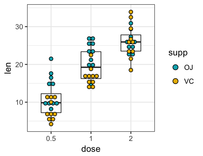
Stripcharts
Stripcharts are also known as one dimensional scatter plots. These plots are suitable compared to box plots when sample sizes are small.
- Key function:
geom_jitter() - key arguments:
color,fill,size,shape. Changes points color, fill, size and shape
- Create a basic stripchart:
- Change points shape and color by groups
- Adjust the degree of jittering:
position_jitter(0.2) - Add summary statistics:
e + geom_jitter(
  aes(shape = dose, color = dose),
  position = position_jitter(0.2),
  size = 1.2
  ) +
  stat_summary(
    aes(color = dose),
    fun.data="mean_sdl",  fun.args = list(mult=1),
    geom = "pointrange",  size = 0.4
    )+
  scale_color_manual(values =  c("#00AFBB", "#E7B800", "#FC4E07"))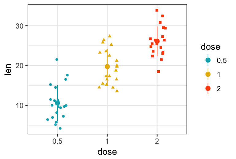
- Create stripcharts for multiple groups. The R code is similar to what we have seen in dot plots section. However, to create dodged jitter points, you should use the function
position_jitterdodge()instead ofposition_dodge().
e + geom_jitter(
  aes(shape = supp, color = supp),
  position = position_jitterdodge(jitter.width = 0.2, dodge.width = 0.8),
  size = 1.2
  ) +
  stat_summary(
    aes(color = supp),
    fun.data="mean_sdl",  fun.args = list(mult=1),
    geom = "pointrange",  size = 0.4,
    position = position_dodge(0.8)
    )+
  scale_color_manual(values =  c("#00AFBB", "#E7B800"))
Sinaplot
sinaplot is inspired by the strip chart and the violin plot. By letting the normalized density of points restrict the jitter along the x-axis, the plot displays the same contour as a violin plot, but resemble a simple strip chart for small number of data points (Sidiropoulos et al. 2015).
In this way the plot conveys information of both the number of data points, the density distribution, outliers and spread in a very simple, comprehensible and condensed format.
Key function: geom_sina() [ggforce]:
library(ggforce)
# Create some data
d1 <- data.frame(
  y = c(rnorm(200, 4, 1), rnorm(200, 5, 2), rnorm(400, 6, 1.5)),
  group = rep(c("Grp1", "Grp2", "Grp3"), c(200, 200, 400))
  )
# Sinaplot
ggplot(d1, aes(group, y)) +
  geom_sina(aes(color = group), size = 0.7)+
  scale_color_manual(values =  c("#00AFBB", "#E7B800", "#FC4E07"))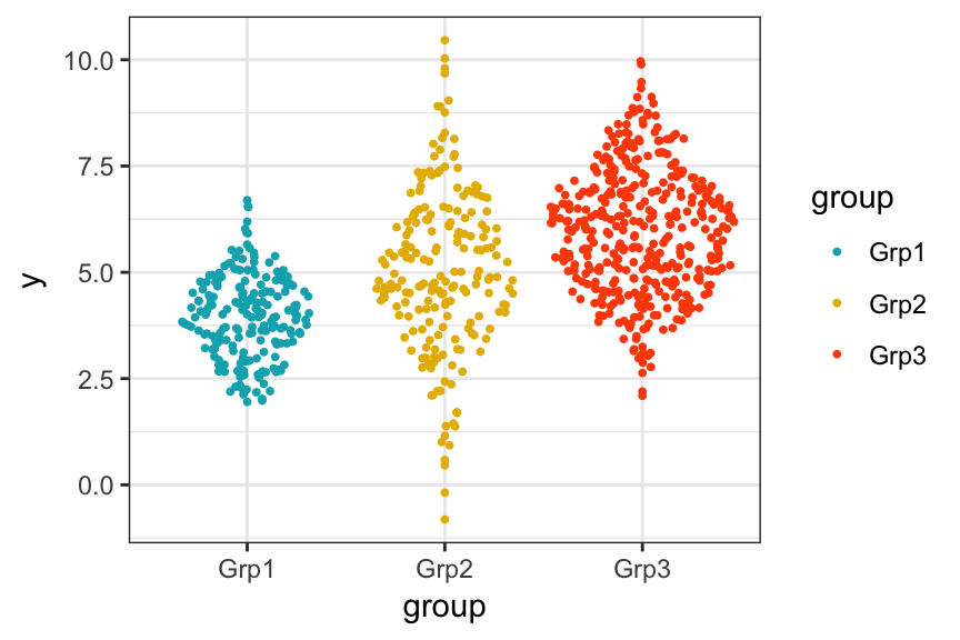
Mean and median plots with error bars
In this section, we’ll show how to plot summary statistics of a continuous variable organized into groups by one or multiple grouping variables.
Note that, an easy way, with less typing, to create mean/median plots, is provided in the ggpubr package. See the associated article at: ggpubr-Plot Means/Medians and Error Bars
Set the default theme to theme_pubr() [in ggpubr]:
theme_set(ggpubr::theme_pubr())- Basic mean/median plots. Case of one continuous variable and one grouping variable:
- Prepare the data:
ToothGrowthdata set.
df <- ToothGrowth
df$dose <- as.factor(df$dose)
head(df, 3)
## len supp dose
## 1 4.2 VC 0.5
## 2 11.5 VC 0.5
## 3 7.3 VC 0.5- Compute summary statistics for the variable
lenorganized into groups by the variabledose:
library(dplyr)
df.summary <- df %>%
group_by(dose) %>%
summarise(
sd = sd(len, na.rm = TRUE),
len = mean(len)
)
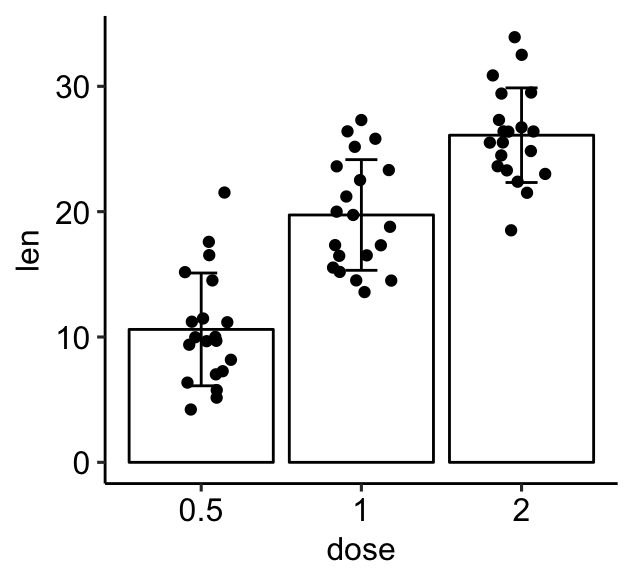
df.summary## # A tibble: 3 x 3
## dose sd len
##
## 1 0.5 4.50 10.6
## 2 1 4.42 19.7
## 3 2 3.77 26.1 - Create error plots using the summary statistics data. Key functions:
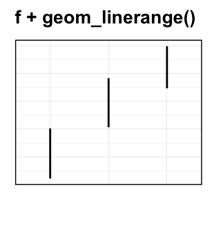
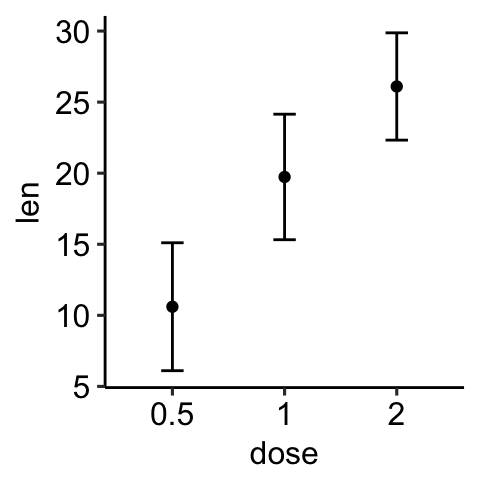
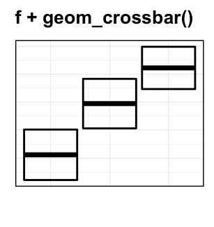
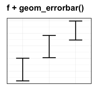
geom_crossbar()for hollow bar with middle indicated by horizontal linegeom_errorbar()for error barsgeom_errorbarh()for horizontal error barsgeom_linerange()for drawing an interval represented by a vertical linegeom_pointrange()for creating an interval represented by a vertical line, with a point in the middle.
Start by initializing ggplot with the summary statistics data:
- Specify x and y as usually - Specify ymin = len-sd and ymax = len+sd to add lower and upper error bars. If you want only to add upper error bars but not the lower ones, use ymin = len (instead of len-sd) and ymax = len+sd.
# Initialize ggplot with data
f <- ggplot(
  df.summary,
  aes(x = dose, y = len, ymin = len-sd, ymax = len+sd)
  )
Possible error plots:


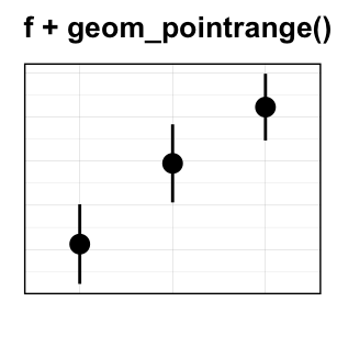
Create simple error plots:
# Vertical line with point in the middle
f + geom_pointrange()
# Standard error bars
f + geom_errorbar(width = 0.2) +
  geom_point(size = 1.5)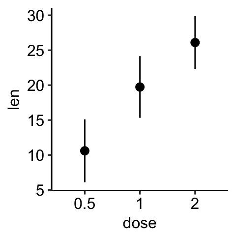
Create horizontal error bars. Put dose on y axis and len on x-axis. Specify xmin and xmax.
# Horizontal error bars with mean points
# Change the color by groups
ggplot(
  df.summary,
  aes(x = len, y = dose, xmin = len-sd, xmax = len+sd)
  ) +
  geom_point(aes(color = dose)) +
  geom_errorbarh(aes(color = dose), height=.2)+
  theme_light()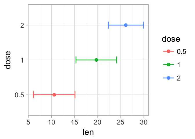
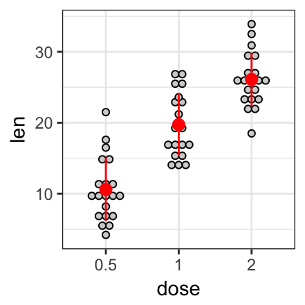
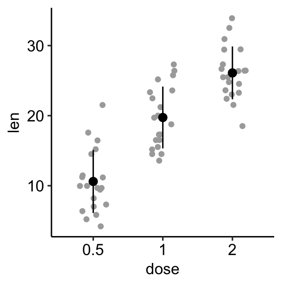
- Add jitter points (representing individual points), dot plots and violin plots. For this, you should initialize ggplot with original data (
df) and specify thedf.summarydata in the error plot function, heregeom_pointrange().
# Combine with jitter points
ggplot(df, aes(dose, len)) +
geom_jitter(
position = position_jitter(0.2), color = "darkgray"
) +
geom_pointrange(
aes(ymin = len-sd, ymax = len+sd),
data = df.summary
)
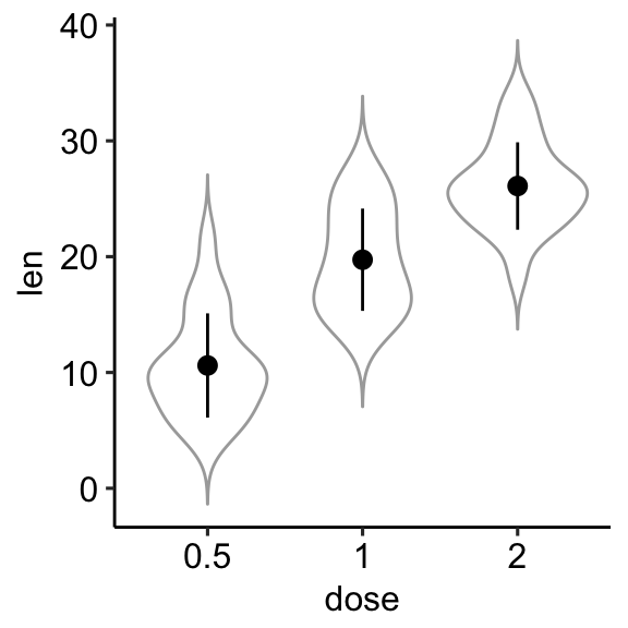
# Combine with violin plots
ggplot(df, aes(dose, len)) +
geom_violin(color = "darkgray", trim = FALSE) +
geom_pointrange(
aes(ymin = len-sd, ymax = len+sd),
data = df.summary
)
- Create basic bar/line plots of mean +/- error. So we need only the
df.summarydata.- Add lower and upper error bars for the line plot:
ymin = len-sdandymax = len+sd.
- Add lower and upper error bars for the line plot:
- Add only upper error bars for the bar plot:
ymin = len(instead oflen-sd) andymax = len+sd.
- Add only upper error bars for the bar plot:
Note that, for line plot, you should always specify group = 1 in the aes(), when you have one group of line.
# (1) Line plot
ggplot(df.summary, aes(dose, len)) +
geom_line(aes(group = 1)) +
geom_errorbar( aes(ymin = len-sd, ymax = len+sd),width = 0.2) +
geom_point(size = 2)
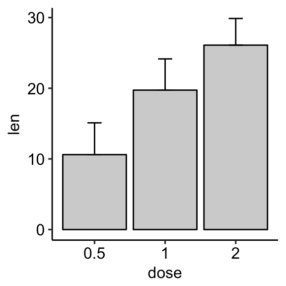
# (2) Bar plot
ggplot(df.summary, aes(dose, len)) +
geom_bar(stat = "identity", fill = "lightgray",
color = "black") +
geom_errorbar(aes(ymin = len, ymax = len+sd), width = 0.2) 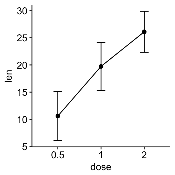
For line plot, you might want to treat x-axis as numeric:
df.sum2 <- df.summary
df.sum2$dose <- as.numeric(df.sum2$dose)
ggplot(df.sum2, aes(dose, len)) +
  geom_line() +
  geom_errorbar( aes(ymin = len-sd, ymax = len+sd),width = 0.2) +
  geom_point(size = 2)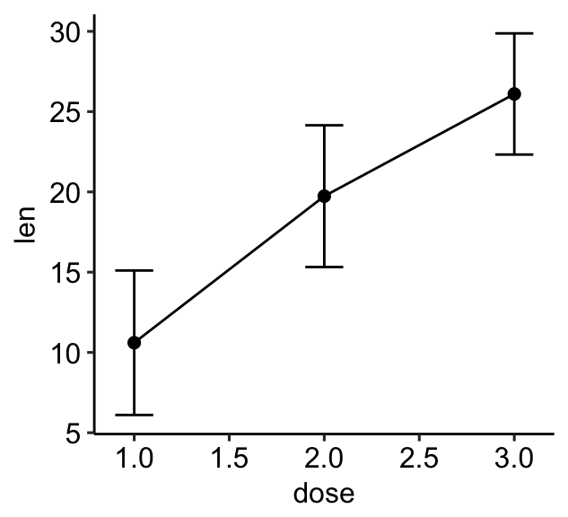
- Bar and line plots + jitter points. We need the original
dfdata for the jitter points and thedf.summarydata for the othergeomlayers.- For the line plot: First, add jitter points, then add lines + error bars + mean points on top of the jitter points.
- For the bar plot: First, add the bar plot, then add jitter points + error bars on top of the bars.
# (1) Create a line plot of means +
# individual jitter points + error bars
ggplot(df, aes(dose, len)) +
  geom_jitter( position = position_jitter(0.2),
               color = "darkgray") +
  geom_line(aes(group = 1), data = df.summary) +
  geom_errorbar(
    aes(ymin = len-sd, ymax = len+sd),
    data = df.summary, width = 0.2) +
  geom_point(data = df.summary, size = 2)
# (2) Bar plots of means + individual jitter points + errors
ggplot(df, aes(dose, len)) +
  geom_bar(stat = "identity", data = df.summary,
           fill = NA, color = "black") +
  geom_jitter( position = position_jitter(0.2),
               color = "black") +
  geom_errorbar(
    aes(ymin = len-sd, ymax = len+sd),
data = df.summary, width = 0.2) 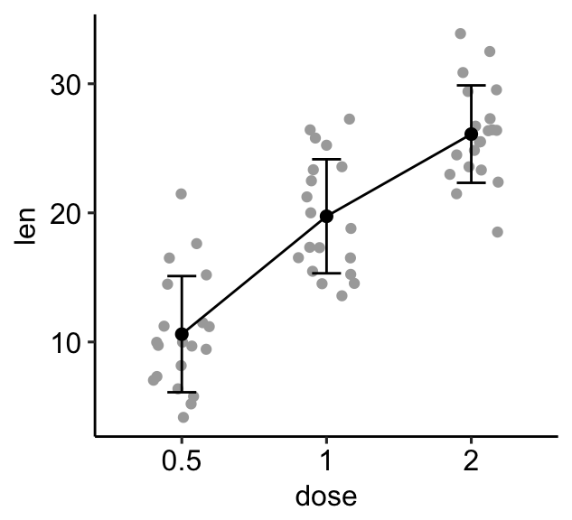
- Mean/median plots for multiple groups. Case of one continuous variable (
len) and two grouping variables (dose,supp).
- Compute the summary statistics of
lengrouped bydoseandsupp:
library(dplyr)
df.summary2 <- df %>%
group_by(dose, supp) %>%
summarise(
sd = sd(len),
len = mean(len)
)
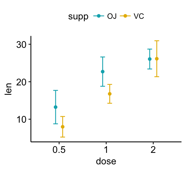
df.summary2## # A tibble: 6 x 4
## # Groups: dose [?]
## dose supp sd len
##
## 1 0.5 OJ 4.46 13.23
## 2 0.5 VC 2.75 7.98
## 3 1 OJ 3.91 22.70
## 4 1 VC 2.52 16.77
## 5 2 OJ 2.66 26.06
## 6 2 VC 4.80 26.14 - Create error plots for multiple groups:
- pointrange colored by groups (supp)
- standard error bars + mean points colored by groups (supp)
# (1) Pointrange: Vertical line with point in the middle
ggplot(df.summary2, aes(dose, len)) +
  geom_pointrange(
    aes(ymin = len-sd, ymax = len+sd, color = supp),
    position = position_dodge(0.3)
    )+
  scale_color_manual(values = c("#00AFBB", "#E7B800"))
# (2) Standard error bars
ggplot(df.summary2, aes(dose, len)) +
  geom_errorbar(
    aes(ymin = len-sd, ymax = len+sd, color = supp),
    position = position_dodge(0.3), width = 0.2
    )+
  geom_point(aes(color = supp), position = position_dodge(0.3)) +
scale_color_manual(values = c("#00AFBB", "#E7B800")) 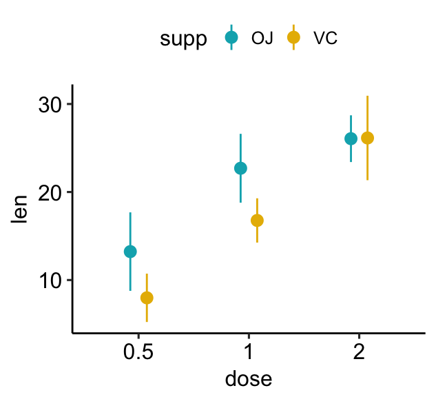
- Create simple line/bar plots for multiple groups.
- Line plots: change linetype by groups (
supp)
- Line plots: change linetype by groups (
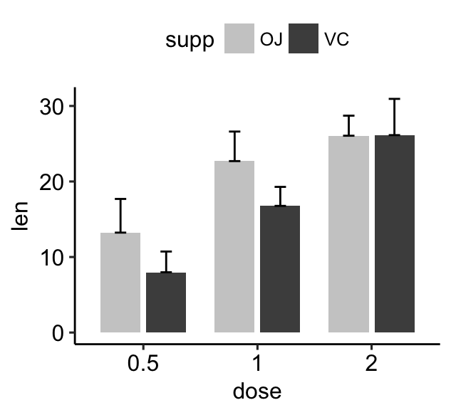
- Bar plots: change fill color by groups (
supp)
- Bar plots: change fill color by groups (
# (1) Line plot + error bars
ggplot(df.summary2, aes(dose, len)) +
  geom_line(aes(linetype = supp, group = supp))+
  geom_point()+
  geom_errorbar(
    aes(ymin = len-sd, ymax = len+sd, group = supp),
     width = 0.2
    )
# (2) Bar plots + upper error bars.
ggplot(df.summary2, aes(dose, len)) +
  geom_bar(aes(fill = supp), stat = "identity",
           position = position_dodge(0.8), width = 0.7)+
  geom_errorbar(
    aes(ymin = len, ymax = len+sd, group = supp),
    width = 0.2, position = position_dodge(0.8)
    )+
  scale_fill_manual(values = c("grey80", "grey30"))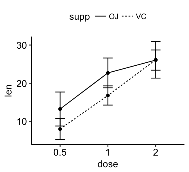
- Create easily plots of mean +/- sd for multiple groups. Use the ggpubr package, which will automatically calculate the summary statistics and create the graphs.
library(ggpubr)
# Create line plots of means
ggline(ToothGrowth, x = "dose", y = "len",
add = c("mean_sd", "jitter"),
color = "supp", palette = c("#00AFBB", "#E7B800"))
# Create bar plots of means
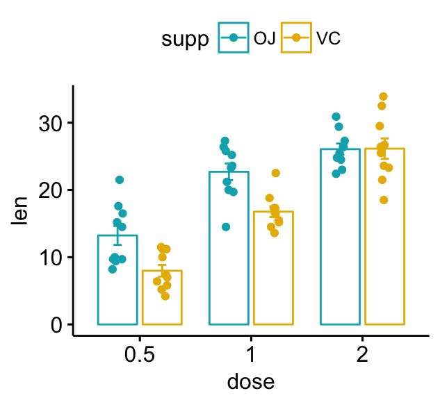
ggbarplot(ToothGrowth, x = "dose", y = "len",
add = c("mean_se", "jitter"),
color = "supp", palette = c("#00AFBB", "#E7B800"),
position = position_dodge(0.8))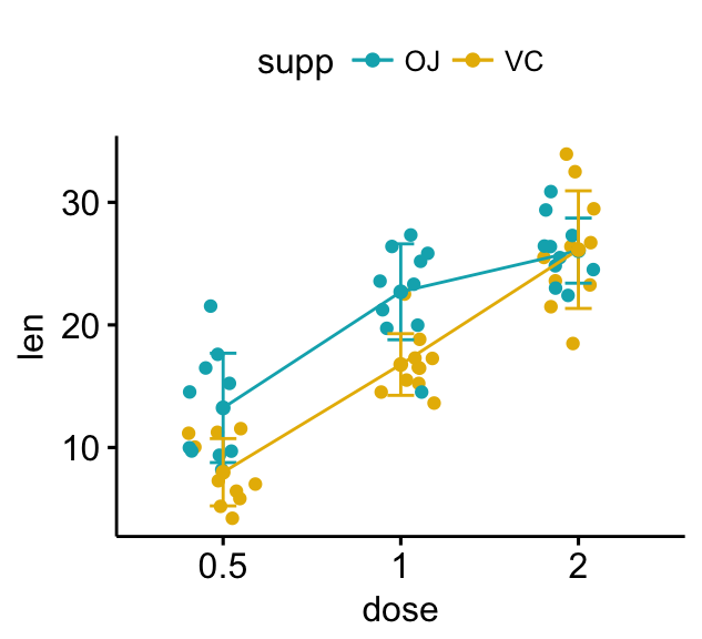
- Use the standard ggplot2 verbs, to reproduce the line plots above:
# Create line plots
ggplot(df, aes(dose, len)) +
  geom_jitter(
    aes(color = supp),
    position = position_jitter(0.2)
    ) +
  geom_line(
    aes(group = supp, color = supp),
    data = df.summary2
    ) +
  geom_errorbar(
    aes(ymin = len-sd, ymax = len+sd, color = supp),
    data = df.summary2, width = 0.2
    )+
  scale_color_manual(values = c("#00AFBB", "#E7B800"))
Add p-values and significance levels
In this section, we’ll describe how to easily i) compare means of two or multiple groups; ii) and to automatically add p-values and significance levels to a ggplot (such as box plots, dot plots, bar plots and line plots, …).
Key functions:
compare_means()[ggpubr package]: easy to use solution to performs one and multiple mean comparisons.stat_compare_means()[ggpubr package]: easy to use solution to automatically add p-values and significance levels to a ggplot.
The most common methods for comparing means include:
| Methods | R function | Description |
|---|---|---|
| T-test | t.test() | Compare two groups (parametric) |
| Wilcoxon test | wilcox.test() | Compare two groups (non-parametric) |
| ANOVA | aov() or anova() | Compare multiple groups (parametric) |
| Kruskal-Wallis | kruskal.test() | Compare multiple groups (non-parametric) |
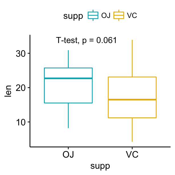
- Compare two independent groups:
- Compute t-test:
library(ggpubr)
compare_means(len ~ supp, data = ToothGrowth,
              method = "t.test")
## # A tibble: 1 x 8
## .y. group1 group2 p p.adj p.format p.signif method
##
## 1 len OJ VC 0.0606 0.0606 0.061 ns T-test - Create a box plot with p-values. Use the option
method = "t.test"ormethod = "wilcox.test". Default is wilcoxon test.
# Create a simple box plot and add p-values
p <- ggplot(ToothGrowth, aes(supp, len)) +
geom_boxplot(aes(color = supp)) +
scale_color_manual(values = c("#00AFBB", "#E7B800"))
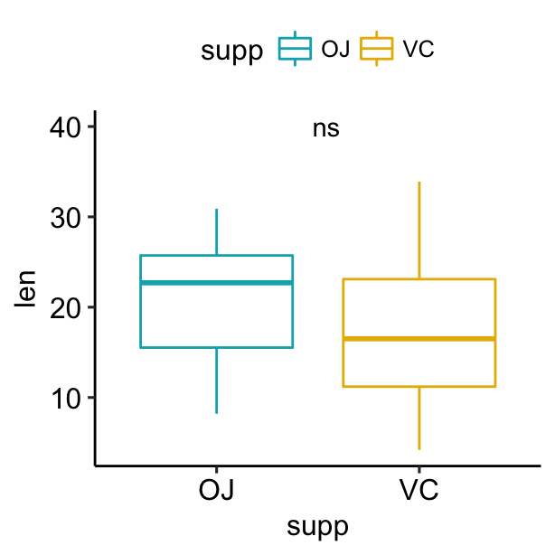
p + stat_compare_means(method = "t.test")
# Display the significance level instead of the p-value
# Adjust label position
p + stat_compare_means(
aes(label = ..p.signif..), label.x = 1.5, label.y = 40
)
- Compare two paired samples. Use
ggpaired()[ggpubr] to create the paired box plot.
ggpaired(ToothGrowth, x = "supp", y = "len",
         color = "supp", line.color = "gray", line.size = 0.4,
         palette = "jco")+
  stat_compare_means(paired = TRUE)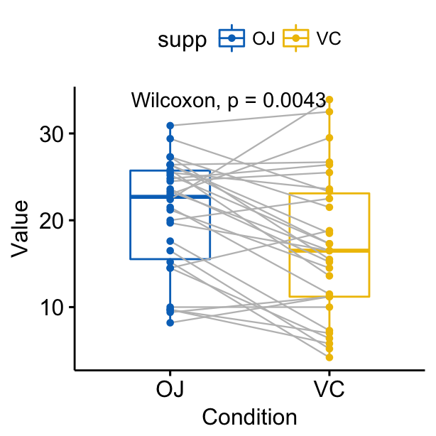
- Compare more than two groups. If the grouping variable contains more than two levels, then pairwise tests will be performed automatically. The default method is “wilcox.test”. You can change this to “t.test”.
# Perorm pairwise comparisons
compare_means(len ~ dose,  data = ToothGrowth)
## # A tibble: 3 x 8
## .y. group1 group2 p p.adj p.format p.signif method
##
## 1 len 0.5 1 7.02e-06 1.40e-05 7.0e-06 **** Wilcoxon
## 2 len 0.5 2 8.41e-08 2.52e-07 8.4e-08 **** Wilcoxon
## 3 len 1 2 1.77e-04 1.77e-04 0.00018 *** Wilcoxon # Visualize: Specify the comparisons you want
my_comparisons <- list( c("0.5", "1"), c("1", "2"), c("0.5", "2") )
ggboxplot(ToothGrowth, x = "dose", y = "len",
color = "dose", palette = "jco")+
stat_compare_means(comparisons = my_comparisons)+
stat_compare_means(label.y = 50) 
- Multiple grouping variables:
- (1/2). Create a multi-panel box plots facetted by group (here, “dose”):
# Use only p.format as label. Remove method name.
ggplot(ToothGrowth, aes(supp, len)) +
  geom_boxplot(aes(color = supp))+
  facet_wrap(~dose) +
  scale_color_manual(values = c("#00AFBB", "#E7B800")) +
  stat_compare_means(label = "p.format")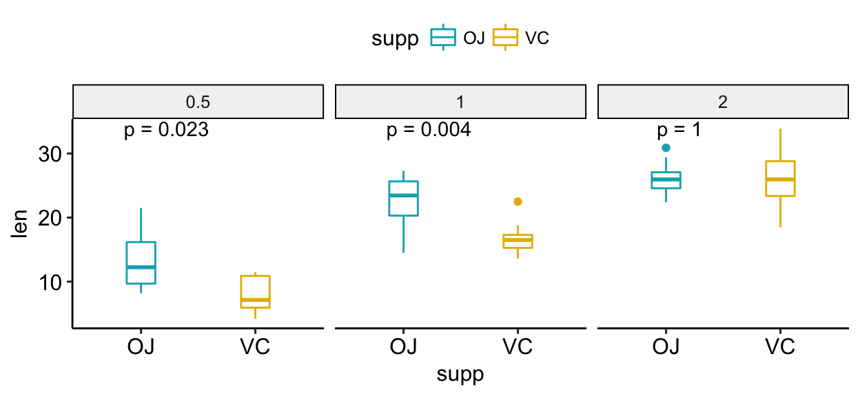
- (2/2). Create one single panel with all box plots. Plot y = “len” by x = “dose” and color by “supp”. Specify the option
groupinstat_compare_means():
ggplot(ToothGrowth, aes(dose, len)) +
  geom_boxplot(aes(color = supp))+
  scale_color_manual(values = c("#00AFBB", "#E7B800")) +
  stat_compare_means(aes(group = supp), label = "p.signif")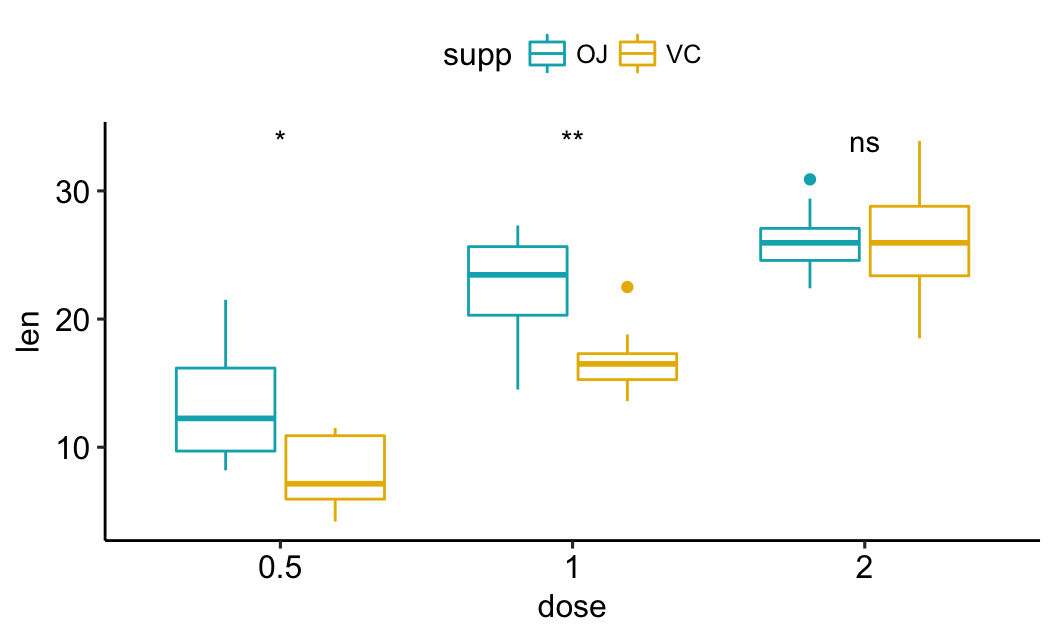
- Paired comparisons for multiple groups:
# Box plot facetted by "dose"
p <- ggpaired(ToothGrowth, x = "supp", y = "len",
          color = "supp", palette = "jco",
          line.color = "gray", line.size = 0.4,
          facet.by = "dose", short.panel.labs = FALSE)
# Use only p.format as label. Remove method name.
p + stat_compare_means(label = "p.format", paired = TRUE)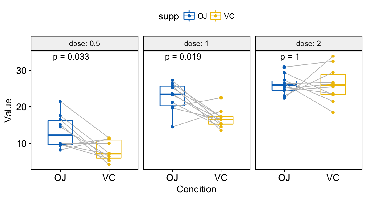
Read more at: Add P-values and Significance Levels to ggplots
Conclusion
- Visualize the distribution of a grouped continuous variable: the grouping variable on x-axis and the continuous variable on y axis.
The possible ggplot2 layers include:
geom_boxplot()for box plotgeom_violin()for violin plotgeom_dotplot()for dot plotgeom_jitter()for stripchartgeom_line()for line plotgeom_bar()for bar plot
Examples of R code: start by creating a plot, named e, and then finish it by adding a layer:
ToothGrowth$dose <- as.factor(ToothGrowth$dose)
e <- ggplot(ToothGrowth, aes(x = dose, y = len))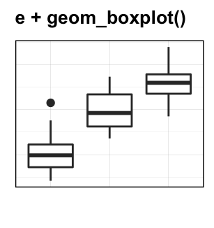
- Create mean and median plots with error bars: the grouping variable on x-axis and the summarized continuous variable (mean/median) on y-axis.
- Compute summary statistics and initialize ggplot with summary data:
# Summary statistics
library(dplyr)
df.summary <- ToothGrowth %>%
  group_by(dose) %>%
  summarise(
    sd = sd(len, na.rm = TRUE),
    len = mean(len)
  )
# Initialize ggplot with data
f <- ggplot(
  df.summary,
  aes(x = dose, y = len, ymin = len-sd, ymax = len+sd)
)- Possible error plots:


- Combine error bars with violin plots, dot plots, line and bar plots:
# Combine with violin plots
ggplot(ToothGrowth, aes(dose, len))+
  geom_violin(trim = FALSE) +
  geom_pointrange(aes(ymin = len-sd, ymax = len + sd),
                  data = df.summary)
# Combine with dot plots
ggplot(ToothGrowth, aes(dose, len))+
  geom_dotplot(stackdir = "center", binaxis = "y",
               fill = "lightgray", dotsize = 1) +
  geom_pointrange(aes(ymin = len-sd, ymax = len + sd),
                  data = df.summary)
# Combine with line plot
ggplot(df.summary, aes(dose, len))+
  geom_line(aes(group = 1)) +
  geom_pointrange(aes(ymin = len-sd, ymax = len + sd))
# Combine with bar plots
ggplot(df.summary, aes(dose, len))+
  geom_bar(stat = "identity", fill = "lightgray") +
  geom_pointrange(aes(ymin = len-sd, ymax = len + sd))
See also
- ggpubr: Publication Ready Plots. https://goo.gl/7uySha
- Facilitating Exploratory Data Visualization: Application to TCGA Genomic Data. https://goo.gl/9LNsRi
- Add P-values and Significance Levels to ggplots. https://goo.gl/VH7Yq7
- Plot Means/Medians and Error Bars. https://goo.gl/zRwAeV
References
Sidiropoulos, Nikos, Sina Hadi Sohi, Nicolas Rapin, and Frederik Otzen Bagger. 2015. “SinaPlot: An Enhanced Chart for Simple and Truthful Representation of Single Observations over Multiple Classes.” bioRxiv. Cold Spring Harbor Laboratory. doi:10.1101/028191.