ggplot2 - Easy Way to Change Graphical Parameters
This article describes the function ggpar() [in ggpubr], which can be used to simply and easily customize any ggplot2-based graphs. The graphical parameters that can be changed using ggpar() include:
- Main titles, axis labels and legend titles
- Legend position and appearance
- colors
- Axis limits
- Axis transformations: log and sqrt
- Axis ticks
- Themes
- Rotate a plot
Note that all the arguments accepted by the function ggpar() can be also directly passed to the plotting functions in ggpubr package, such as ggboxplot(), ggdotplot(), ggscatter(), …
Contents:
Prerequisites
Install ggpubr (version >= 0.1.4), for easily creating ggplot2-based publication ready plots.
Install from CRAN:
install.packages("ggpubr")Or, install the latest developmental version from GitHub as follow:
if(!require(devtools)) install.packages("devtools")
devtools::install_github("kassambara/ggpubr")
Load ggpubr:
library(ggpubr)Basic plots
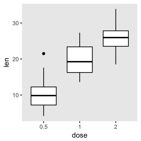
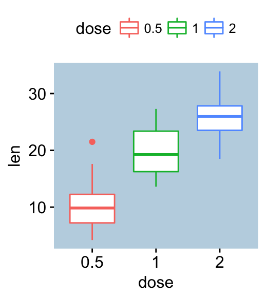
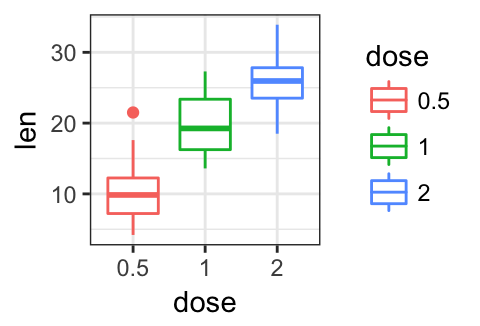
We start by creating a basic box plot colored by groups. To add the panel border line, we’ll use the helper function border() [in ggpubr].
# Basic plot
p <- ggboxplot(ToothGrowth, x = "dose", y = "len",
color = "dose")
p
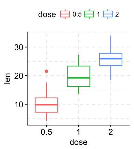
# Add grids
p + grids(linetype = "dashed")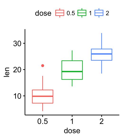
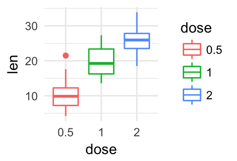
# Add panel border line
p + border("black")

# Change background color
p + bgcolor("#BFD5E3") +
border("#BFD5E3") 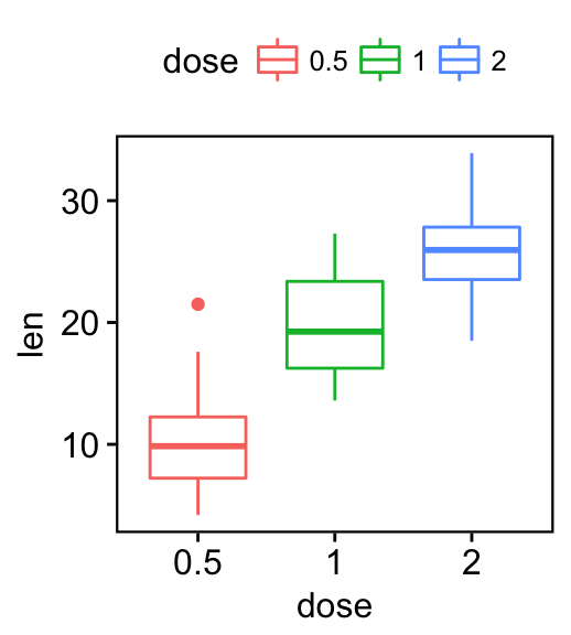
Change titles and axis labels
Change plot titles and labels as follow:
# Change titles and axis labels
p2 <- ggpar(p,
            title = "Box Plot created with ggpubr",
            subtitle = "Length by dose",
            caption = "Source: ggpubr",
            xlab ="Dose (mg)",
            ylab = "Teeth length",
            legend.title = "Dose (mg)")
p2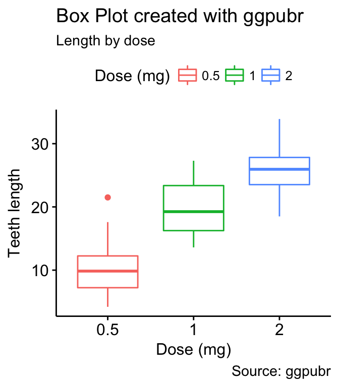
Change the font/appearance of plot titles and labels. Use ggpar():
ggpar(p2,
      font.title = c(14, "bold.italic", "red"),
      font.subtitle = c(10,  "orange"),
      font.caption = c(10,  "orange"),
      font.x = c(14,  "blue"),
      font.y = c(14,  "#993333")
      )
or, equivalently, use font():
p2 +
 font("title", size = 14, color = "red", face = "bold.italic")+
 font("subtitle", size = 10, color = "orange")+
 font("caption", size = 10, color = "orange")+
 font("xlab", size = 12, color = "blue")+
 font("ylab", size = 12, color = "#993333")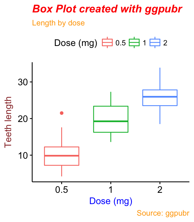
Note that, you can change simultaneously titles/labels text and appearance at once using the function ggpar() as follow:
# Change title texts and fonts
# line break: \n
ggpar(p, title = "Plot of length \n by dose",
      xlab ="Dose (mg)", ylab = "Teeth length",
      legend.title = "Dose (mg)",
      font.title = c(14,"bold.italic", "red"),
      font.x = c(14, "bold", "#2E9FDF"),
      font.y = c(14, "bold", "#E7B800"))
Note that,
-
font.title, font.subtitle, font.caption, font.x, font.y are vectors of length 3 indicating respectively the size (e.g.: 14), the style (e.g.: “plain”, “bold”, “italic”, “bold.italic”) and the color (e.g.: “red”) of main title, subtitle, caption, xlab and ylab, respectively. For example font.x = c(14, “bold”, “red”). Use font.x = 14, to change only font size; or use font.x = “bold”, to change only font face.
-
you can use line breaks, to split long title into multiple lines.
Change legend position & appearance
ggpar(p,
      legend = "right", legend.title = "Dose (mg)") +
  font("legend.title", color = "blue", face = "bold")+
  font("legend.text", color = "red")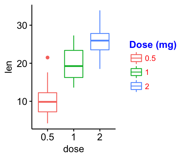
Note that, the legend argument is a character vector specifying legend position. Allowed values are one of c(“top”, “bottom”, “left”, “right”, “none”). To remove the legend use legend = “none”. Legend position can be also specified using a numeric vector c(x, y). Their values should be between 0 and 1. c(0,0) corresponds to the “bottom left” and c(1,1) corresponds to the “top right” position.
Change color palettes
Group colors
The argument palette (in ggpar() function ) can be used to change group color palettes. Allowed values include:
- Custom color palettes e.g. c(“blue”, “red”) or c(“#00AFBB”, “#E7B800”);
- “grey” for grey color palettes;
- brewer palettes e.g. “RdBu”, “Blues”, …; To view all, type this in R: RColorBrewer::display.brewer.all().
- and scientific journal palettes from ggsci R package, e.g.: “npg”, “aaas”, “lancet”, “jco”, “ucscgb”, “uchicago”, “simpsons” and “rickandmorty”.
# Use custom color palette
ggpar(p, palette = c("#00AFBB", "#E7B800", "#FC4E07"))
# Use brewer palette.
# Type RColorBrewer::display.brewer.all(), to see possible palettes
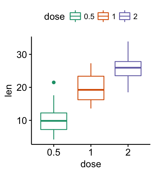
ggpar(p, palette = "Dark2" )
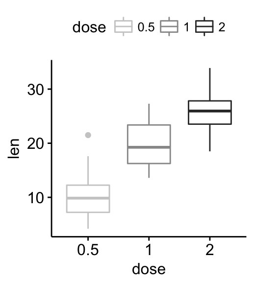
# Use grey palette
ggpar(p, palette = "grey")
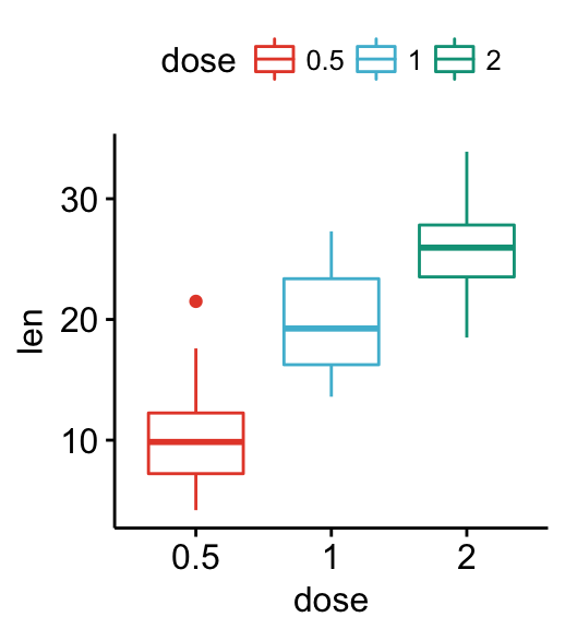
# Use scientific journal palette from ggsci package
# Allowed values: "npg", "aaas", "lancet", "jco",
# "ucscgb", "uchicago", "simpsons" and "rickandmorty".
ggpar(p, palette = "npg") # nature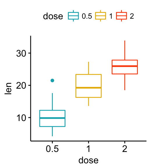
Alternatively, you can use directly the functions color_palette() and fill_palette() [in ggpubr] as follow:
# jco color palette
p + color_palette("jco")
# Custom color
p + color_palette(c("#00AFBB", "#E7B800", "#FC4E07"))
Gradient colors
To change easily gradient colors, the ggpubr package provides the functions: gradient_color() and gradient_fill().
For example, start by creating a scatter plot colored according the values of a continuous variable “mpg”.
p3 <- ggscatter(mtcars, x = "wt", y = "mpg", color = "mpg",
                size = 2)
Change gradient color:
# Use one custom color
p3 + gradient_color("red")
# Two colors
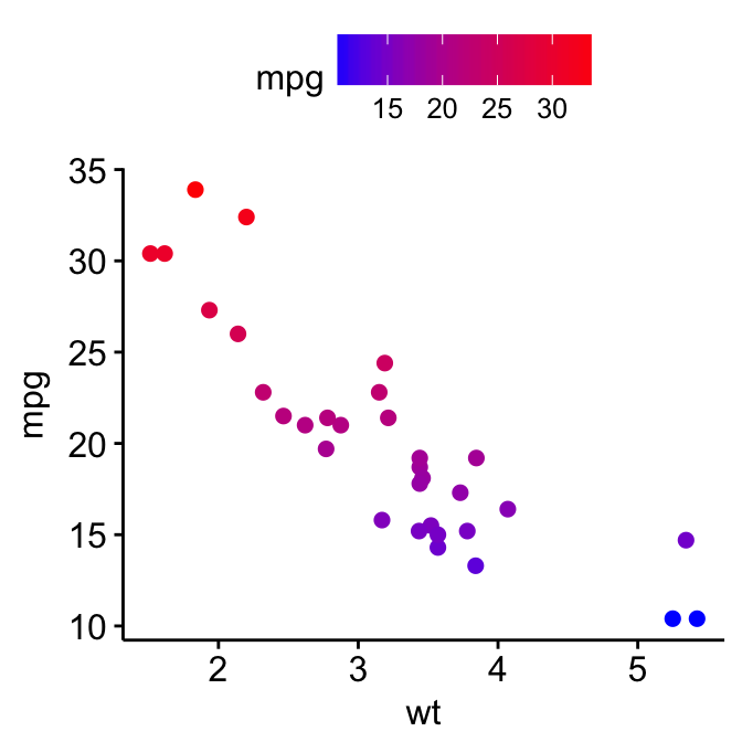
p3 + gradient_color(c("blue", "red"))
# Three colors
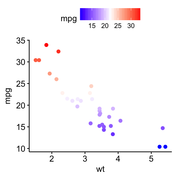
p3 + gradient_color(c("blue", "white", "red"))
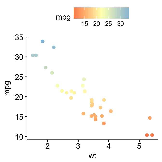
# Use RColorBrewer palette
p3 + gradient_color("RdYlBu")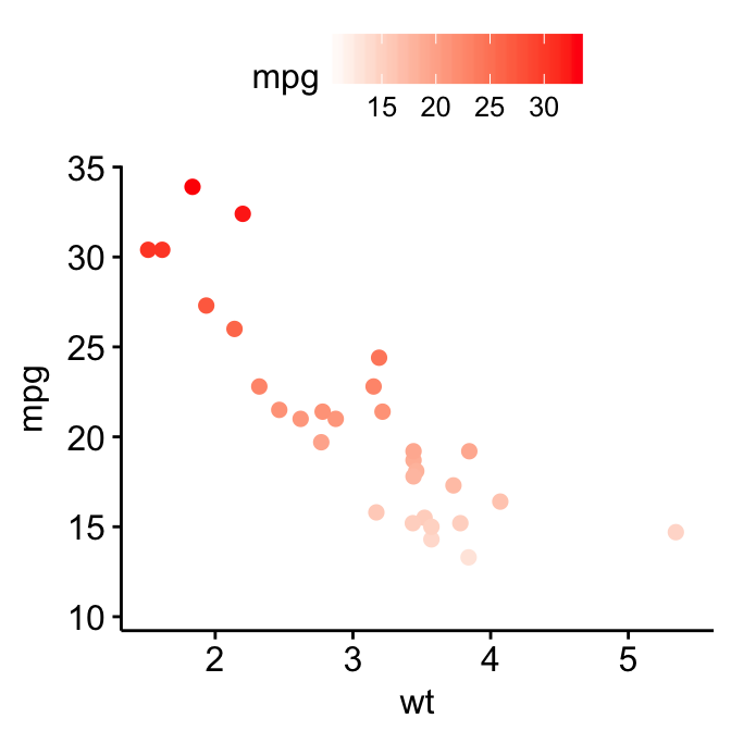
For gradient_fill(), the same syntax holds true. Start by creating a scatter plot filled by a continuous variable. Then, change the gradient color.
p4 <- ggscatter(mtcars, x = "wt", y = "mpg", fill = "mpg",
                size = 4, shape = 21)
p4 + gradient_fill(c("blue", "white", "red"))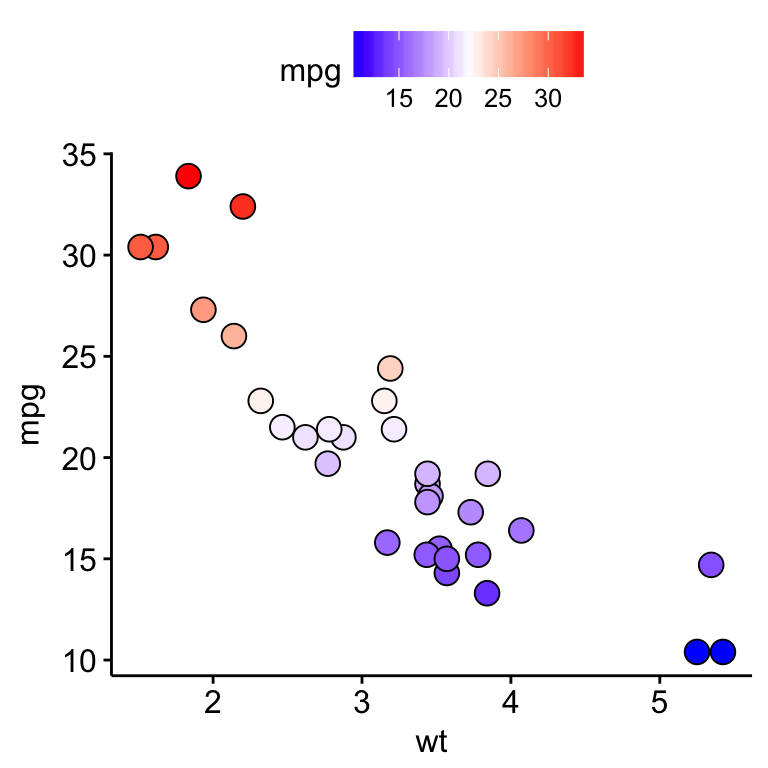
Change axis limits and scales
The following arguments can be used in ggpar():
- xlim, ylim: a numeric vector of length 2, specifying x and y axis limits (minimum and maximum values), respectively. e.g.: ylim = c(0, 50).
- xscale, yscale: x and y axis scale, respectively. Allowed values are one of c(“none”, “log2”, “log10”, “sqrt”); e.g.: yscale=“log2”.
- format.scale: logical value. If TRUE, axis tick mark labels will be formatted when xscale or yscale = “log2” or “log10”.
# Change y axis limits
ggpar(p, ylim = c(0, 50))
# Change y axis scale to log2
ggpar(p, yscale = "log2")
# Format axis scale
ggpar(p, yscale = "log2", format.scale = TRUE)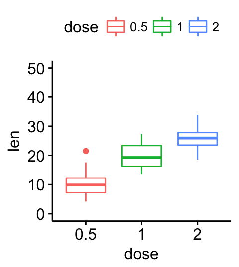
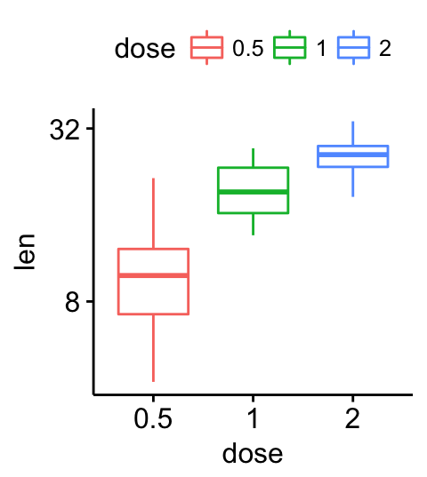
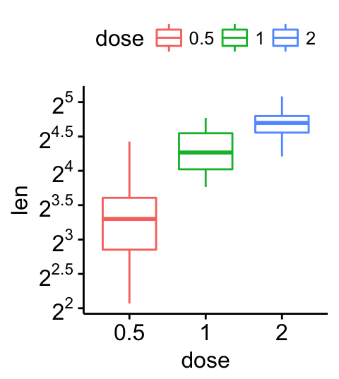
Alternatively, you can also use the function xscale() and yscale() [in ggpubr], as follow:
p + yscale("log2", .format = TRUE)Customize axis text and ticks
# Change the font of x and y axis texts.
# Rotate x and y texts, angle = 45
p +
font("xy.text", size = 12, color = "blue", face = "bold") +
rotate_x_text(45)+
rotate_y_text(45)
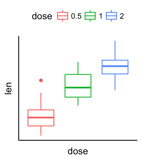
# remove ticks and axis texts
p + rremove("ticks")+
rremove("axis.text")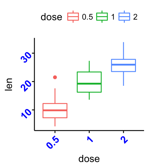
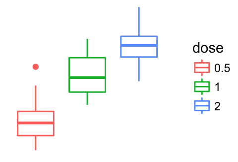
Rotate a plot
# Horizontal box plot
p + rotate()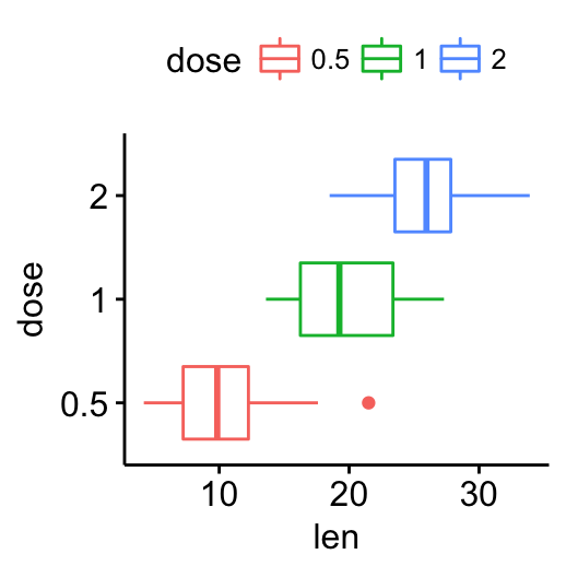
Change themes
The default theme in ggpubr is theme_pubr(), for publication ready theme.
The argument ggtheme can be used in any ggpubr plotting functions to change the plot theme.
Allowed values include ggplot2 official themes: theme_gray(), theme_bw(), theme_minimal(), theme_classic(), theme_void(), etc. It’s also possible to use the function “+” to add a theme.
# Gray theme
p + theme_gray()
# Black and white theme
p + theme_bw()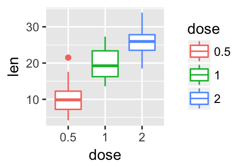
# Theme light
p + theme_light()
# Minimal theme
p + theme_minimal()
# Empty theme
p + theme_void()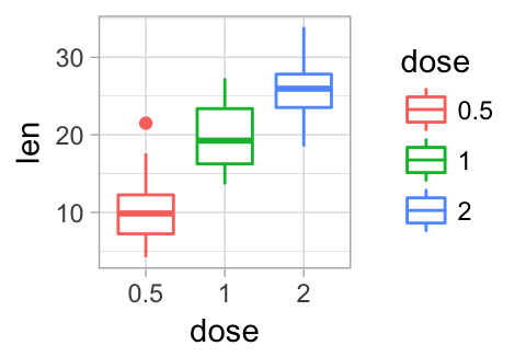
Remove ggplot components
The function rremove() [in ggpubr] can be used to remove a specific component from a ggplot.
Usage:
rremove(object)Object: character string specifying the plot components. Allowed values include:
- “grid” for both x and y grids
- “x.grid” for x axis grids
- “y.grid” for y axis grids
- “axis” for both x and y axes
- “x.axis” for x axis
- “y.axis” for y axis
- “xlab”, or “x.title” for x axis label
- “ylab”, or “y.title” for y axis label
- “xylab”, “xy.title” or “axis.title” for both x and y axis labels
- “x.text” for x axis texts (x axis tick labels)
- “y.text” for y axis texts (y axis tick labels)
- “xy.text” or “axis.text” for both x and y axis texts
- “ticks” for both x and y ticks
- “x.ticks” for x ticks
- “y.ticks” for y ticks
- “legend.title” for the legend title
- “legend” for the legend
Examples:
# Basic plot
p <- ggboxplot(ToothGrowth, x = "dose", y = "len",
  ggtheme = theme_gray())
p
# Remove all grids
p + rremove("grid")
# Remove only x grids
p + rremove("x.grid")