


Correspondence analysis basics - R software and data mining
- Required package
- Load FactoMineR and factoextra
- Data format: Contingency tables
- Visualize a contingency table using graphical matrix
- Row sums and column sums
- Row variables
- Column variables
- Association between row and column variables
- Graphical representation of a contingency table: Mosaic plot
- G-test: Likelihood ratio test
- Correspondence analysis
- CA - Singular value decomposition of the standardized residuals
- Packages in R
- Infos
Correspondence analysis (CA) is an extension of Principal Component Analysis (PCA) suited to analyze frequencies formed by qualitative variables (i.e, contingency table).
This R tutorial describes the idea and the mathematical procedures of Correspondence Analysis (CA) using R software.
The mathematical procedures of CA are complex and require matrix algebra.
In this tutorial, I put a lot of effort into writing all the formula in a very simple format so that every beginner can understand the methods.
Required package
FactoMineR(for computing CA) and factoextra (for CA visualization) packages are used.
These packages can be installed as follow :
install.packages("FactoMineR")
# install.packages("devtools")
devtools::install_github("kassambara/factoextra")
Load FactoMineR and factoextra
library("FactoMineR")
library("factoextra")
Data format: Contingency tables
We’ll use the data set housetasks[in factoextra]
data(housetasks)
head(housetasks)
Wife Alternating Husband Jointly
Laundry 156 14 2 4
Main_meal 124 20 5 4
Dinner 77 11 7 13
Breakfeast 82 36 15 7
Tidying 53 11 1 57
Dishes 32 24 4 53An image of the data is shown below:
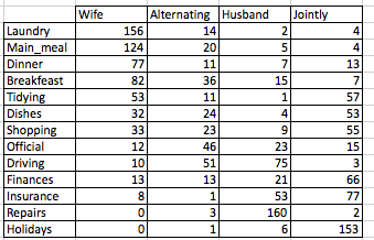
The data is a contingency table containing 13 housetasks and their repartition in the couple :
- rows are the different tasks
- values are the frequencies of the tasks done:
- by the wife only
- alternatively
- by the husband only
- or jointly
As the above contingency table is not very large, with a quick visual examination it can be seen that:
- The house tasks Laundry, Main_Meal and Dinner are dominant in the column Wife
- Repairs are dominant in the column Husband
- Holidays are dominant in the column Jointly
Visualize a contingency table using graphical matrix
To easily interpret the contingency table, a graphical matrix can be drawn using the function balloonplot() [in gplots package]. In this graph, each cell contains a dot whose size reflects the relative magnitude of the value it contains.
library("gplots")
# 1. convert the data as a table
dt <- as.table(as.matrix(housetasks))
# 2. Graph
balloonplot(t(dt), main ="housetasks", xlab ="", ylab="",
            label = FALSE, show.margins = FALSE)
For a very large contingency table, the visual interpretation would be very hard. Other methods are required such as correspondence analysis.
I will describe step by step many tools and statistical approaches to visualize, analyse and interpret a contingency table.
Row sums and column sums
Row sums (row.sum) and column sums (col.sum) are called row margins and column margins, respectively. They can be calculated as follow:
# Row margins
row.sum <- apply(housetasks, 1, sum)
head(row.sum)
Laundry Main_meal Dinner Breakfeast Tidying Dishes
176 153 108 140 122 113 # Column margins
col.sum <- apply(housetasks, 2, sum)
head(col.sum) Wife Alternating Husband Jointly
600 254 381 509 # grand total
n <- sum(housetasks)The grand total is the total sum of all values in the contingency table.
The contingency table with row and column margins are shown below:
Wife | Alternating | Husband | Jointly | TOTAL | |
Laundry | 156 | 14 | 2 | 4 | 176 |
Main_meal | 124 | 20 | 5 | 4 | 153 |
Dinner | 77 | 11 | 7 | 13 | 108 |
Breakfeast | 82 | 36 | 15 | 7 | 140 |
Tidying | 53 | 11 | 1 | 57 | 122 |
Dishes | 32 | 24 | 4 | 53 | 113 |
Shopping | 33 | 23 | 9 | 55 | 120 |
Official | 12 | 46 | 23 | 15 | 96 |
Driving | 10 | 51 | 75 | 3 | 139 |
Finances | 13 | 13 | 21 | 66 | 113 |
Insurance | 8 | 1 | 53 | 77 | 139 |
Repairs | 0 | 3 | 160 | 2 | 165 |
Holidays | 0 | 1 | 6 | 153 | 160 |
TOTAL | 600 | 254 | 381 | 509 | 1744 |
- Row margins: light gray
- Column margins: light blue
- The grand total (the total of all values in the table): pink
Row variables
To compare rows, we can analyse their profiles in order to identify similar row variables.
Row profiles
The profile of a given row is calculated by taking each row point and dividing by its margin (i.e, the sum of all row points). The formula is:
For example the profile of the row point Laundry/wife is P = 156/176 = 88.6%.
The R code below can be used to compute row profiles:
row.profile <- housetasks/row.sum
# head(row.profile)
Wife | Alternating | Husband | Jointly | TOTAL | |
Laundry | 0.88636364 | 0.079545455 | 0.011363636 | 0.02272727 | 1 |
Main_meal | 0.81045752 | 0.130718954 | 0.032679739 | 0.02614379 | 1 |
Dinner | 0.71296296 | 0.101851852 | 0.064814815 | 0.12037037 | 1 |
Breakfeast | 0.58571429 | 0.257142857 | 0.107142857 | 0.05000000 | 1 |
Tidying | 0.43442623 | 0.090163934 | 0.008196721 | 0.46721311 | 1 |
Dishes | 0.28318584 | 0.212389381 | 0.035398230 | 0.46902655 | 1 |
Shopping | 0.27500000 | 0.191666667 | 0.075000000 | 0.45833333 | 1 |
Official | 0.12500000 | 0.479166667 | 0.239583333 | 0.15625000 | 1 |
Driving | 0.07194245 | 0.366906475 | 0.539568345 | 0.02158273 | 1 |
Finances | 0.11504425 | 0.115044248 | 0.185840708 | 0.58407080 | 1 |
Insurance | 0.05755396 | 0.007194245 | 0.381294964 | 0.55395683 | 1 |
Repairs | 0.00000000 | 0.018181818 | 0.969696970 | 0.01212121 | 1 |
Holidays | 0.00000000 | 0.006250000 | 0.037500000 | 0.95625000 | 1 |
TOTAL | 0.34403670 | 0.145642202 | 0.218463303 | 0.29185780 | 1 |
In the table above, the row TOTAL (in light blue) is called the average row profile (or marginal profile of columns or column margin)
The average row profile is computed as follow:
For example, the average row profile is : (600/1744, 254/1744, 381/1744, 509/1744). It can be computed in R as follow:
# Column sums
col.sum <- apply(housetasks, 2, sum)
# average row profile = Column sums / grand total
average.rp <- col.sum/n
average.rp
Wife Alternating Husband Jointly
0.3440367 0.1456422 0.2184633 0.2918578 Distance (or similarity) between row profiles
If we want to compare 2 rows (row1 and row2), we need to compute the squared distance between their profiles as follow:
This distance is called Chi-square distance.
For example the distance between the rows Laundry and Main_meal are:
\[ d^2(Laundry, Main\_meal) = \frac{(0.886-0.810)^2}{0.344} + \frac{(0.0795-0.131)^2}{0.146} + ... = 0.036 \]
The distance between Laundry and Main_meal can be calculated as follow in R:
# Laundry and Main_meal profiles
laundry.p <- row.profile["Laundry",]
main_meal.p <- row.profile["Main_meal",]
# Distance between Laundry and Main_meal
d2 <- sum(((laundry.p - main_meal.p)^2) / average.rp)
d2
[1] 0.03684787The distance between Laundry and Driving is:
# Driving profile
driving.p <- row.profile["Driving",]
# Distance between Laundry and Driving
d2 <- sum(((laundry.p - driving.p)^2) / average.rp)
d2
[1] 3.772028Note that, the rows Laundry and Main_meal are very close (d2 ~ 0.036, similar profiles) compared to the rows Laundry and Driving (d2 ~ 3.77)
You can also compute the squared distance between each row profile and the average row profile in order to view rows that are the most similar or different to the average row.
Squared distance between each row profile and the average row profile
The R code below computes the distance from the average profile for all the row variables:
d2.row <- apply(row.profile, 1,
        function(row.p, av.p){sum(((row.p - av.p)^2)/av.p)},
        average.rp)
as.matrix(round(d2.row,3))
[,1]
Laundry 1.329
Main_meal 1.034
Dinner 0.618
Breakfeast 0.512
Tidying 0.353
Dishes 0.302
Shopping 0.218
Official 0.968
Driving 1.274
Finances 0.456
Insurance 0.727
Repairs 3.307
Holidays 2.140The rows Repairs, Holidays, Laundry and Driving have the most different profiles from the average profile.
Distance matrix
In this section the squared distance is computed between each row profile and the other rows in the contingency table.
The result is a distance matrix (a kind of correlation or dissimilarity matrix).
The custom R function below is used to compute the distance matrix:
## data: a data frame or matrix;
## average.profile: average profile
dist.matrix <- function(data, average.profile){
   mat <- as.matrix(t(data))
    n <- ncol(mat)
    dist.mat<- matrix(NA, n, n)
    diag(dist.mat) <- 0
    for (i in 1:(n - 1)) {
        for (j in (i + 1):n) {
            d2 <- sum(((mat[, i] - mat[, j])^2) / average.profile)
            dist.mat[i, j] <- dist.mat[j, i] <- d2
        }
    }
  colnames(dist.mat) <- rownames(dist.mat) <- colnames(mat)
  dist.mat
}
Compute and visualize the distance between row profiles. The package corrplot is required for the visualization. It can be installed as follow: install.packages(“corrplot”).
# Distance matrix
dist.mat <- dist.matrix(row.profile, average.rp)
dist.mat <-round(dist.mat, 2)
# Visualize the matrix
library("corrplot")
corrplot(dist.mat, type="upper",  is.corr = FALSE)
The size of the circle is proportional to the magnitude of the distance between row profiles.
When the data contains many categories, correspondence analysis is very useful to visualize the similarity between items.
Row mass and inertia
The Row mass (or row weight) is the total frequency of a given row. It’s calculated as follow:
row.sum <- apply(housetasks, 1, sum)
grand.total <- sum(housetasks)
row.mass <- row.sum/grand.total
head(row.mass)
Laundry Main_meal Dinner Breakfeast Tidying Dishes
0.10091743 0.08772936 0.06192661 0.08027523 0.06995413 0.06479358 The Row inertia is calculated as the row mass multiplied by the squared distance between the row and the average row profile:
- The inertia of a row (or a column) is the amount of information it contains.
- The total inertia is the total information contained in the data table. It’s computed as the sum of rows inertia (or equivalently, as the sum of columns inertia)
# Row inertia
row.inertia <- row.mass * d2.row
head(row.inertia)
Laundry Main_meal Dinner Breakfeast Tidying Dishes
0.13415976 0.09069235 0.03824633 0.04112368 0.02466697 0.01958732 # Total inertia
sum(row.inertia)[1] 1.11494The total inertia corresponds to the amount of the information the data contains.
Row summary
The result for rows can be summarized as follow:
row <- cbind.data.frame(d2 = d2.row, mass = row.mass, inertia = row.inertia)
round(row,3)
d2 mass inertia
Laundry 1.329 0.101 0.134
Main_meal 1.034 0.088 0.091
Dinner 0.618 0.062 0.038
Breakfeast 0.512 0.080 0.041
Tidying 0.353 0.070 0.025
Dishes 0.302 0.065 0.020
Shopping 0.218 0.069 0.015
Official 0.968 0.055 0.053
Driving 1.274 0.080 0.102
Finances 0.456 0.065 0.030
Insurance 0.727 0.080 0.058
Repairs 3.307 0.095 0.313
Holidays 2.140 0.092 0.196Column variables
Column profiles
These are calculated in the same way as the row profiles table.
The profile of a given column is computed as follow:
The R code below can be used to compute column profile:
col.profile <- t(housetasks)/col.sum
col.profile <- as.data.frame(t(col.profile))
# head(col.profile)
Wife | Alternating | Husband | Jointly | TOTAL | |
Laundry | 0.26000000 | 0.055118110 | 0.005249344 | 0.007858546 | 0.10091743 |
Main_meal | 0.20666667 | 0.078740157 | 0.013123360 | 0.007858546 | 0.08772936 |
Dinner | 0.12833333 | 0.043307087 | 0.018372703 | 0.025540275 | 0.06192661 |
Breakfeast | 0.13666667 | 0.141732283 | 0.039370079 | 0.013752456 | 0.08027523 |
Tidying | 0.08833333 | 0.043307087 | 0.002624672 | 0.111984283 | 0.06995413 |
Dishes | 0.05333333 | 0.094488189 | 0.010498688 | 0.104125737 | 0.06479358 |
Shopping | 0.05500000 | 0.090551181 | 0.023622047 | 0.108055010 | 0.06880734 |
Official | 0.02000000 | 0.181102362 | 0.060367454 | 0.029469548 | 0.05504587 |
Driving | 0.01666667 | 0.200787402 | 0.196850394 | 0.005893910 | 0.07970183 |
Finances | 0.02166667 | 0.051181102 | 0.055118110 | 0.129666012 | 0.06479358 |
Insurance | 0.01333333 | 0.003937008 | 0.139107612 | 0.151277014 | 0.07970183 |
Repairs | 0.00000000 | 0.011811024 | 0.419947507 | 0.003929273 | 0.09461009 |
Holidays | 0.00000000 | 0.003937008 | 0.015748031 | 0.300589391 | 0.09174312 |
TOTAL | 1.00000000 | 1.000000000 | 1.000000000 | 1.000000000 | 1.00000000 |
In the table above, the column TOTAL is called the average column profile (or marginale profile of rows)
The average column profile is calculated as follow:
For example, the average column profile is : (176/1744, 153/1744, 108/1744, 140/1744, …). It can be computed in R as follow:
# Row sums
row.sum <- apply(housetasks, 1, sum)
# average column profile= row sums/grand total
average.cp <- row.sum/n
head(average.cp)
Laundry Main_meal Dinner Breakfeast Tidying Dishes
0.10091743 0.08772936 0.06192661 0.08027523 0.06995413 0.06479358 Distance (similarity) between column profiles
If we want to compare columns, we need to compute the squared distance between their profiles as follow:
For example the distance between the columns Wife and Husband are:
\[ d^2(Wife, Husband) = \frac{(0.26-0.005)^2}{0.10} + \frac{(0.21-0.013)^2}{0.09} + ... + ... = 4.05 \]
The distance between Wife and Husband can be calculated as follow in R:
# Wife and Husband profiles
wife.p <- col.profile[, "Wife"]
husband.p <- col.profile[, "Husband"]
# Distance between Wife and Husband
d2 <- sum(((wife.p - husband.p)^2) / average.cp)
d2
[1] 4.050311You can also compute the squared distance between each column profile and the average column profile
Squared distance between each column profile and the average column profile
The R code below computes the distance from the average profile for all the column variables
d2.col <- apply(col.profile, 2,
        function(col.p, av.p){sum(((col.p - av.p)^2)/av.p)},
        average.cp)
round(d2.col,3)
Wife Alternating Husband Jointly
0.875 0.809 1.746 1.078 Distance matrix
# Distance matrix
dist.mat <- dist.matrix(t(col.profile), average.cp)
dist.mat <-round(dist.mat, 2)
dist.mat
Wife Alternating Husband Jointly
Wife 0.00 1.71 4.05 2.93
Alternating 1.71 0.00 2.67 2.58
Husband 4.05 2.67 0.00 3.70
Jointly 2.93 2.58 3.70 0.00# Visualize the matrix
library("corrplot")
corrplot(dist.mat, type="upper", order="hclust", is.corr = FALSE)
column mass and inertia
The column mass(or column weight) is the total frequency of each column. It’s calculated as follow:
col.sum <- apply(housetasks, 2, sum)
grand.total <- sum(housetasks)
col.mass <- col.sum/grand.total
head(col.mass)
Wife Alternating Husband Jointly
0.3440367 0.1456422 0.2184633 0.2918578 The column inertia is calculated as the column mass multiplied by the squared distance between the column and the average column profile:
col.inertia <- col.mass * d2.col
head(col.inertia)
Wife Alternating Husband Jointly
0.3010185 0.1178242 0.3813729 0.3147248 # total inertia
sum(col.inertia)[1] 1.11494Recall that the total inertia corresponds to the amount of the information the data contains. Note that, the total inertia obtained using column profile is the same as the one obtained when analyzing row profile. That’s normal, because we are analyzing the same data with just a different angle of view.
Column summary
The result for rows can be summarized as follow:
col <- cbind.data.frame(d2 = d2.col, mass = col.mass,
                        inertia = col.inertia)
round(col,3)
d2 mass inertia
Wife 0.875 0.344 0.301
Alternating 0.809 0.146 0.118
Husband 1.746 0.218 0.381
Jointly 1.078 0.292 0.315Association between row and column variables
When the contingency table is not very large (as above), it’s easy to visually inspect and interpret row and column profiles:
- It’s evident that, the housetasks - Laundry, Main_Meal and Dinner - are more frequently done by the “Wife”.
- Repairs and driving are dominantly done by the husband
- Holidays are more frequently taken jointly
Larger contingency table is complex to interpret visually and several methods are required to help to this process.
Another statistical method that can be applied to contingency table is the Chi-square test of independence.
Chi-square test
Chi-square test issued to examine whether rows and columns of a contingency table are statistically significantly associated.
- Null hypothesis (H0): the row and the column variables of the contingency table are independent.
- Alternative hypothesis (H1): row and column variables are dependent
For each cell of the table, we have to calculate the expected value under null hypothesis.
For a given cell, the expected value is calculated as follow:
The Chi-square statistic is calculated as follow:
\[ \chi^2 = \sum{\frac{(o - e)^2}{e}} \]
- o is the observed value
- e is the expected value
This calculated Chi-square statistic is compared to the critical value (obtained from statistical tables) with \(df = (r - 1)(c - 1)\) degrees of freedom and p = 0.05.
- r is the number of rows in the contingency table
- c is the number of column in the contingency table
If the calculated Chi-square statistic is greater than the critical value, then we must conclude that the row and the column variables are not independent of each other. This implies that they are significantly associated.
Note that, Chi-square test should only be applied when the expected frequency of any cell is at least 5.
Chi-square statistic can be easily computed using the function chisq.test() as follow:
chisq <- chisq.test(housetasks)
chisq
    Pearson's Chi-squared test
data:  housetasks
X-squared = 1944.456, df = 36, p-value < 2.2e-16
In our example, the row and the column variables are statistically significantly associated(p-value = 0)
Note that, while Chi-square test can help to establish dependence between rows and the columns, the nature of the dependency is unknown.
The observed and the expected counts can be extracted from the result of the test as follow:
# Observed counts
chisq$observed
Wife Alternating Husband Jointly
Laundry 156 14 2 4
Main_meal 124 20 5 4
Dinner 77 11 7 13
Breakfeast 82 36 15 7
Tidying 53 11 1 57
Dishes 32 24 4 53
Shopping 33 23 9 55
Official 12 46 23 15
Driving 10 51 75 3
Finances 13 13 21 66
Insurance 8 1 53 77
Repairs 0 3 160 2
Holidays 0 1 6 153# Expected counts
round(chisq$expected,2) Wife Alternating Husband Jointly
Laundry 60.55 25.63 38.45 51.37
Main_meal 52.64 22.28 33.42 44.65
Dinner 37.16 15.73 23.59 31.52
Breakfeast 48.17 20.39 30.58 40.86
Tidying 41.97 17.77 26.65 35.61
Dishes 38.88 16.46 24.69 32.98
Shopping 41.28 17.48 26.22 35.02
Official 33.03 13.98 20.97 28.02
Driving 47.82 20.24 30.37 40.57
Finances 38.88 16.46 24.69 32.98
Insurance 47.82 20.24 30.37 40.57
Repairs 56.77 24.03 36.05 48.16
Holidays 55.05 23.30 34.95 46.70As mentioned above the Chi-square statistic is 1944.456196.
Which are the most contributing cells to the definition of the total Chi-square statistic?
If you want to know the most contributing cells to the total Chi-square score, you just have to calculate the Chi-square statistic for each cell:
\[ r = \frac{o - e}{\sqrt{e}} \]
The above formula returns the so-called Pearson residuals (r) for each cell (or standardized residuals)
Cells with the highest absolute standardized residuals contribute the most to the total Chi-square score.
Pearson residuals can be easily extracted from the output of the function chisq.test():
round(chisq$residuals, 3) Wife Alternating Husband Jointly
Laundry 12.266 -2.298 -5.878 -6.609
Main_meal 9.836 -0.484 -4.917 -6.084
Dinner 6.537 -1.192 -3.416 -3.299
Breakfeast 4.875 3.457 -2.818 -5.297
Tidying 1.702 -1.606 -4.969 3.585
Dishes -1.103 1.859 -4.163 3.486
Shopping -1.289 1.321 -3.362 3.376
Official -3.659 8.563 0.443 -2.459
Driving -5.469 6.836 8.100 -5.898
Finances -4.150 -0.852 -0.742 5.750
Insurance -5.758 -4.277 4.107 5.720
Repairs -7.534 -4.290 20.646 -6.651
Holidays -7.419 -4.620 -4.897 15.556Let’s visualize Pearson residuals using the package corrplot:
library(corrplot)
corrplot(chisq$residuals, is.cor = FALSE)
For a given cell, the size of the circle is proportional to the amount of the cell contribution.
The sign of the standardized residuals is also very important to interpret the association between rows and columns as explained in the block below.
- Positive residuals are in blue. Positive values in cells specify an attraction (positive association) between the corresponding row and column variables.
- In the image above, it’s evident that there are an association between the column Wife and the rows Laundry, Main_meal.
- There is a strong positive association between the column Husband and the row Repair
- Negative residuals are in red. This implies a repulsion (negative association) between the corresponding row and column variables. For example the column Wife are negatively associated (~ “not associated”) with the row Repairs. There is a repulsion between the column Husband and, the rows Laundry and Main_meal
Note that, correspondence analysis is just the singular value decomposition of the standardized residuals. This will be explained in the next section.
The contribution (in %) of a given cell to the total Chi-square score is calculated as follow:
- r is the residual of the cell
# Contibution in percentage (%)
contrib <- 100*chisq$residuals^2/chisq$statistic
round(contrib, 3)
Wife Alternating Husband Jointly
Laundry 7.738 0.272 1.777 2.246
Main_meal 4.976 0.012 1.243 1.903
Dinner 2.197 0.073 0.600 0.560
Breakfeast 1.222 0.615 0.408 1.443
Tidying 0.149 0.133 1.270 0.661
Dishes 0.063 0.178 0.891 0.625
Shopping 0.085 0.090 0.581 0.586
Official 0.688 3.771 0.010 0.311
Driving 1.538 2.403 3.374 1.789
Finances 0.886 0.037 0.028 1.700
Insurance 1.705 0.941 0.868 1.683
Repairs 2.919 0.947 21.921 2.275
Holidays 2.831 1.098 1.233 12.445# Visualize the contribution
corrplot(contrib, is.cor = FALSE)
The relative contribution of each cell to the total Chi-square score give some indication of the nature of the dependency between rows and columns of the contingency table.
It can be seen that:
- The column “Wife” is strongly associated with Laundry, Main_meal, Dinner
- The column “Husband” is strongly associated with the row Repairs
- The column jointly is frequently associated with the row Holidays
From the image above, it can be seen that the most contributing cells to the Chi-square are Wife/Laundry (7.74%), Wife/Main_meal (4.98%), Husband/Repairs (21.9%), Jointly/Holidays (12.44%).
These cells contribute about 47.06% to the total Chi-square score and thus account for most of the difference between expected and observed values.
This confirms the earlier visual interpretation of the data. As stated earlier, visual interpretation may be complex when the contingency table is very large. In this case, the contribution of one cell to the total Chi-square score becomes a useful way of establishing the nature of dependency.Chi-square statistic and the total inertia
As mentioned above, the total inertia is the amount of the information contained in the data table.
It’s called \(\phi^2\) (squared phi) and is calculated as follow:
phi2 <- as.numeric(chisq$statistic/sum(housetasks))
phi2
[1] 1.11494The square root of \(\phi^2\) are called trace and may be interpreted as a correlation coefficient(Bendixen, 2003). Any value of the trace > 0.2 indicates a significant dependency between rows and columns (Bendixen M., 2003)
Graphical representation of a contingency table: Mosaic plot
Mosaic plot is used to visualize a contingency table in order to examine the association between categorical variables.
The function mosaicplot() [in garphics package] can be used.
library("graphics")
# Mosaic plot of observed values
mosaicplot(housetasks,  las=2, col="steelblue",
           main = "housetasks - observed counts")
# Mosaic plot of expected values
mosaicplot(chisq$expected,  las=2, col = "gray",
           main = "housetasks - expected counts")
In these plots, column variables are firstly splited (vertical split) and then row variables are splited(horizontal split). For each cell, the height of bars is proportional to the observed relative frequency it contains:
\[ \frac{cell.value}{column.sum} \]
The blue plot, is the mosaic plot of the observed values. The gray one is the mosaic plot of the expected values under null hypothesis.
If row and column variables were completely independent the mosaic bars for the observed values (blue graph) would be aligned as the mosaic bars for the expected values (gray graph).
It’s also possible to color the mosaic plot according to the value of the standardized residuals:
mosaicplot(housetasks, shade = TRUE, las=2,main = "housetasks")
- The argument shade is used to color the graph
- The argument las = 2 produces vertical labels
- This plot clearly show you that Laundry, Main_meal, Dinner and Breakfeast are more often done by the “Wife”.
- Repairs are done by the Husband
G-test: Likelihood ratio test
The G–test of independence is an alternative to the chi-square test of independence, and they will give approximately the same conclusion.
The test is based on the likelihood ratio defined as follow:
- o is the observed value
- e is the expected value under null hypothesis
This likelihood ratio, or its logarithm, can be used to compute a p-value. When the logarithm of the likelihood ratio is used, the statistic is known as a log-likelihood ratio statistic.
This test is called G-test or likelihood ratio test or maximum likelihood statistical significance test) and can be used in situations where Chi-square tests were previously recommended.
The G-test is generally defined as follow:
- o is the observed frequency in a cell
- e is the expected frequency under the null hypothesis
- log is the natural logarithm
- The sum is taken over all non-empty cells.
The distribution of G is approximately a chi-squared distribution, with the same number of degrees of freedom as in the corresponding chi-squared test:
- r is the number of rows in the contingency table
- c is the number of column in the contingency table
The commonly used Pearson Chi-square test is, in fact, just an approximation of the log-likelihood ratio on which the G-tests are based.
Remember that, the Chi-square formula is:
\[ \chi^2 = \sum{\frac{(o - e)^2}{e}} \]
Likelihood ratio test in R
The functions likelihood.test()[in Deducer package] or G.test()[in RVAideMemoire] can be used to perform a G-test on a contingency table.
We’ll use the package RVAideMemoire which can be installed as follow : install.packages(“RVAideMemoire”).
The function G.test() work as chisq.test():
library("RVAideMemoire")
gtest <- G.test(as.matrix(housetasks))
gtest
    G-test
data:  as.matrix(housetasks)
G = 1907.658, df = 36, p-value < 2.2e-16
Interpret the association between rows and columns using likelihood ratio
To interpret the association between the rows and the columns of the contingency table, the likelihood ratio can be used as an index (i):
For a given cell,
- If ratio > 1, there is an “attraction” (association) between the corresponding column and row
- If ratio < 1, there is a “repulsion” between the corresponding column and row
The ratio can be calculated as follow:
ratio <- chisq$observed/chisq$expected
round(ratio,3)
Wife Alternating Husband Jointly
Laundry 2.576 0.546 0.052 0.078
Main_meal 2.356 0.898 0.150 0.090
Dinner 2.072 0.699 0.297 0.412
Breakfeast 1.702 1.766 0.490 0.171
Tidying 1.263 0.619 0.038 1.601
Dishes 0.823 1.458 0.162 1.607
Shopping 0.799 1.316 0.343 1.570
Official 0.363 3.290 1.097 0.535
Driving 0.209 2.519 2.470 0.074
Finances 0.334 0.790 0.851 2.001
Insurance 0.167 0.049 1.745 1.898
Repairs 0.000 0.125 4.439 0.042
Holidays 0.000 0.043 0.172 3.276Note that, you can also use the R code : gtest$observed/gtest$expected
The package corrplot can be used to make a graph of the likelihood ratio:
corrplot(ratio, is.cor = FALSE)
The image above confirms our previous observations:
- The rows Laundry, Main_meal and Dinner are associated with the column Wife
- Repairs are done more often by the Husband
- Holidays are taken Jointly
Let’s take the log(ratio) to see the attraction and the repulsion in different colors:
- If ratio < 1 => log(ratio) < 0 (negative values) => red color
- If ratio > 1 = > log(ratio) > 0 (positive values) => blue color
We’ll also add a small value (0.5) to all cells to avoid log(0):
corrplot(log2(ratio + 0.5), is.cor = FALSE)
Correspondence analysis
Correspondence analysis (CA) is required for large contingency table.
It used to graphically visualize row points and column points in a low dimensional space.
CA is a dimensional reduction method applied to a contingency table. The information retained by each dimension is called eigenvalue.
The total information (or inertia) contained in the data is called phi (\(\phi^2\)) and can be calculated as follow:
For a given axis, the eigenvalue (\(\lambda\)) is computed as follow:
Or equivalently
- row.coord and col.coord are the coordinates of row and column variables on the axis.
The association index between a row and column for the principal axes can be computed as follow:
\[ i = 1 + \sum{\frac{row.coord * col.coord}{\sqrt{\lambda}}} \]
- \(\lambda\) is the eigenvalue of the axes
- The sum denotes the sum for all axis
If there is an attraction the corresponding row and column coordinates have the same sign on the axes. If there is a repulsion the corresponding row and column coordinates have different signs on the axes. A high value indicates a strong attraction or repulsion
CA - Singular value decomposition of the standardized residuals
Correspondence analysis (CA) is used to represent graphically the table of distances between row variables or between column variables.
CA approach includes the following steps:
- STEP 1. Compute the standardized residuals
The standardized residuals (S) is:
\[ S = \frac{o - e}{\sqrt{e}} \]
In fact, S is just the square roots of the terms comprising \(\chi^2\) statistic.
STEP II. Compute the singular value decomposition (SVD) of the standardized residuals.
Let M be: \(M = \frac{1}{sqrt(grand.total)} \times S\)
SVD means that we want to find orthogonal matrices U and V, together with a diagonal matrix \(\Delta\), such that:
(Phillip M. Yelland, 2010)
- \(U\) is a matrix containing row eigenvectors
- \(\Delta\) is the diagonal matrix. The numbers on the diagonal of the matrix are called singular values (SV). The eigenvalues are the squared SV.
- \(V\) is a matrix containing column eigenvectors
The eigenvalue of a given axis is:
- \(\delta\) is the singular value
The coordinates of row variables on a given axis are:
The coordinates of columns are:
Compute SVD in R:
# Grand total
n <- sum(housetasks)
# Standardized residuals
residuals <- chisq$residuals/sqrt(n)
# Number of dimensions
nb.axes <- min(nrow(residuals)-1, ncol(residuals)-1)
# Singular value decomposition
res.svd <- svd(residuals, nu = nb.axes, nv = nb.axes)
res.svd
$d
[1] 7.368102e-01 6.670853e-01 3.564385e-01 1.012225e-16
$u
[,1] [,2] [,3]
[1,] -0.42762952 -0.23587902 -0.28228398
[2,] -0.35197789 -0.21761257 -0.13633376
[3,] -0.23391020 -0.11493572 -0.14480767
[4,] -0.19557424 -0.19231779 0.17519699
[5,] -0.14136307 0.17221046 -0.06990952
[6,] -0.06528142 0.16864510 0.19063825
[7,] -0.04189568 0.15859251 0.14910925
[8,] 0.07216535 -0.08919754 0.60778606
[9,] 0.28421536 -0.27652950 0.43123528
[10,] 0.09354184 0.23576569 0.02484968
[11,] 0.24793268 0.20050833 -0.22918636
[12,] 0.63820133 -0.39850534 -0.40738669
[13,] 0.10379321 0.65156733 -0.11011902
$v
[,1] [,2] [,3]
[1,] -0.66679846 -0.3211267 -0.3289692
[2,] -0.03220853 -0.1668171 0.9085662
[3,] 0.73643655 -0.4217418 -0.2476526
[4,] 0.10956112 0.8313745 -0.0703917sv <- res.svd$d[1:nb.axes] # singular value
u <-res.svd$u
v <- res.svd$vEigenvalues and screeplot
# Eigenvalues
eig <- sv^2
# Variances in percentage
variance <- eig*100/sum(eig)
# Cumulative variances
cumvar <- cumsum(variance)
eig<- data.frame(eig = eig, variance = variance,
                     cumvariance = cumvar)
head(eig)
eig variance cumvariance
1 0.5428893 48.69222 48.69222
2 0.4450028 39.91269 88.60491
3 0.1270484 11.39509 100.00000barplot(eig[, 2], names.arg=1:nrow(eig),
main = "Variances",
xlab = "Dimensions",
ylab = "Percentage of variances",
col ="steelblue")
# Add connected line segments to the plot
lines(x = 1:nrow(eig), eig[, 2],
type="b", pch=19, col = "red")
How many dimensions to retain?:
- The maximum number of axes in the CA is :
r and c are respectively the number of rows and columns in the table.
- Use elbow method
Row coordinates
We can use the function apply to perform arbitrary operations on the rows and columns of a matrix.
A simplified format is:
apply(X, MARGIN, FUN, ...)- x: a matrix
- MARGIN: allowed values can be 1 or 2. 1 specifies that we want to operate on the rows of the matrix. 2 specifies that we want to operate on the column.
- FUN: the function to be applied
- …: optional arguments to FUN
# row sum
row.sum <- apply(housetasks, 1, sum)
# row mass
row.mass <- row.sum/n
# row coord = sv * u /sqrt(row.mass)
cc <- t(apply(u, 1, '*', sv)) # each row X sv
row.coord <- apply(cc, 2, '/', sqrt(row.mass))
rownames(row.coord) <- rownames(housetasks)
colnames(row.coord) <- paste0("Dim.", 1:nb.axes)
round(row.coord,3)
Dim.1 Dim.2 Dim.3
Laundry -0.992 -0.495 -0.317
Main_meal -0.876 -0.490 -0.164
Dinner -0.693 -0.308 -0.207
Breakfeast -0.509 -0.453 0.220
Tidying -0.394 0.434 -0.094
Dishes -0.189 0.442 0.267
Shopping -0.118 0.403 0.203
Official 0.227 -0.254 0.923
Driving 0.742 -0.653 0.544
Finances 0.271 0.618 0.035
Insurance 0.647 0.474 -0.289
Repairs 1.529 -0.864 -0.472
Holidays 0.252 1.435 -0.130# plot
plot(row.coord, pch=19, col = "blue")
text(row.coord, labels =rownames(row.coord), pos = 3, col ="blue")
abline(v=0, h=0, lty = 2)
Column coordinates
# Coordinates of columns
col.sum <- apply(housetasks, 2, sum)
col.mass <- col.sum/n
# coordinates sv * v /sqrt(col.mass)
cc <- t(apply(v, 1, '*', sv))
col.coord <- apply(cc, 2, '/', sqrt(col.mass))
rownames(col.coord) <- colnames(housetasks)
colnames(col.coord) <- paste0("Dim", 1:nb.axes)
head(col.coord)
Dim1 Dim2 Dim3
Wife -0.83762154 -0.3652207 -0.19991139
Alternating -0.06218462 -0.2915938 0.84858939
Husband 1.16091847 -0.6019199 -0.18885924
Jointly 0.14942609 1.0265791 -0.04644302# plot
plot(col.coord, pch=17, col = "red")
text(col.coord, labels =rownames(col.coord), pos = 3, col ="red")
abline(v=0, h=0, lty = 2)
Biplot of rows and columns to view the association
xlim <- range(c(row.coord[,1], col.coord[,1]))*1.1
ylim <- range(c(row.coord[,2], col.coord[,2]))*1.1
# Plot of rows
plot(row.coord, pch=19, col = "blue", xlim = xlim, ylim = ylim)
text(row.coord, labels =rownames(row.coord), pos = 3, col ="blue")
# plot off columns
points(col.coord, pch=17, col = "red")
text(col.coord, labels =rownames(col.coord), pos = 3, col ="red")
abline(v=0, h=0, lty = 2)
You can interpret the distance between rows points or between column points but the distance between column points and row points are not meaningful.
Diagnostic
Recall that, the total inertia contained in the data is:
Our two-dimensional plot captures about 88% of the total inertia of the table.
Contribution of rows and columns
The contributions of a rows/columns to the definition of a principal axis are :
Contribution of rows in %
# contrib <- row.mass * row.coord^2/eigenvalue
cc <- apply(row.coord^2, 2, "*", row.mass)
row.contrib <- t(apply(cc, 1, "/", eig[1:nb.axes,1])) *100
round(row.contrib, 2)
Dim.1 Dim.2 Dim.3
Laundry 18.29 5.56 7.97
Main_meal 12.39 4.74 1.86
Dinner 5.47 1.32 2.10
Breakfeast 3.82 3.70 3.07
Tidying 2.00 2.97 0.49
Dishes 0.43 2.84 3.63
Shopping 0.18 2.52 2.22
Official 0.52 0.80 36.94
Driving 8.08 7.65 18.60
Finances 0.88 5.56 0.06
Insurance 6.15 4.02 5.25
Repairs 40.73 15.88 16.60
Holidays 1.08 42.45 1.21corrplot(row.contrib, is.cor = FALSE)
Contribution of columns in %
# contrib <- col.mass * col.coord^2/eigenvalue
cc <- apply(col.coord^2, 2, "*", col.mass)
col.contrib <- t(apply(cc, 1, "/", eig[1:nb.axes,1])) *100
round(col.contrib, 2)
Dim1 Dim2 Dim3
Wife 44.46 10.31 10.82
Alternating 0.10 2.78 82.55
Husband 54.23 17.79 6.13
Jointly 1.20 69.12 0.50corrplot(col.contrib, is.cor = FALSE)
Quality of the representation
The quality of the representation is called COS2.
The quality of the representation of a row on an axis is:
- row.coord is the coordinate of the row on the axis
- \(d^2\) is the squared distance from the average profile
Recall that the distance between each row profile and the average row profile is:
row.profile <- housetasks/row.sum
head(round(row.profile, 3))
Wife Alternating Husband Jointly
Laundry 0.886 0.080 0.011 0.023
Main_meal 0.810 0.131 0.033 0.026
Dinner 0.713 0.102 0.065 0.120
Breakfeast 0.586 0.257 0.107 0.050
Tidying 0.434 0.090 0.008 0.467
Dishes 0.283 0.212 0.035 0.469average.profile <- col.sum/n
head(round(average.profile, 3)) Wife Alternating Husband Jointly
0.344 0.146 0.218 0.292 The R code below computes the distance from the average profile for all the row variables
d2.row <- apply(row.profile, 1,
                function(row.p, av.p){sum(((row.p - av.p)^2)/av.p)},
                average.rp)
head(round(d2.row,3))
Laundry Main_meal Dinner Breakfeast Tidying Dishes
1.329 1.034 0.618 0.512 0.353 0.302 The cos2 of rows on the factor map are:
row.cos2 <- apply(row.coord^2, 2, "/", d2.row)
round(row.cos2, 3)
Dim.1 Dim.2 Dim.3
Laundry 0.740 0.185 0.075
Main_meal 0.742 0.232 0.026
Dinner 0.777 0.154 0.070
Breakfeast 0.505 0.400 0.095
Tidying 0.440 0.535 0.025
Dishes 0.118 0.646 0.236
Shopping 0.064 0.748 0.189
Official 0.053 0.066 0.881
Driving 0.432 0.335 0.233
Finances 0.161 0.837 0.003
Insurance 0.576 0.309 0.115
Repairs 0.707 0.226 0.067
Holidays 0.030 0.962 0.008visualize the cos2:
corrplot(row.cos2, is.cor = FALSE)
Cos2 of columns
col.profile <- t(housetasks)/col.sum
col.profile <- t(col.profile)
#head(round(col.profile, 3))
average.profile <- row.sum/n
#head(round(average.profile, 3))
The R code below computes the distance from the average profile for all the column variables
d2.col <- apply(col.profile, 2,
        function(col.p, av.p){sum(((col.p - av.p)^2)/av.p)},
        average.profile)
#round(d2.col,3)
The cos2 of columns on the factor map are:
col.cos2 <- apply(col.coord^2, 2, "/", d2.col)
round(col.cos2, 3)
Dim1 Dim2 Dim3
Wife 0.802 0.152 0.046
Alternating 0.005 0.105 0.890
Husband 0.772 0.208 0.020
Jointly 0.021 0.977 0.002visualize the cos2:
corrplot(col.cos2, is.cor = FALSE)
Supplementary rows/columns
The supplementary row coordinates
# Supplementary row
sup.row <- as.data.frame(housetasks["Dishes",, drop = FALSE])
# Supplementary row profile
sup.row.sum <- apply(sup.row, 1, sum)
sup.row.profile <- sweep(sup.row, 1, sup.row.sum, "/")
# V/sqrt(col.mass)
vv <- sweep(v, 1, sqrt(col.mass), FUN = "/")
# Supplementary row coord
sup.row.coord <- as.matrix(sup.row.profile) %*% vv
sup.row.coord
[,1] [,2] [,3]
Dishes -0.1889641 0.4419662 0.2669493## COS2 = coor^2/Distance from average profile
d2.row <- apply(sup.row.profile, 1,
function(row.p, av.p){sum(((row.p - av.p)^2)/av.p)},
average.rp)
sup.row.cos2 <- sweep(sup.row.coord^2, 1, d2.row, FUN = "/")Packages in R
There are many packages for CA:
- FactoMineR
- ade4
- ca
library(FactoMineR)
res.ca <- CA(housetasks, graph = F)
# print
res.ca
**Results of the Correspondence Analysis (CA)**
The row variable has 13 categories; the column variable has 4 categories
The chi square of independence between the two variables is equal to 1944.456 (p-value = 0 ).
*The results are available in the following objects:
name description
1 "$eig" "eigenvalues"
2 "$col" "results for the columns"
3 "$col$coord" "coord. for the columns"
4 "$col$cos2" "cos2 for the columns"
5 "$col$contrib" "contributions of the columns"
6 "$row" "results for the rows"
7 "$row$coord" "coord. for the rows"
8 "$row$cos2" "cos2 for the rows"
9 "$row$contrib" "contributions of the rows"
10 "$call" "summary called parameters"
11 "$call$marge.col" "weights of the columns"
12 "$call$marge.row" "weights of the rows" # eigenvalue
head(res.ca$eig)[, 1:2] eigenvalue percentage of variance
dim 1 5.428893e-01 4.869222e+01
dim 2 4.450028e-01 3.991269e+01
dim 3 1.270484e-01 1.139509e+01
dim 4 5.119700e-33 4.591904e-31# barplot of percentage of variance
barplot(res.ca$eig[,2], names.arg = rownames(res.ca$eig))
# Plot row points
plot(res.ca, invisible ="col")
# Plot column points
plot(res.ca, invisible ="col")
# Biplot of rows and columns
plot(res.ca)
Infos
This analysis has been performed using R software (ver. 3.1.2), FactoMineR (ver. 1.29) and factoextra (ver. 1.0.2)
- Phillip M. Yelland. An introduction to correspondence analysis. Mathematica Journal. 2010. http://www.mathematica-journal.com/data/uploads/2010/09/Yelland.pdf
- Ricco RAKOTOMALALA (article in french). Analyse factorielle des correspondances. University Lyon 2. http://eric.univ-lyon2.fr/~ricco/cours/slides/AFC.pdf
- Bendixen M. 2003, A Practical Guide to the Use of Correspondence Analysis in Marketing Research, Marketing Bulletin, 2003, 14, Technical Note 2. http://marketing-bulletin.massey.ac.nz/V14/MB_V14_T2_Bendixen.pdf
Show me some love with the like buttons below... Thank you and please don't forget to share and comment below!!
Montrez-moi un peu d'amour avec les like ci-dessous ... Merci et n'oubliez pas, s'il vous plaît, de partager et de commenter ci-dessous!
Recommended for You!


Recommended for you
This section contains best data science and self-development resources to help you on your path.
Coursera - Online Courses and Specialization
Data science
- Course: Machine Learning: Master the Fundamentals by Standford
- Specialization: Data Science by Johns Hopkins University
- Specialization: Python for Everybody by University of Michigan
- Courses: Build Skills for a Top Job in any Industry by Coursera
- Specialization: Master Machine Learning Fundamentals by University of Washington
- Specialization: Statistics with R by Duke University
- Specialization: Software Development in R by Johns Hopkins University
- Specialization: Genomic Data Science by Johns Hopkins University
Popular Courses Launched in 2020
- Google IT Automation with Python by Google
- AI for Medicine by deeplearning.ai
- Epidemiology in Public Health Practice by Johns Hopkins University
- AWS Fundamentals by Amazon Web Services
Trending Courses
- The Science of Well-Being by Yale University
- Google IT Support Professional by Google
- Python for Everybody by University of Michigan
- IBM Data Science Professional Certificate by IBM
- Business Foundations by University of Pennsylvania
- Introduction to Psychology by Yale University
- Excel Skills for Business by Macquarie University
- Psychological First Aid by Johns Hopkins University
- Graphic Design by Cal Arts
Books - Data Science
Our Books
- Practical Guide to Cluster Analysis in R by A. Kassambara (Datanovia)
- Practical Guide To Principal Component Methods in R by A. Kassambara (Datanovia)
- Machine Learning Essentials: Practical Guide in R by A. Kassambara (Datanovia)
- R Graphics Essentials for Great Data Visualization by A. Kassambara (Datanovia)
- GGPlot2 Essentials for Great Data Visualization in R by A. Kassambara (Datanovia)
- Network Analysis and Visualization in R by A. Kassambara (Datanovia)
- Practical Statistics in R for Comparing Groups: Numerical Variables by A. Kassambara (Datanovia)
- Inter-Rater Reliability Essentials: Practical Guide in R by A. Kassambara (Datanovia)
Others
- R for Data Science: Import, Tidy, Transform, Visualize, and Model Data by Hadley Wickham & Garrett Grolemund
- Hands-On Machine Learning with Scikit-Learn, Keras, and TensorFlow: Concepts, Tools, and Techniques to Build Intelligent Systems by Aurelien Géron
- Practical Statistics for Data Scientists: 50 Essential Concepts by Peter Bruce & Andrew Bruce
- Hands-On Programming with R: Write Your Own Functions And Simulations by Garrett Grolemund & Hadley Wickham
- An Introduction to Statistical Learning: with Applications in R by Gareth James et al.
- Deep Learning with R by François Chollet & J.J. Allaire
- Deep Learning with Python by François Chollet