ggplot2.lineplot : Easy line plots in R software using ggplot2
Introduction
ggplot2.lineplot is an easy to use function to generate line plots in R software using ggplot2 plotting system. It can also be used to customize quickly the plot parameters including main title, axis labels, legend, background and colors. ggplot2.lineplot function is from easyGgplot2 package. An R script is available in the next section to install the package.
The aim of this article is to show you step by step, how to plot and customize a line plot using ggplot2.lineplot function.
At the end of this tutorial you will be able to draw, with few R code, the following plots:
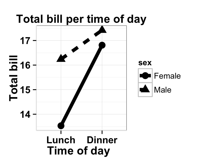
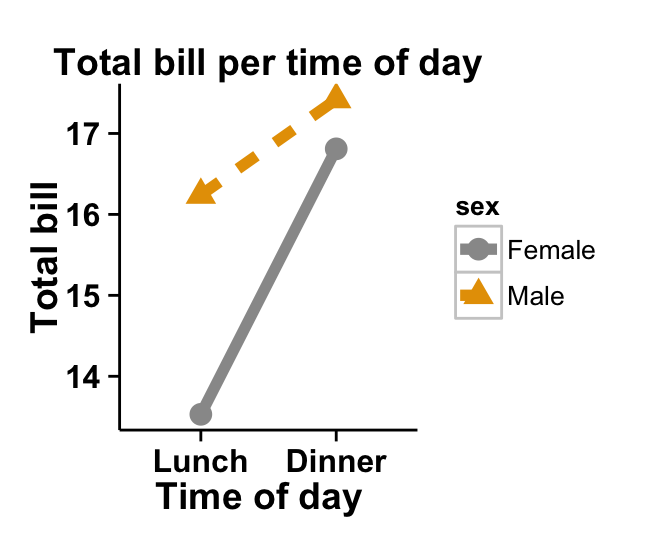
ggplot2.lineplot function is described in detail at the end of this document.
Install and load easyGgplot2 package
easyGgplot2 R package can be installed as follow :
install.packages("devtools")
library(devtools)
install_github("easyGgplot2", "kassambara")
Load the package using this R code :
library(easyGgplot2)Data format
The data must be a numeric vector or a data.frame (columns are variables and rows are observations).
restaurant data from easyGgplot2 package will be used in the following example.
#data.frame
head(restaurant)
## sex time total_bill
## 1 Female Lunch 13.53
## 2 Female Dinner 16.81
## 3 Male Lunch 16.24
## 4 Male Dinner 17.42Basic line plot
A subset of restaurant data is used :
df<-restaurant[c(1,4), c("time", "total_bill")]
head(df)
## time total_bill
## 1 Lunch 13.53
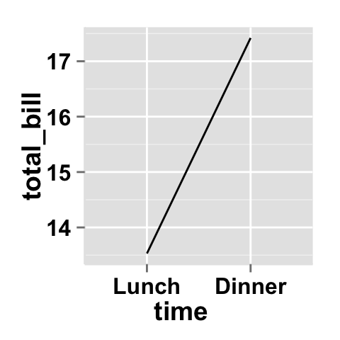
## 4 Dinner 17.42# Basic line plot of the values of "total_bill" variables
ggplot2.lineplot(data=df, xName="time", yName='total_bill')
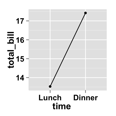
# Add points
ggplot2.lineplot(data=df, xName="time", yName='total_bill',
addPoint=TRUE)
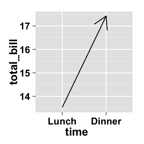
# Use the arrow parameter to add an arrow to the line
# See ?grid::arrow for more details
rquery.loadPackages("grid")
ggplot2.lineplot(data=df, xName="time", yName='total_bill',
arrow=arrow())
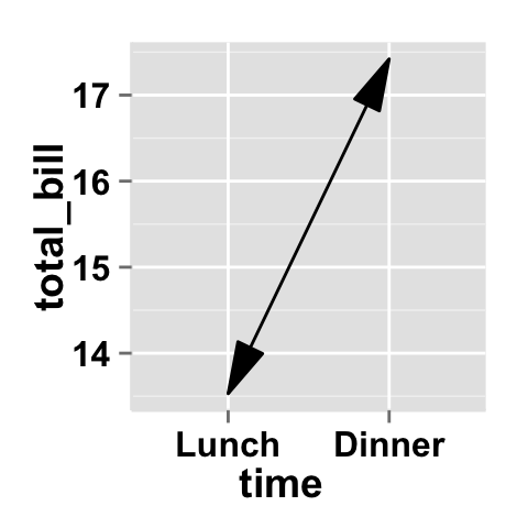
# Add closed arrow to the to end of the line
ggplot2.lineplot(data=df, xName="time", yName='total_bill',
arrow=arrow(angle = 15, ends = "both",
type = "closed")
)
Change the line type and the point shape of line plot
Different point shapes and line types can be used in the plot. By default, ggplot2 uses solid line type and circle shape.
- The different point shapes in R are described here.
- The available line types are shown here.
# Change color of both line and points
# Change line type and point type,
  #and use thicker line and larger points
# Change points to circles with white fill
ggplot2.lineplot(data=df, xName="time", yName='total_bill',
             #line color, type and size
             color="red", linetype="dotted", size=1.5,
             addPoint=TRUE, pointSize=4, pointShape=21,
             pointFill="white", pointColor="red")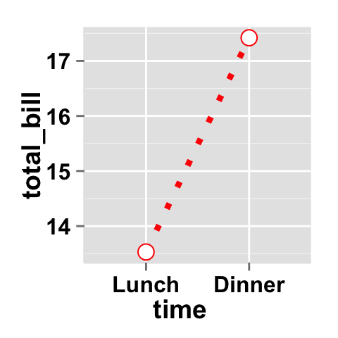
Lineplot with more variables
This data will be used for the examples below:
df1 <- restaurant
head(df1)
## sex time total_bill
## 1 Female Lunch 13.53
## 2 Female Dinner 16.81
## 3 Male Lunch 16.24
## 4 Male Dinner 17.42# Plot of variable 'total_bill' according to xName 'time'.
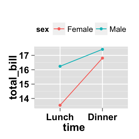
# The plot is colored by the groupName 'sex'
# line type and point shape are set by the groupName 'sex'
ggplot2.lineplot(data=df1, xName='time', yName="total_bill",
groupName='sex', addPoint=TRUE,
legendPosition="top")
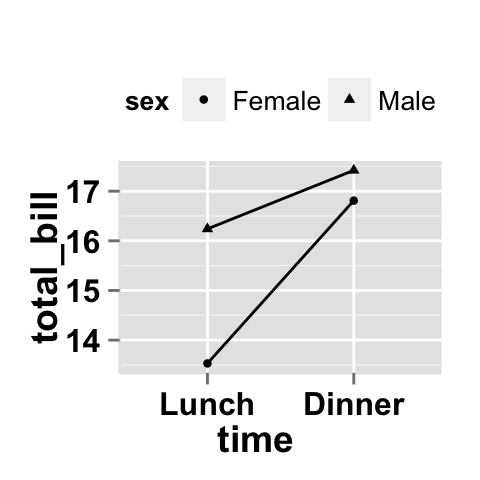
# Use the same linetype and point shape
# but different colors by group
ggplot2.lineplot(data=df1, xName='time', yName="total_bill",
groupName='sex',legendPosition="top",
linetype="solid",addPoint=TRUE, shape=19)
# Basic plot with black color and
# differents point shapes by group
ggplot2.lineplot(data=df1, xName='time', yName="total_bill",
groupName='sex',legendPosition="top",
linetype="solid",addPoint=TRUE, color="black")
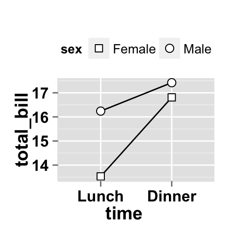
# Set point shape manually
ggplot2.lineplot(data=df1, xName='time', yName="total_bill",
groupName='sex',legendPosition="top",
linetype="solid",addPoint=TRUE, color="black",
pointSize=3, pointFill="white")+
scale_shape_manual(values=c(22,21))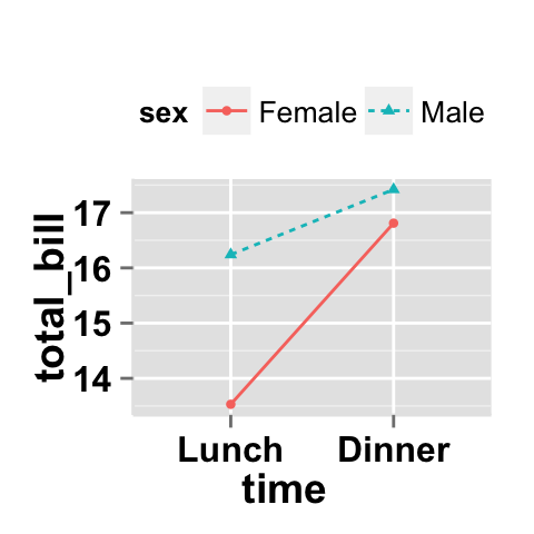
Customize your line plot
Parameters
The arguments that can be used to customize x and y axis are listed below :
| Parameters | Description |
|---|---|
| mainTitle | the title of the plot |
| mainTitleFont | a vector of length 3 indicating respectively the size, the style (“italic”, “bold”, “bold.italic”) and the color of x and y axis titles. Default value is: mainTitleFont=c(14, “bold”, “black”). |
| xShowTitle, yShowTitle | if TRUE, x and y axis titles will be shown. Set the value to FALSE to hide axis labels. Default values are TRUE. |
| xtitle, ytitle | x and y axis labels. Default values are NULL. |
| xtitleFont, ytitleFont | a vector of length 3 indicating respectively the size, the style and the color of x and y axis titles. Possible values for the style:“plain”, “italic”, “bold”, “bold.italic”. Color can be specified as an hexadecimal code (e.g: “#FFCC00”) or by the name (e.g : “red”, “green”). Default values are xtitleFont=c(14,"bold", "black"), ytitleFont=c(14,"bold", "black"). |
| xlim, ylim | limit for the x and y axis. Default values are NULL. |
| xScale, yScale | x and y axis scales. Possible values : c(“none”, “log2”, “log10”). e.g: yScale=“log2”. Default values are NULL. |
| xShowTickLabel, yShowTickLabel | if TRUE, x and y axis tick mark labels will be shown. Default values are TRUE. |
| xTickLabelFont, yTickLabelFont | a vector of length 3 indicating respectively the size, the style and the color of x and y axis tick label fonts. Default value are xTickLabelFont=c(12, "bold", "black"), yTickLabelFont=c(12, "bold", "black"). |
| xtickLabelRotation, ytickLabelRotation | Rotation angle of x and y axis tick labels. Default value are 0. |
| hideAxisTicks | if TRUE, x and y axis ticks are hidden. Default value is FALSE. |
| axisLine | a vector of length 3 indicating respectively the size, the line type and the color of axis lines. Default value is c(0.5, "solid", "#E5E5E5"). |
For more details follow this link : ggplot2.customize.
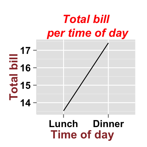
Main title and axis labels
# Change main title and axis titles
ggplot2.lineplot(data=df, xName="time", yName='total_bill',
                mainTitle="Total bill\n per time of day",
                xtitle="Time of day", ytitle="Total bill")
# Customize title styles. Possible values for the font style :
  # 'plain', 'italic', 'bold', 'bold.italic'.
ggplot2.lineplot(data=df, xName="time", yName='total_bill',
                mainTitle="Total bill\n per time of day",
                xtitle="Time of day", ytitle="Total bill",
                mainTitleFont=c(14,"bold.italic", "red"),
                xtitleFont=c(14,"bold", "#993333"),
                ytitleFont=c(14,"bold", "#993333"))
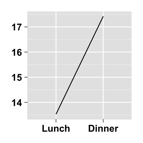
# Hide x an y axis titles
ggplot2.lineplot(data=df, xName="time", yName='total_bill',
                xShowTitle=FALSE, yShowTitle=FALSE)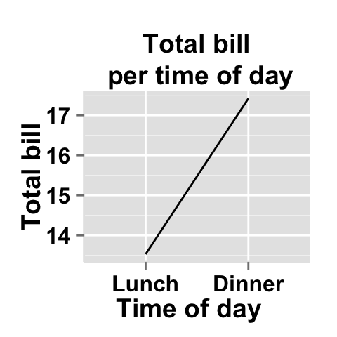
Axis ticks
# Axis ticks labels and orientaion
ggplot2.lineplot(data=df, xName="time", yName='total_bill',
            xShowTitle=FALSE, yShowTitle=FALSE,
            xTickLabelFont=c(14,"bold", "#993333"),
            yTickLabelFont=c(14,"bold", "#993333"),
            xtickLabelRotation=45, ytickLabelRotation=45)
# Hide axis tick labels
ggplot2.lineplot(data=df, xName="time", yName='total_bill',
          xShowTitle=FALSE, yShowTitle=FALSE,
          xShowTickLabel=FALSE, yShowTickLabel=FALSE)
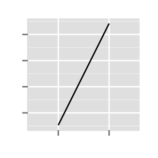
# Hide axis ticks
ggplot2.lineplot(data=df, xName="time", yName='total_bill',
          xShowTitle=FALSE, yShowTitle=FALSE,
          xShowTickLabel=FALSE, yShowTickLabel=FALSE,
          hideAxisTicks=TRUE)
# AxisLine : a vector of length 3 indicating the size,
  #the line type and the color of axis lines
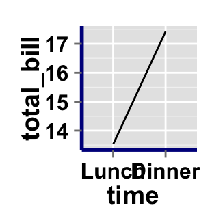
ggplot2.lineplot(data=df, xName="time", yName='total_bill',
                 axisLine=c(1, "solid", "darkblue"))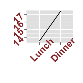
Background and colors
Change line plot background and fill colors
# change background color to "white". Default is "gray"
ggplot2.lineplot(data=df, xName="time", yName='total_bill',
            backgroundColor="white")
# Change background color to "lightblue" and grid color to "white"
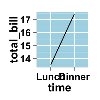
ggplot2.lineplot(data=df, xName="time", yName='total_bill',
            backgroundColor="lightblue", gridColor="white")
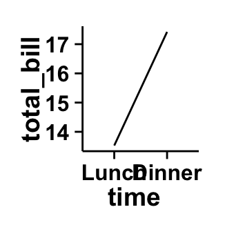
# Remove grid; Remove Top and right border around the plot
ggplot2.lineplot(data=df, xName="time", yName='total_bill',
          backgroundColor="white", fill='#FFAAD4', color="black",
          removePanelGrid=TRUE,removePanelBorder=TRUE,
          axisLine=c(0.5, "solid", "black"))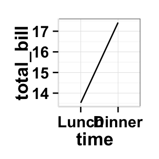
Change line plot color according to the group
Colors can be specified as a hexadecimal RGB triplet, such as "#FFCC00" or by names (e.g : "red" ). You can also use other color scales, such as ones taken from the RColorBrewer package. The different color systems available in R have been described in detail here.
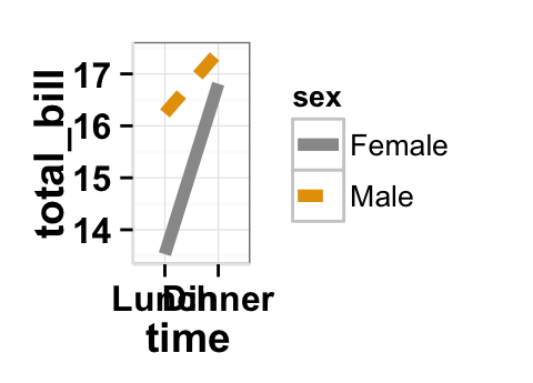
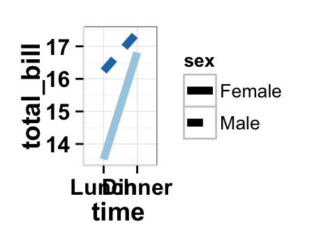
To change line plot color according to the group, you have to specify the name of the data column containing the groups using the argument groupName. Use the argument groupColors, to specify colors by hexadecimal code or by name. In this case, the length of groupColors should be the same as the number of the groups. Use the argument brewerPalette, to specify colors using RColorBrewerpalette.
# Color the line plot by groupName
ggplot2.lineplot(data=df1, xName='time', yName="total_bill",
          groupName='sex', size=2)
# Change group colors using hexadecimal colors;
ggplot2.lineplot(data=df1, xName='time', yName="total_bill",
          groupName='sex',size=2,
          backgroundColor="white", #background and line colors
          groupColors=c('#999999','#E69F00'))

# Change group colors using brewer palette: "Paired"
ggplot2.lineplot(data=df1, xName='time', yName="total_bill",
          groupName='sex',size=2,
          backgroundColor="white", #background and line colors
          brewerPalette="Paired")
# Change group colors using color names
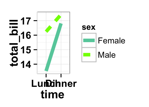
ggplot2.lineplot(data=df1, xName='time', yName="total_bill",
          groupName='sex',size=2,
          backgroundColor="white", #background and line colors
          groupColors=c('aquamarine3','chartreuse1'))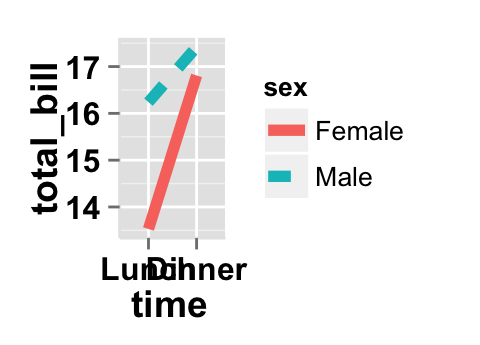
Legend
Legend position
# Change the legend position to "top"
  # (possible values: "left","top", "right", "bottom")
ggplot2.lineplot(data=df1, xName='time', yName="total_bill",
                groupName='sex',legendPosition="top")

# legendPosition can be also a numeric vector c(x, y)
ggplot2.lineplot(data=df1, xName='time', yName="total_bill",
                groupName='sex', legendPosition=c(0.8,0.2))

# Remove plot legend
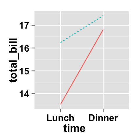
ggplot2.lineplot(data=df1, xName='time', yName="total_bill",
                 groupName='sex',showLegend=FALSE)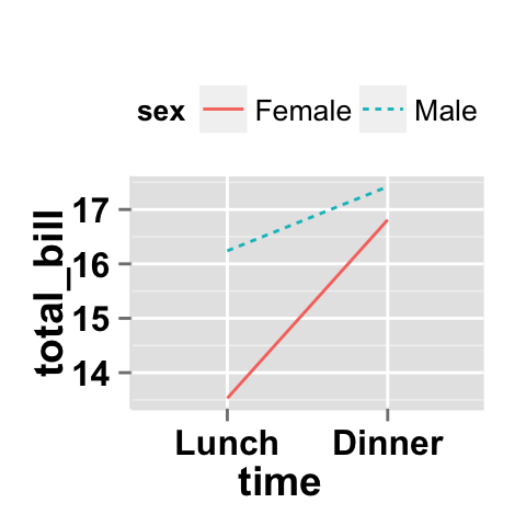
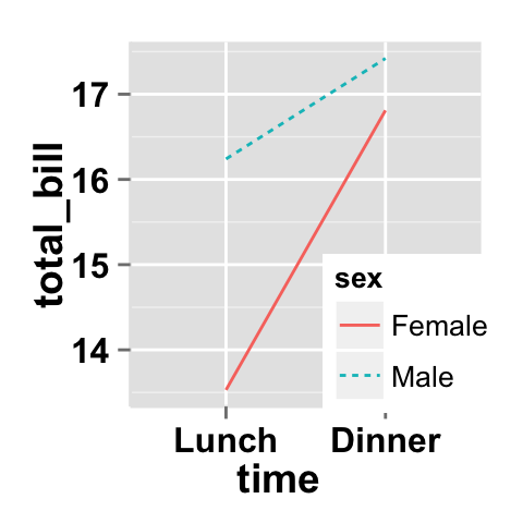
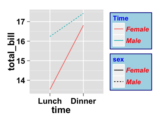
It is also possible to position the legend inside the plotting area. You have to indicate the x, y coordinates of legend box. x and y values must be between 0 and 1. c(0,0) corresponds to “bottom left” and c(1,1) corresponds to “top right” position.
Legend background color, title and text font styles
# Change legend background color, title and text font styles
ggplot2.lineplot(data=df1, xName='time', yName="total_bill",
        groupName='sex',
        #legendPosition=c("right", "left","top", "bottom")
        legendPosition="right",
        #legendTitleFont=c(size, style, color)
        legendTitle="Time", legendTitleFont=c(10, "bold", "blue"),
        #legendTextFont=c(size, style, color)
        legendTextFont=c(10, "bold.italic", "red"),
        #legendBackground: c(fill, lineSize, lineType, lineColor)
        legendBackground=c("lightblue", 0.5, "solid", "darkblue" )
        )
Axis scales
Possible values for y axis scale are “none”, “log2” and log10. Default value is “none”.
# Change x axis limit
ggplot2.lineplot(data=df, xName="time", yName='total_bill',
                 ylim=c(0,18))

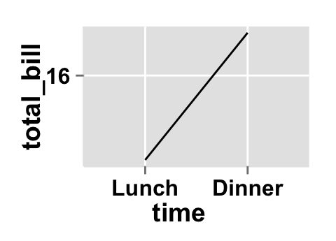
# y Log scale. yScale="log2".
# Possible value="none", "log2" and "log10"
ggplot2.lineplot(data=df, xName="time", yName='total_bill',
                 yScale="log2")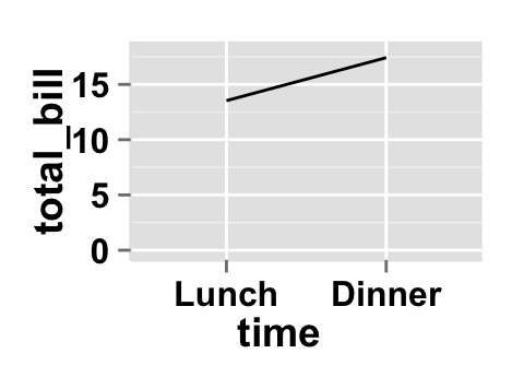
Create a customized plots with few R code
# Customized lineplot
ggplot2.lineplot(data=df1, xName="time", yName='total_bill',
        groupName="sex",size=2,
        addPoint=TRUE, pointSize=4, backgroundColor="white",
        color="black",
        xtitle="Time of day", ytitle="Total bill",
        mainTitle="Total bill per time of day")

# Remove grid; Remove Top and right border around the plot;
# different colors per group
ggplot2.lineplot(data=df1, xName="time", yName='total_bill',
        groupName="sex",size=2,
        addPoint=TRUE, pointSize=4, backgroundColor="white",
        groupColors=c('#999999','#E69F00'),
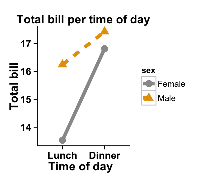
        xtitle="Time of day", ytitle="Total bill",
        mainTitle="Total bill per time of day",
        removePanelGrid=TRUE,removePanelBorder=TRUE,
        axisLine=c(0.5, "solid", "black"))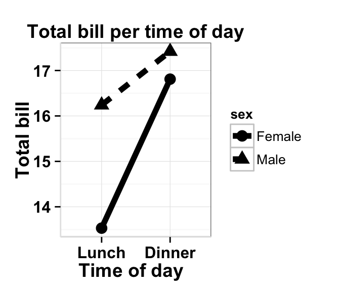
Line plot with a numeric x-axis
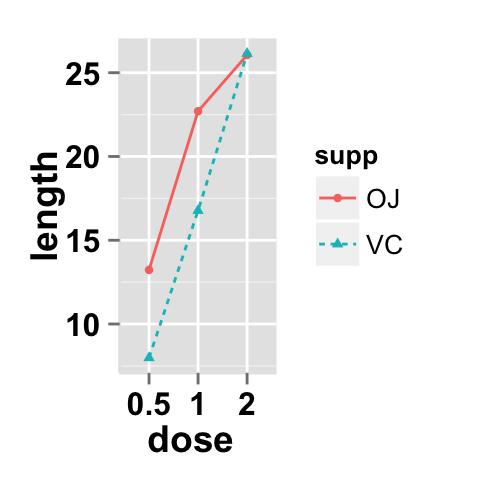
When the variable on the x-axis is numeric, it is sometimes useful to treat it as continuous, and sometimes useful to treat it as categorical. In this data set, the dose is a numeric variable with values 0.5, 1.0, and 2.0. It might be useful to treat these values as equal categories when making a graph.
This is derived from the ToothGrowth dataset included with R.
dfn <- read.table(header=T, text='
supp dose length
  OJ  0.5  13.23
  OJ  1.0  22.70
  OJ  2.0  26.06
  VC  0.5   7.98
  VC  1.0  16.77
  VC  2.0  26.14
')
# line plot with x-axis treated as continuous
ggplot2.lineplot(data=dfn, xName="dose", yName='length',
               groupName="supp",
               addPoint=TRUE, xAxisType="continuous")
# With x-axis treated as categorical
ggplot2.lineplot(data=dfn, xName="dose", yName='length',
               groupName="supp",
               addPoint=TRUE, xAxisType="categorical")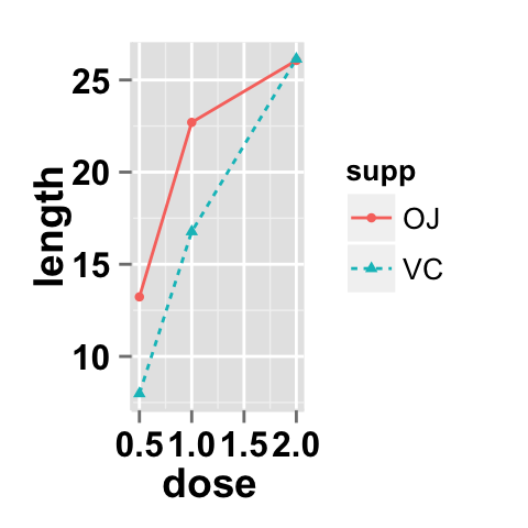
ggplot2.lineplot function
Description
Plot easily a line plot using easyGgplot2 R package.
usage
ggplot2.lineplot(data, xName, yName,  groupName=NULL,
         addPoint=FALSE, pointSize=1.5, pointShape=19,
         pointFill=NULL, pointColor="black",
         arrow=NULL, xAxisType=c("categorical", "continuous"),
         groupColors=NULL, brewerPalette=NULL,...)
Arguments
| Arguments | Descriptions |
|---|---|
| data | data.frame or a numeric vector. Columns are variables and rows are observations. |
| xName | The name of column containing x variable (i.e groups). |
| yName | The name of column containing y variable. |
| groupName | The name of column containing group variable. This variable is used to color plot according to the group. |
| addPoint | If TRUE, points are added to the plot. Default value is FALSE. |
| pointSize, pointShape, pointFill, pointColor | Modify point size, shape, fill and color. |
| arrow | arrow is function from package grid. This function Describe arrows to add to a line. See ?grid::arrow for more details. Usage : arrow=arrow(). Default value is NULL. |
| xAxisType | Indicate the type of x-axis. Possible values =c(“categorical”, “continuous”). Default value is “categorical”. When the variable on the x-axis is numeric, it is sometimes useful to treat it as continuous, and sometimes useful to treat it as categorical. |
| groupColors | Color of groups. groupColors should have the same length as groups. |
| brewerPalette | This can be also used to indicate group colors. In this case the parameter groupColors should be NULL. e.g: brewerPalette=“Paired”. |
| …. | Other arguments passed on to ggplot2.customize custom function or to geom_line functions from ggplot2 package. |
The other arguments which can be used are described at this link : ggplot2 customize. They are used to customize the plot (axis, title, background, color, legend, ….) generated using ggplot2 or easyGgplot2 R package.
Examples
library(easyGgplot2)
#data
df<-restaurant[c(1,4), c("time", "total_bill")]
#plot
ggplot2.lineplot(data=df, xName="time", yName='total_bill',
          mainTitle="Plot of total bill\n per time of day",
          xtitle="Time of day", ytitle="Total bill")
#Or use this
plot<-ggplot2.lineplot(data=df, xName="time", yName='total_bill')
plot<-ggplot2.customize(plot,
          mainTitle="Plot of total bill\n per time of day",
          xtitle="Time of day", ytitle="Total bill")
print(plot)
Easy ggplot2 ebook
Note that an eBook is available on easyGgplot2 package here.
By Alboukadel Kassambara
Copyright 2014 Alboukadel Kassambara. All rights reserved.
Published by STHDA (http://www.sthda.com/english).
September 2014 : First edition.
Licence : This document is under creative commons licence (http://creativecommons.org/licenses/by-nc-sa/3.0/).
Contact : Alboukadel Kassambara alboukadel.kassambara@gmail.com
Infos
This analysis was performed using R (ver. 3.1.0), easyGgplot2 (ver 1.0.0) and ggplot2 (ver 1.0.0).
Show me some love with the like buttons below... Thank you and please don't forget to share and comment below!!
Montrez-moi un peu d'amour avec les like ci-dessous ... Merci et n'oubliez pas, s'il vous plaît, de partager et de commenter ci-dessous!
Recommended for You!
Recommended for you
This section contains best data science and self-development resources to help you on your path.
Coursera - Online Courses and Specialization
Data science
- Course: Machine Learning: Master the Fundamentals by Standford
- Specialization: Data Science by Johns Hopkins University
- Specialization: Python for Everybody by University of Michigan
- Courses: Build Skills for a Top Job in any Industry by Coursera
- Specialization: Master Machine Learning Fundamentals by University of Washington
- Specialization: Statistics with R by Duke University
- Specialization: Software Development in R by Johns Hopkins University
- Specialization: Genomic Data Science by Johns Hopkins University
Popular Courses Launched in 2020
- Google IT Automation with Python by Google
- AI for Medicine by deeplearning.ai
- Epidemiology in Public Health Practice by Johns Hopkins University
- AWS Fundamentals by Amazon Web Services
Trending Courses
- The Science of Well-Being by Yale University
- Google IT Support Professional by Google
- Python for Everybody by University of Michigan
- IBM Data Science Professional Certificate by IBM
- Business Foundations by University of Pennsylvania
- Introduction to Psychology by Yale University
- Excel Skills for Business by Macquarie University
- Psychological First Aid by Johns Hopkins University
- Graphic Design by Cal Arts
Books - Data Science
Our Books
- Practical Guide to Cluster Analysis in R by A. Kassambara (Datanovia)
- Practical Guide To Principal Component Methods in R by A. Kassambara (Datanovia)
- Machine Learning Essentials: Practical Guide in R by A. Kassambara (Datanovia)
- R Graphics Essentials for Great Data Visualization by A. Kassambara (Datanovia)
- GGPlot2 Essentials for Great Data Visualization in R by A. Kassambara (Datanovia)
- Network Analysis and Visualization in R by A. Kassambara (Datanovia)
- Practical Statistics in R for Comparing Groups: Numerical Variables by A. Kassambara (Datanovia)
- Inter-Rater Reliability Essentials: Practical Guide in R by A. Kassambara (Datanovia)
Others
- R for Data Science: Import, Tidy, Transform, Visualize, and Model Data by Hadley Wickham & Garrett Grolemund
- Hands-On Machine Learning with Scikit-Learn, Keras, and TensorFlow: Concepts, Tools, and Techniques to Build Intelligent Systems by Aurelien Géron
- Practical Statistics for Data Scientists: 50 Essential Concepts by Peter Bruce & Andrew Bruce
- Hands-On Programming with R: Write Your Own Functions And Simulations by Garrett Grolemund & Hadley Wickham
- An Introduction to Statistical Learning: with Applications in R by Gareth James et al.
- Deep Learning with R by François Chollet & J.J. Allaire
- Deep Learning with Python by François Chollet


