


Plot Time Series Data Using GGPlot
In this chapter, we start by describing how to plot simple and multiple time series data using the R function geom_line() [in ggplot2].
Next, we show how to set date axis limits and add trend smoothed line to a time series graphs. Finally, we introduce some extensions to the ggplot2 package for easily handling and analyzing time series objects.
Additionally, you’ll learn how to detect peaks (maxima) and valleys (minima) in time series data.
Contents:

Basic ggplot of time series
- Plot types: line plot with dates on x-axis
- Demo data set:
economics[ggplot2] time series data sets are used.
In this section we’ll plot the variables psavert (personal savings rate) and uempmed (number of unemployed in thousands) by date (x-axis).
- Load required packages and set the default theme:
library(ggplot2)
theme_set(theme_minimal())
# Demo dataset
head(economics)
## # A tibble: 6 x 6
## date pce pop psavert uempmed unemploy
##
## 1 1967-07-01 507 198712 12.5 4.5 2944
## 2 1967-08-01 510 198911 12.5 4.7 2945
## 3 1967-09-01 516 199113 11.7 4.6 2958
## 4 1967-10-01 513 199311 12.5 4.9 3143
## 5 1967-11-01 518 199498 12.5 4.7 3066
## 6 1967-12-01 526 199657 12.1 4.8 3018 - Create basic line plots
# Basic line plot
ggplot(data = economics, aes(x = date, y = pop))+
geom_line(color = "#00AFBB", size = 2)
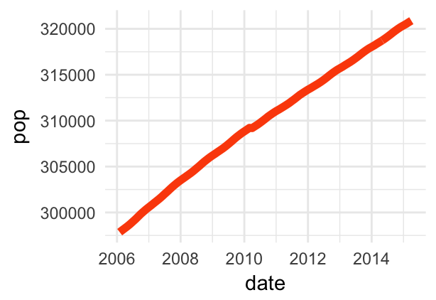
# Plot a subset of the data
ss <- subset(economics, date > as.Date("2006-1-1"))
ggplot(data = ss, aes(x = date, y = pop)) +
geom_line(color = "#FC4E07", size = 2)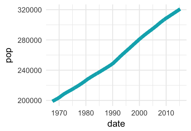
- Control line size by the value of a continuous variable:
ggplot(data = economics, aes(x = date, y = pop)) +
  geom_line(aes(size = unemploy/pop), color = "#FC4E07")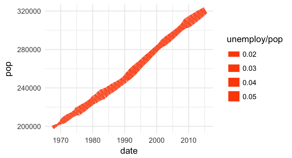
Plot multiple time series data
Here, we’ll plot the variables psavert and uempmed by dates. You should first reshape the data using the tidyr package: - Collapse psavert and uempmed values in the same column (new column). R function: gather()[tidyr] - Create a grouping variable that with levels = psavert and uempmed
library(tidyr)
library(dplyr)
df <- economics %>%
  select(date, psavert, uempmed) %>%
  gather(key = "variable", value = "value", -date)
head(df, 3)
## # A tibble: 3 x 3
## date variable value
##
## 1 1967-07-01 psavert 12.5
## 2 1967-08-01 psavert 12.5
## 3 1967-09-01 psavert 11.7 # Multiple line plot
ggplot(df, aes(x = date, y = value)) +
geom_line(aes(color = variable), size = 1) +
scale_color_manual(values = c("#00AFBB", "#E7B800")) +
theme_minimal()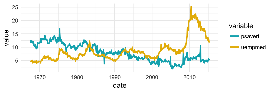
# Area plot
ggplot(df, aes(x = date, y = value)) +
  geom_area(aes(color = variable, fill = variable),
            alpha = 0.5, position = position_dodge(0.8)) +
  scale_color_manual(values = c("#00AFBB", "#E7B800")) +
  scale_fill_manual(values = c("#00AFBB", "#E7B800"))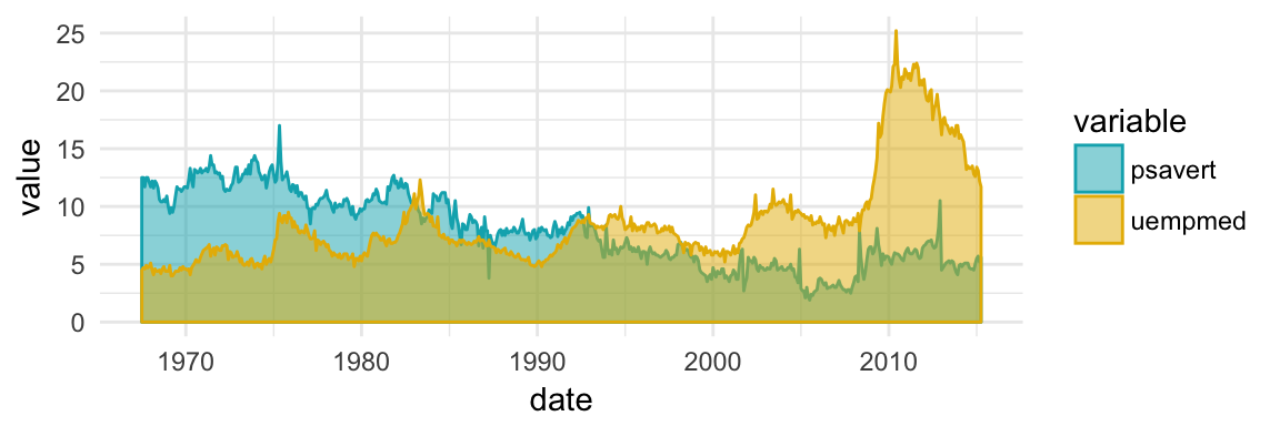
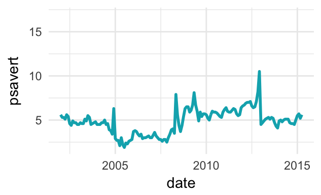
Set date axis limits
Key R function: scale_x_date()
# Base plot with date axis
p <- ggplot(data = economics, aes(x = date, y = psavert)) +
     geom_line(color = "#00AFBB", size = 1)
p
# Set axis limits c(min, max)
min <- as.Date("2002-1-1")
max <- NA
p + scale_x_date(limits = c(min, max))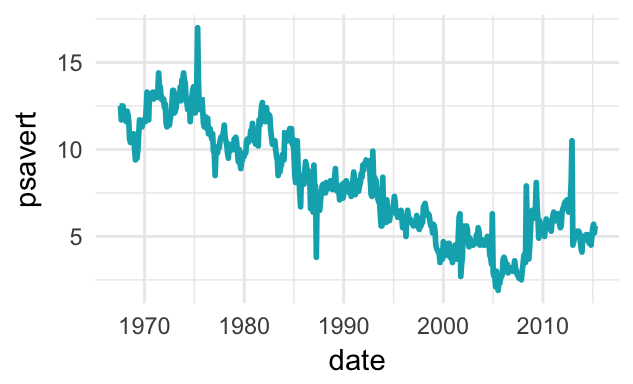
Format date axis labels
Key function: scale_x_date().
To format date axis labels, you can use different combinations of days, weeks, months and years:
- Weekday name: use
%aand%Afor abbreviated and full weekday name, respectively - Month name: use
%band%Bfor abbreviated and full month name, respectively %d: day of the month as decimal number%Y: Year with century.- See more options in the documentation of the function
?strptime
# Format : month/year
p + scale_x_date(date_labels = "%b/%Y")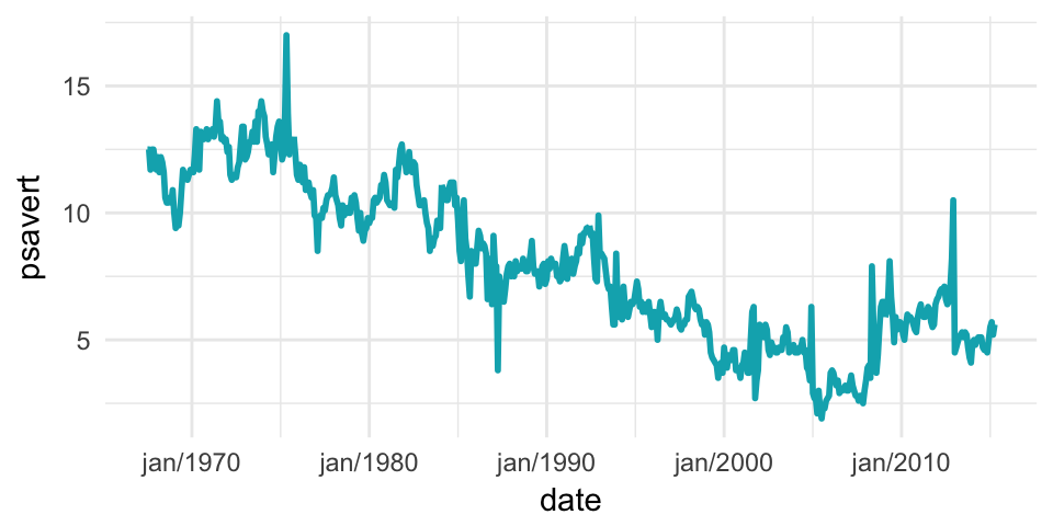
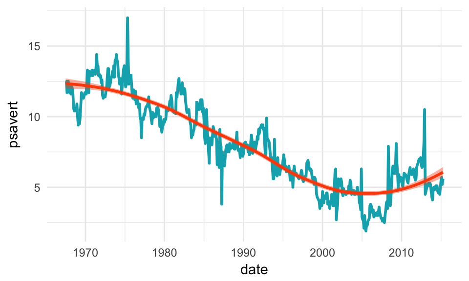
Add trend smoothed line
Key function: stat_smooth()
p + stat_smooth(
  color = "#FC4E07", fill = "#FC4E07",
  method = "loess"
  )
ggplot2 extensions for ts objects
The ggfortify package is an extension to ggplot2 that makes it easy to plot time series objects (Horikoshi and Tang 2017). It can handle the output of many time series packages, including: zoo::zooreg(), xts::xts(), timeSeries::timSeries(), tseries::irts(), forecast::forecast(), vars:vars().
Another interesting package is the ggpmisc package (Aphalo 2017), which provides two useful methods for time series object:
stat_peaks()finds at which x positions local y maxima are located, andstat_valleys()finds at which x positions local y minima are located.
Here, we’ll show how to easily:
- Visualize a time series object, using the data set
AirPassengers(monthly airline passenger numbers 1949-1960). - Identify shifts in mean and/or variance in a time series using the
changepointpackage. - Detect jumps in a data using the
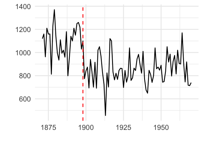
strucchangepackage and the data setNile(Measurements of the annual flow of the river Nile at Aswan). - Detect peaks and valleys using the
ggpmiscpackage and the data setlynx(Annual Canadian Lynx trappings 1821–1934).
First, install required R packages:
install.packages(
  c("ggfortify", "changepoint",
    "strucchange", "ggpmisc")
)
Then use the autoplot.ts() function to visualize time series objects, as follow:
library(ggfortify)
library(magrittr) # for piping %>%
# Plot ts objects
autoplot(AirPassengers)
# Identify change points in mean and variance
AirPassengers %>%
  changepoint:: cpt.meanvar() %>%  # Identify change points
  autoplot()
# Detect jump in a data
strucchange::breakpoints(Nile ~ 1) %>%
  autoplot()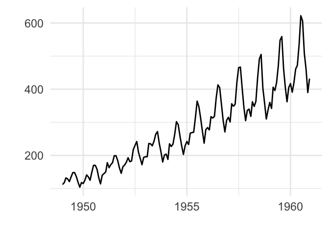

Detect peaks and valleys:
library(ggpmisc)
ggplot(lynx, as.numeric = FALSE) + geom_line() +
  stat_peaks(colour = "red") +
  stat_peaks(geom = "text", colour = "red",
             vjust = -0.5, x.label.fmt = "%Y") +
  stat_valleys(colour = "blue") +
  stat_valleys(geom = "text", colour = "blue", angle = 45,
               vjust = 1.5, hjust = 1,  x.label.fmt = "%Y")+
  ylim(-500, 7300)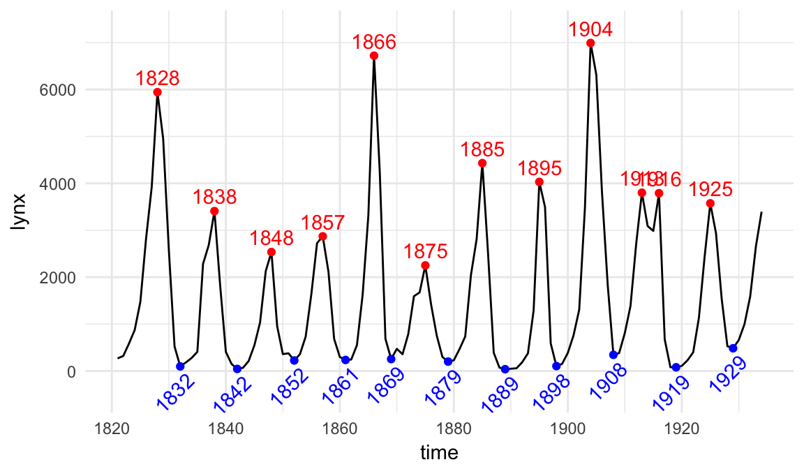
References
Aphalo, Pedro J. 2017. Ggpmisc: Miscellaneous Extensions to ’Ggplot2’. https://CRAN.R-project.org/package=ggpmisc.
Horikoshi, Masaaki, and Yuan Tang. 2017. Ggfortify: Data Visualization Tools for Statistical Analysis Results. https://CRAN.R-project.org/package=ggfortify.