


CA - Correspondence Analysis in R: Essentials
Correspondence analysis (CA) is an extension of principal component analysis (Chapter @ref(principal-component-analysis)) suited to explore relationships among qualitative variables (or categorical data). Like principal component analysis, it provides a solution for summarizing and visualizing data set in two-dimension plots.
Here, we describe the simple correspondence analysis, which is used to analyze frequencies formed by two categorical data, a data table known as contengency table. It provides factor scores (coordinates) for both row and column points of contingency table. These coordinates are used to visualize graphically the association between row and column elements in the contingency table.
When analyzing a two-way contingency table, a typical question is whether certain row elements are associated with some elements of column elements. Correspondence analysis is a geometric approach for visualizing the rows and columns of a two-way contingency table as points in a low-dimensional space, such that the positions of the row and column points are consistent with their associations in the table. The aim is to have a global view of the data that is useful for interpretation.
In the current chapter, we’ll show how to compute and interpret correspondence analysis using two R packages: i) FactoMineR for the analysis and ii) factoextra for data visualization. Additionally, we’ll show how to reveal the most important variables that explain the variations in a data set. We continue by explaining how to apply correspondence analysis using supplementary rows and columns. This is important, if you want to make predictions with CA. The last sections of this guide describe also how to filter CA result in order to keep only the most contributing variables. Finally, we’ll see how to deal with outliers.
Contents:
The Book:
Computation
R packages
Several functions from different packages are available in the R software for computing correspondence analysis:
- CA() [FactoMineR package],
- ca() [ca package],
- dudi.coa() [ade4 package],
- corresp() [MASS package],
- and epCA() [ExPosition package]
No matter what function you decide to use, you can easily extract and visualize the results of correspondence analysis using R functions provided in the factoextra R package.
Here, we’ll use FactoMineR (for the analysis) and factoextra (for ggplot2-based elegant visualization). To install the two packages, type this:
install.packages(c("FactoMineR", "factoextra"))Load the packages:
library("FactoMineR")
library("factoextra")
Data format
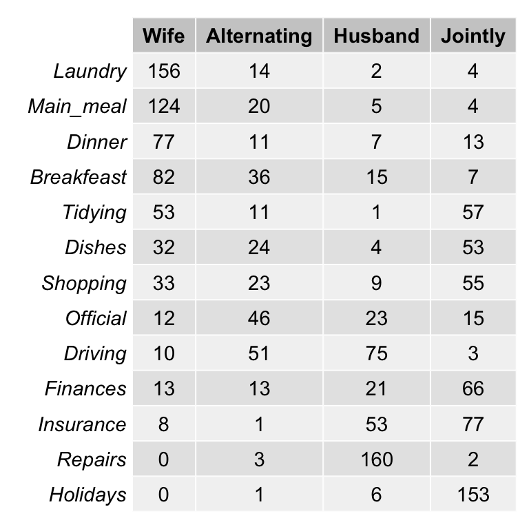
The data should be a contingency table. We’ll use the demo data sets housetasks available in the factoextra R package
data(housetasks)
# head(housetasks)
The data is a contingency table containing 13 housetasks and their repartition in the couple:
- rows are the different tasks
-
values are the frequencies of the tasks done :
- by the wife only
- alternatively
- by the husband only
- or jointly
The data is illustrated in the following image:
Graph of contingency tables and chi-square test
The above contingency table is not very large. Therefore, it’s easy to visually inspect and interpret row and column profiles:
- It’s evident that, the housetasks -
Laundry, Main_Meal and Dinner- are more frequently done by the “Wife”. - Repairs and driving are dominantly done by the husband
- Holidays are frequently associated with the column “jointly”
Exploratory data analysis and visualization of contingency tables have been covered in our previous article: Chi-Square test of independence in R. Briefly, contingency table can be visualized using the functions balloonplot() [gplots package] and mosaicplot() [garphics package]:
library("gplots")
# 1. convert the data as a table
dt <- as.table(as.matrix(housetasks))
# 2. Graph
balloonplot(t(dt), main ="housetasks", xlab ="", ylab="",
            label = FALSE, show.margins = FALSE)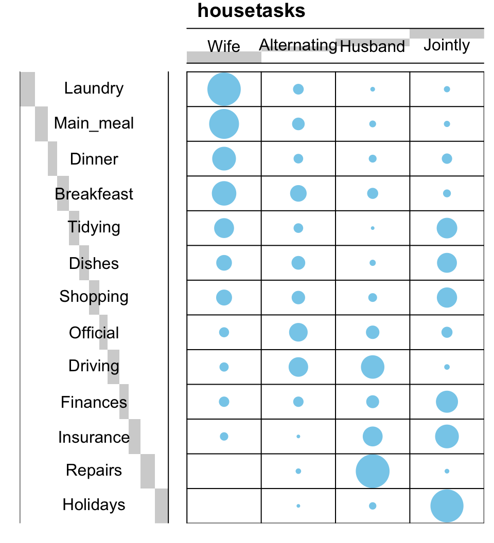
Note that, row and column sums are printed by default in the bottom and right margins, respectively. These values are hidden, in the above plot, using the argument show.margins = FALSE.
For a small contingency table, you can use the Chi-square test to evaluate whether there is a significant dependence between row and column categories:
chisq <- chisq.test(housetasks)
chisq
##
## Pearson's Chi-squared test
##
## data: housetasks
## X-squared = 2000, df = 40, p-value <2e-16
In our example, the row and the column variables are statistically significantly associated (p-value = r chisq$p.value).
R code to compute CA
The function CA()[FactoMiner package] can be used. A simplified format is :
CA(X, ncp = 5, graph = TRUE)X: a data frame (contingency table)ncp: number of dimensions kept in the final results.graph: a logical value. If TRUE a graph is displayed.
To compute correspondence analysis, type this:
library("FactoMineR")
res.ca <- CA(housetasks, graph = FALSE)
The output of the function CA() is a list including :
print(res.ca)## **Results of the Correspondence Analysis (CA)**
## The row variable has 13 categories; the column variable has 4 categories
## The chi square of independence between the two variables is equal to 1944 (p-value = 0 ).
## *The results are available in the following objects:
##
## name description
## 1 "$eig" "eigenvalues"
## 2 "$col" "results for the columns"
## 3 "$col$coord" "coord. for the columns"
## 4 "$col$cos2" "cos2 for the columns"
## 5 "$col$contrib" "contributions of the columns"
## 6 "$row" "results for the rows"
## 7 "$row$coord" "coord. for the rows"
## 8 "$row$cos2" "cos2 for the rows"
## 9 "$row$contrib" "contributions of the rows"
## 10 "$call" "summary called parameters"
## 11 "$call$marge.col" "weights of the columns"
## 12 "$call$marge.row" "weights of the rows"The object that is created using the function CA() contains many information found in many different lists and matrices. These values are described in the next section.
Visualization and interpretation
We’ll use the following functions [in factoextra] to help in the interpretation and the visualization of the correspondence analysis:
get_eigenvalue(res.ca): Extract the eigenvalues/variances retained by each dimension (axis)fviz_eig(res.ca): Visualize the eigenvaluesget_ca_row(res.ca),get_ca_col(res.ca): Extract the results for rows and columns, respectively.fviz_ca_row(res.ca),fviz_ca_col(res.ca): Visualize the results for rows and columns, respectively.fviz_ca_biplot(res.ca): Make a biplot of rows and columns.
In the next sections, we’ll illustrate each of these functions.
Statistical significance
To interpret correspondence analysis, the first step is to evaluate whether there is a significant dependency between the rows and columns.
A rigorous method is to use the chi-square statistic for examining the association between row and column variables. This appears at the top of the report generated by the function summary(res.ca) orprint(res.ca), see section @ref(r-code-to-compute-ca). A high chi-square statistic means strong link between row and column variables.
In our example, the association is highly significant (chi-square: 1944.456, p = 0).
# Chi-square statistics
chi2 <- 1944.456
# Degree of freedom
df <- (nrow(housetasks) - 1) * (ncol(housetasks) - 1)
# P-value
pval <- pchisq(chi2, df = df, lower.tail = FALSE)
pval
## [1] 0Eigenvalues / Variances
Recall that, we examine the eigenvalues to determine the number of axis to be considered. The eigenvalues and the proportion of variances retained by the different axes can be extracted using the function get_eigenvalue() [factoextra package]. Eigenvalues are large for the first axis and small for the subsequent axis.
library("factoextra")
eig.val <- get_eigenvalue(res.ca)
eig.val
## eigenvalue variance.percent cumulative.variance.percent
## Dim.1 0.543 48.7 48.7
## Dim.2 0.445 39.9 88.6
## Dim.3 0.127 11.4 100.0Eigenvalues correspond to the amount of information retained by each axis. Dimensions are ordered decreasingly and listed according to the amount of variance explained in the solution. Dimension 1 explains the most variance in the solution, followed by dimension 2 and so on.
The cumulative percentage explained is obtained by adding the successive proportions of variation explained to obtain the running total. For instance, 48.69% plus 39.91% equals 88.6%, and so forth. Therefore, about 88.6% of the variation is explained by the first two dimensions.
Eigenvalues can be used to determine the number of axes to retain. There is no “rule of thumb” to choose the number of dimensions to keep for the data interpretation. It depends on the research question and the researcher’s need. For example, if you are satisfied with 80% of the total variances explained then use the number of dimensions necessary to achieve that.
Note that, a good dimension reduction is achieved when the the first few dimensions account for a large proportion of the variability.
In our analysis, the first two axes explain 88.6% of the variation. This is an acceptably large percentage.
An alternative method to determine the number of dimensions is to look at a Scree Plot, which is the plot of eigenvalues/variances ordered from largest to the smallest. The number of component is determined at the point, beyond which the remaining eigenvalues are all relatively small and of comparable size.
The scree plot can be produced using the function fviz_eig() or fviz_screeplot() [factoextra package].
fviz_screeplot(res.ca, addlabels = TRUE, ylim = c(0, 50))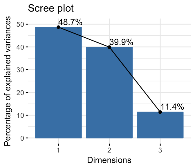
The point at which the scree plot shows a bend (so called “elbow”) can be considered as indicating an optimal dimensionality.
It’s also possible to calculate an average eigenvalue above which the axis should be kept in the solution.
Our data contains 13 rows and 4 columns.
If the data were random, the expected value of the eigenvalue for each axis would be 1/(nrow(housetasks)-1) = 1/12 = 8.33% in terms of rows.
Likewise, the average axis should account for 1/(ncol(housetasks)-1) = 1/3 = 33.33% in terms of the 4 columns.
According to (M. T. Bendixen 1995):
Any axis with a contribution larger than the maximum of these two percentages should be considered as important and included in the solution for the interpretation of the data.
The R code below, draws the scree plot with a red dashed line specifying the average eigenvalue:
fviz_screeplot(res.ca) +
 geom_hline(yintercept=33.33, linetype=2, color="red")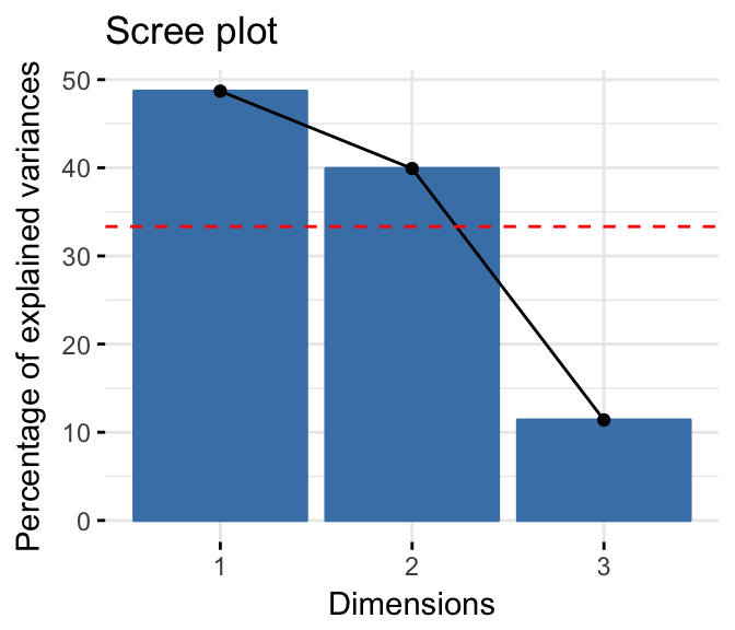
According to the graph above, only dimensions 1 and 2 should be used in the solution. The dimension 3 explains only 11.4% of the total inertia which is below the average eigeinvalue (33.33%) and too little to be kept for further analysis.
Note that, you can use more than 2 dimensions. However, the supplementary dimensions are unlikely to contribute significantly to the interpretation of nature of the association between the rows and columns.
Dimensions 1 and 2 explain approximately 48.7% and 39.9% of the total inertia respectively. This corresponds to a cumulative total of 88.6% of total inertia retained by the 2 dimensions. The higher the retention, the more subtlety in the original data is retained in the low-dimensional solution (M. Bendixen 2003).
Biplot
The function fviz_ca_biplot() [factoextra package] can be used to draw the biplot of rows and columns variables.
# repel= TRUE to avoid text overlapping (slow if many point)
fviz_ca_biplot(res.ca, repel = TRUE)
The graph above is called symetric plot and shows a global pattern within the data. Rows are represented by blue points and columns by red triangles.
The distance between any row points or column points gives a measure of their similarity (or dissimilarity). Row points with similar profile are closed on the factor map. The same holds true for column points.
This graph shows that :
- housetasks such as dinner, breakfeast, laundry are done more often by the wife
- Driving and repairs are done by the husband
- ……
-
Symetric plot represents the row and column profiles simultaneously in a common space. In this case, only the distance between row points or the distance between column points can be really interpreted.
-
The distance between any row and column items is not meaningful! You can only make a general statements about the observed pattern.
-
In order to interpret the distance between column and row points, the column profiles must be presented in row space or vice-versa. This type of map is called asymmetric biplot and is discussed at the end of this article.
The next step for the interpretation is to determine which row and column variables contribute the most in the definition of the different dimensions retained in the model.
Graph of row variables
Results
The function get_ca_row() [in factoextra] is used to extract the results for row variables. This function returns a list containing the coordinates, the cos2, the contribution and the inertia of row variables:
row <- get_ca_row(res.ca)
row
## Correspondence Analysis - Results for rows
## ===================================================
## Name Description
## 1 "$coord" "Coordinates for the rows"
## 2 "$cos2" "Cos2 for the rows"
## 3 "$contrib" "contributions of the rows"
## 4 "$inertia" "Inertia of the rows"The components of the get_ca_row() function can be used in the plot of rows as follow:
row$coord: coordinates of each row point in each dimension (1, 2 and 3). Used to create the scatter plot.row$cos2: quality of representation of rows.var$contrib: contribution of rows (in %) to the definition of the dimensions.
Note that, it’s possible to plot row points and to color them according to either i) their quality on the factor map (cos2) or ii) their contribution values to the definition of dimensions (contrib).
The different components can be accessed as follow:
# Coordinates
head(row$coord)
# Cos2: quality on the factore map
head(row$cos2)
# Contributions to the principal components
head(row$contrib)
In this section, we describe how to visualize row points only. Next, we highlight rows according to either i) their quality of representation on the factor map or ii) their contributions to the dimensions.
Coordinates of row points
The R code below displays the coordinates of each row point in each dimension (1, 2 and 3):
head(row$coord)## Dim 1 Dim 2 Dim 3
## Laundry -0.992 0.495 -0.3167
## Main_meal -0.876 0.490 -0.1641
## Dinner -0.693 0.308 -0.2074
## Breakfeast -0.509 0.453 0.2204
## Tidying -0.394 -0.434 -0.0942
## Dishes -0.189 -0.442 0.2669Use the function fviz_ca_row() [in factoextra] to visualize only row points:
fviz_ca_row(res.ca, repel = TRUE)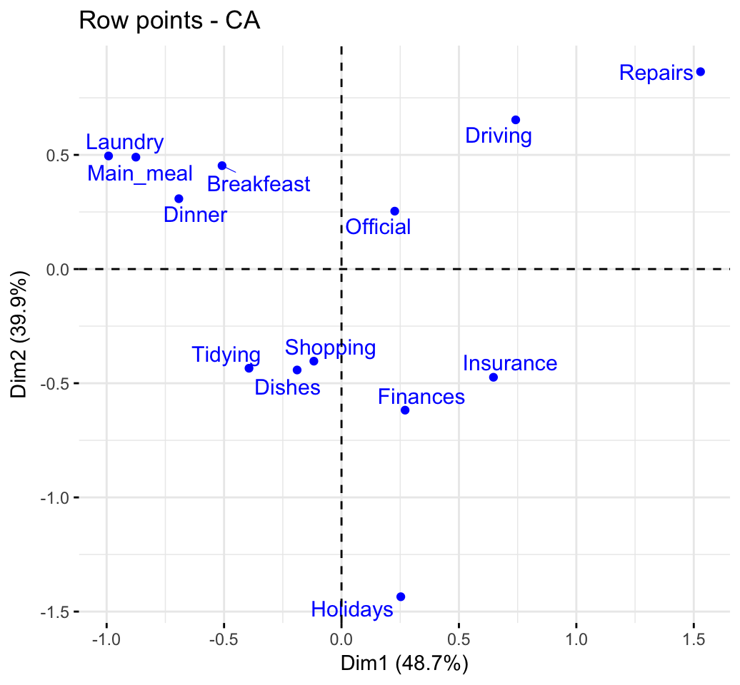
It’s possible to change the color and the shape of the row points using the arguments col.row and shape.row as follow:
fviz_ca_row(res.ca, col.row="steelblue", shape.row = 15)The plot above shows the relationships between row points:
- Rows with a similar profile are grouped together.
- Negatively correlated rows are positioned on opposite sides of the plot origin (opposed quadrants).
- The distance between row points and the origin measures the quality of the row points on the factor map. Row points that are away from the origin are well represented on the factor map.
Quality of representation of rows
The result of the analysis shows that, the contingency table has been successfully represented in low dimension space using correspondence analysis. The two dimensions 1 and 2 are sufficient to retain 88.6% of the total inertia (variation) contained in the data.
However, not all the points are equally well displayed in the two dimensions.
Recall that, the quality of representation of the rows on the factor map is called the squared cosine (cos2) or the squared correlations.
The cos2 measures the degree of association between rows/columns and a particular axis. The cos2 of row points can be extracted as follow:
head(row$cos2, 4)## Dim 1 Dim 2 Dim 3
## Laundry 0.740 0.185 0.0755
## Main_meal 0.742 0.232 0.0260
## Dinner 0.777 0.154 0.0697
## Breakfeast 0.505 0.400 0.0948The values of the cos2 are comprised between 0 and 1. The sum of the cos2 for rows on all the CA dimensions is equal to one.
The quality of representation of a row or column in n dimensions is simply the sum of the squared cosine of that row or column over the n dimensions.
If a row item is well represented by two dimensions, the sum of the cos2 is closed to one. For some of the row items, more than 2 dimensions are required to perfectly represent the data.
It’s possible to color row points by their cos2 values using the argument col.row = "cos2". This produces a gradient colors, which can be customized using the argument gradient.cols. For instance, gradient.cols = c("white", "blue", "red") means that:
- variables with low cos2 values will be colored in “white”
- variables with mid cos2 values will be colored in “blue”
- variables with high cos2 values will be colored in red
# Color by cos2 values: quality on the factor map
fviz_ca_row(res.ca, col.row = "cos2",
             gradient.cols = c("#00AFBB", "#E7B800", "#FC4E07"),
             repel = TRUE)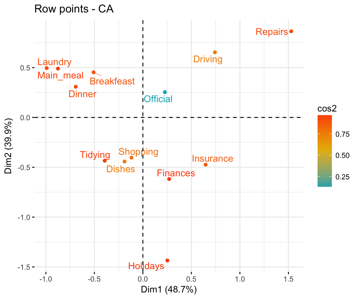
Note that, it’s also possible to change the transparency of the row points according to their cos2 values using the option alpha.row = "cos2". For example, type this:
# Change the transparency by cos2 values
fviz_ca_row(res.ca, alpha.row="cos2")
You can visualize the cos2 of row points on all the dimensions using the corrplot package:
library("corrplot")
corrplot(row$cos2, is.corr=FALSE)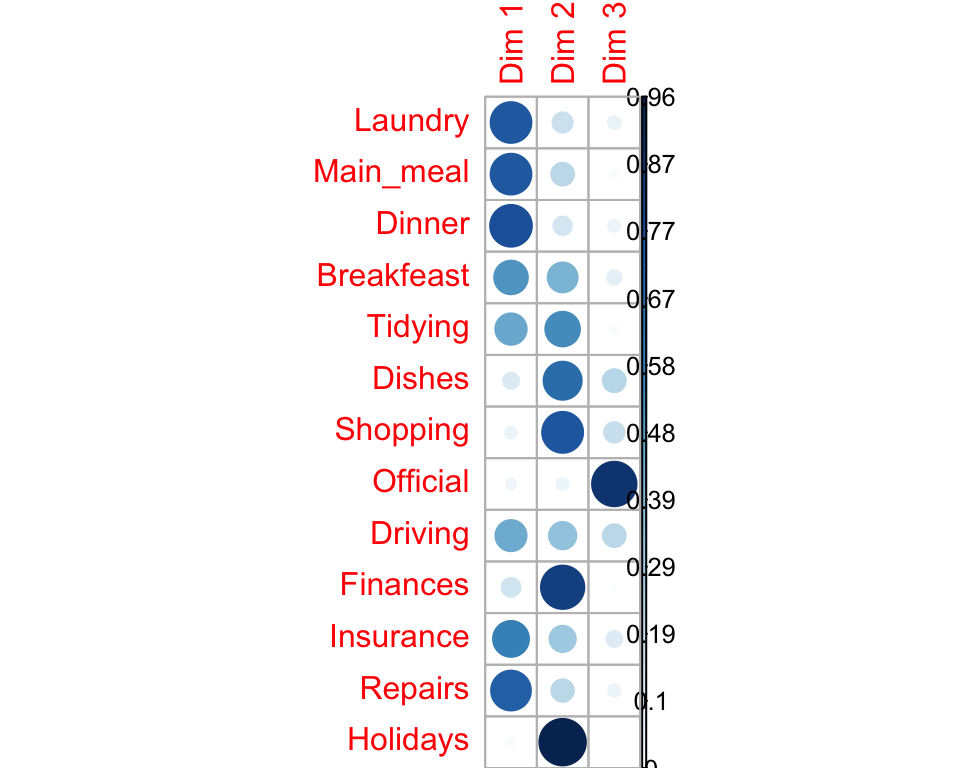
It’s also possible to create a bar plot of rows cos2 using the function fviz_cos2() [in factoextra]:
# Cos2 of rows on Dim.1 and Dim.2
fviz_cos2(res.ca, choice = "row", axes = 1:2)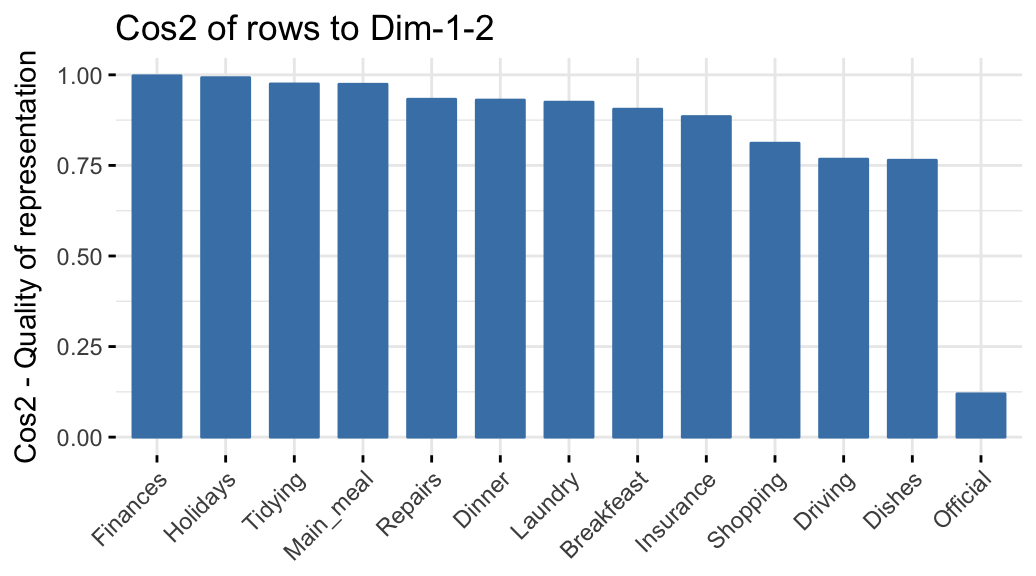
Note that, all row points except Official are well represented by the first two dimensions. This implies that the position of the point corresponding the item Official on the scatter plot should be interpreted with some caution. A higher dimensional solution is probably necessary for the item Official.
Contributions of rows to the dimensions
The contribution of rows (in %) to the definition of the dimensions can be extracted as follow:
head(row$contrib)## Dim 1 Dim 2 Dim 3
## Laundry 18.287 5.56 7.968
## Main_meal 12.389 4.74 1.859
## Dinner 5.471 1.32 2.097
## Breakfeast 3.825 3.70 3.069
## Tidying 1.998 2.97 0.489
## Dishes 0.426 2.84 3.634The row variables with the larger value, contribute the most to the definition of the dimensions.
- Rows that contribute the most to Dim.1 and Dim.2 are the most important in explaining the variability in the data set.
- Rows that do not contribute much to any dimension or that contribute to the last dimensions are less important.
It’s possible to use the function corrplot() [corrplot package] to highlight the most contributing row points for each dimension:
library("corrplot")
corrplot(row$contrib, is.corr=FALSE) 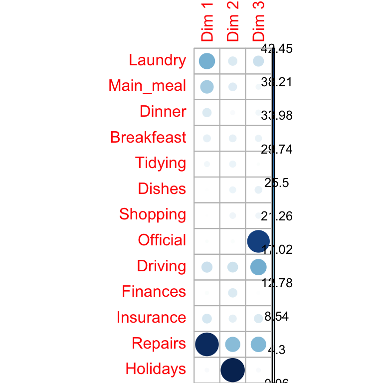
The function fviz_contrib() [factoextra package] can be used to draw a bar plot of row contributions. If your data contains many rows, you can decide to show only the top contributing rows. The R code below shows the top 10 rows contributing to the dimensions:
# Contributions of rows to dimension 1
fviz_contrib(res.ca, choice = "row", axes = 1, top = 10)
# Contributions of rows to dimension 2
fviz_contrib(res.ca, choice = "row", axes = 2, top = 10)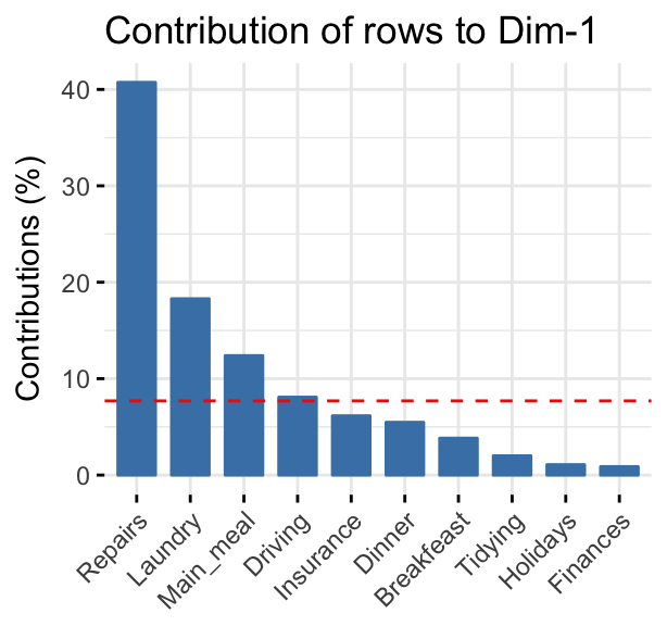
The total contribution to dimension 1 and 2 can be obtained as follow:
# Total contribution to dimension 1 and 2
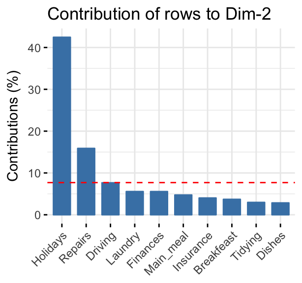
fviz_contrib(res.ca, choice = "row", axes = 1:2, top = 10)The red dashed line on the graph above indicates the expected average value, If the contributions were uniform. The calculation of the expected contribution value, under null hypothesis, has been detailed in the principal component analysis chapter (@ref(principal-component-analysis)).
It can be seen that:
- the row items
Repairs, Laundry, Main_meal and Drivingare the most important in the definition of the first dimension. - the row items
Holidays and Repairscontribute the most to the dimension 2.
The most important (or, contributing) row points can be highlighted on the scatter plot as follow:
fviz_ca_row(res.ca, col.row = "contrib",
             gradient.cols = c("#00AFBB", "#E7B800", "#FC4E07"),
             repel = TRUE)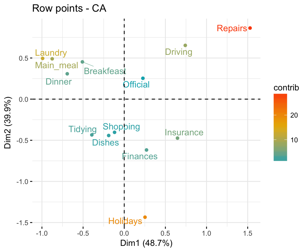
The scatter plot gives an idea of what pole of the dimensions the row categories are actually contributing to. It is evident that row categories Repair and Driving have an important contribution to the positive pole of the first dimension, while the categories Laundry and Main_meal have a major contribution to the negative pole of the first dimension; etc, ….
In other words, dimension 1 is mainly defined by the opposition of Repair and Driving (positive pole), and Laundry and Main_meal (negative pole).
Note that, it’s also possible to control the transparency of row points according to their contribution values using the option alpha.row = "contrib". For example, type this:
# Change the transparency by contrib values
fviz_ca_row(res.ca, alpha.row="contrib",
             repel = TRUE)
Graph of column variables
Results
The function get_ca_col() [in factoextra] is used to extract the results for column variables. This function returns a list containing the coordinates, the cos2, the contribution and the inertia of columns variables:
col <- get_ca_col(res.ca)
col
## Correspondence Analysis - Results for columns
## ===================================================
## Name Description
## 1 "$coord" "Coordinates for the columns"
## 2 "$cos2" "Cos2 for the columns"
## 3 "$contrib" "contributions of the columns"
## 4 "$inertia" "Inertia of the columns"The result for columns gives the same information as described for rows. For this reason, we’ll just displayed the result for columns in this section with only a very brief comment.
To get access to the different components, use this:
# Coordinates of column points
head(col$coord)
# Quality of representation
head(col$cos2)
# Contributions
head(col$contrib)
Plots: quality and contribution
The fviz_ca_col() is used to produce the graph of column points. To create a simple plot, type this:
fviz_ca_col(res.ca)Like row points, it’s also possible to color column points by their cos2 values:
fviz_ca_col(res.ca, col.col = "cos2",
             gradient.cols = c("#00AFBB", "#E7B800", "#FC4E07"),
             repel = TRUE)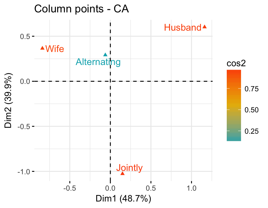
The R code below creates a barplot of columns cos2:
fviz_cos2(res.ca, choice = "col", axes = 1:2)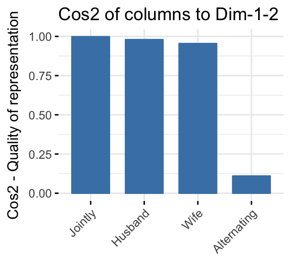
Recall that, the value of the cos2 is between 0 and 1. A cos2 closed to 1 corresponds to a column/row variables that are well represented on the factor map.
Note that, only the column item Alternating is not very well displayed on the first two dimensions. The position of this item must be interpreted with caution in the space formed by dimensions 1 and 2.
To visualize the contribution of rows to the first two dimensions, type this:
fviz_contrib(res.ca, choice = "col", axes = 1:2)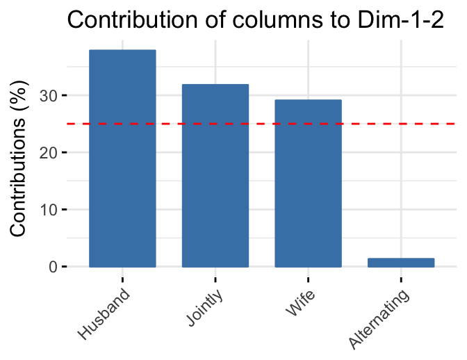
Biplot options
Biplot is a graphical display of rows and columns in 2 or 3 dimensions. We have already described how to create CA biplots in section @ref(ca-biplot). Here, we’ll describe different types of CA biplots.
Symmetric biplot
As mentioned above, the standard plot of correspondence analysis is a symmetric biplot in which both rows (blue points) and columns (red triangles) are represented in the same space using the principal coordinates. These coordinates represent the row and column profiles. In this case, only the distance between row points or the distance between column points can be really interpreted.
With symmetric plot, the inter-distance between rows and columns can’t be interpreted. Only a general statements can be made about the pattern.
fviz_ca_biplot(res.ca, repel = TRUE)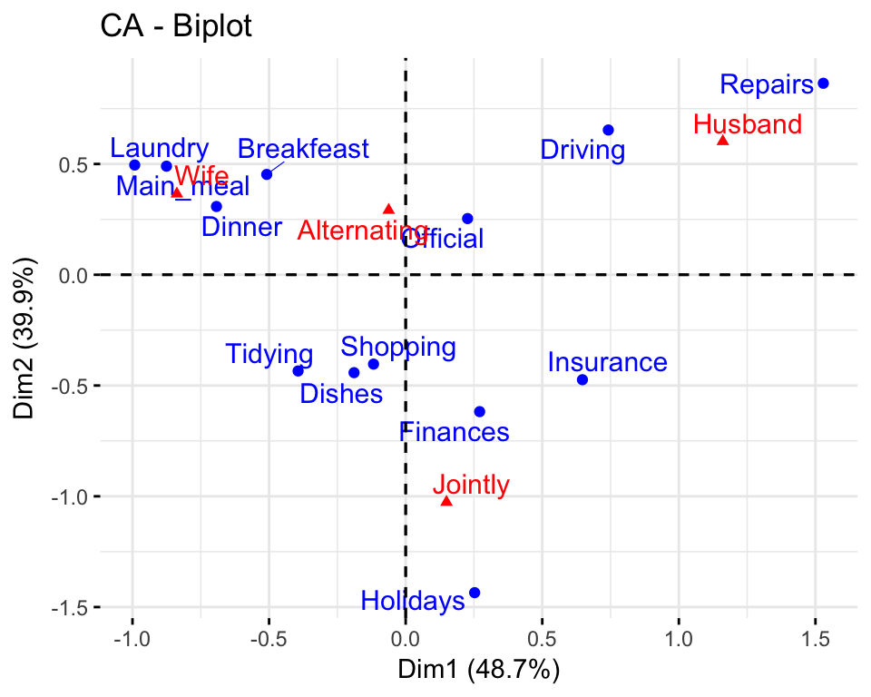
Note that, in order to interpret the distance between column points and row points, the simplest way is to make an asymmetric plot. This means that, the column profiles must be presented in row space or vice-versa.
Asymmetric biplot
To make an asymetric biplot, rows (or columns) points are plotted from the standard co-ordinates (S) and the profiles of the columns (or the rows) are plotted from the principale coordinates (P) (M. Bendixen 2003).
For a given axis, the standard and principle co-ordinates are related as follows:
P = sqrt(eigenvalue) X S
P: the principal coordinate of a row (or a column) on the axiseigenvalue: the eigenvalue of the axis
Depending on the situation, other types of display can be set using the argument map (Nenadic and Greenacre 2007) in the function fviz_ca_biplot() [in factoextra].
The allowed options for the argument map are:
"rowprincipal"or"colprincipal"- these are the so-calledasymmetric biplots, with either rows in principal coordinates and columns in standard coordinates, or vice versa (also known as row-metric-preserving or column-metric-preserving, respectively).
"rowprincipal": columns are represented in row space"colprincipal": rows are represented in column space
"symbiplot"- both rows and columns are scaled to have variances equal to the singular values (square roots of eigenvalues), which gives asymmetric biplotbut does not preserve row or column metrics."rowgab"or"colgab":Asymetric mapsproposed by Gabriel & Odoroff (Gabriel and Odoroff 1990):
"rowgab": rows in principal coordinates and columns in standard coordinates multiplied by the mass."colgab": columns in principal coordinates and rows in standard coordinates multiplied by the mass.
"rowgreen"or"colgreen": The so-calledcontribution biplotsshowing visually the most contributing points (Greenacre 2006b).
"rowgreen": rows in principal coordinates and columns in standard coordinates multiplied by square root of the mass."colgreen": columns in principal coordinates and rows in standard coordinates multiplied by the square root of the mass.
The R code below draws a standard asymetric biplot:
fviz_ca_biplot(res.ca,
               map ="rowprincipal", arrow = c(TRUE, TRUE),
               repel = TRUE)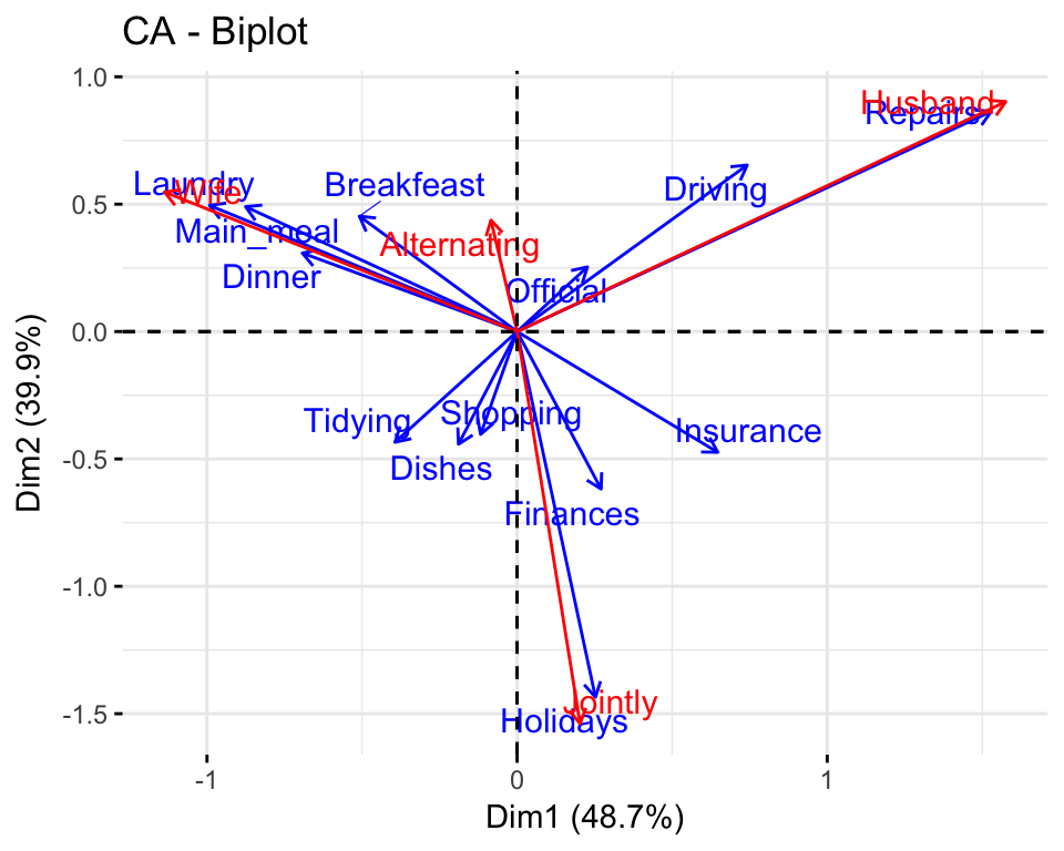
We used, the argument arrows, which is a vector of two logicals specifying if the plot should contain points (FALSE, default) or arrows (TRUE). The first value sets the rows and the second value sets the columns.
If the angle between two arrows is acute, then their is a strong association between the corresponding row and column.
To interpret the distance between rows and and a column you should perpendicularly project row points on the column arrow.
Contribution biplot
In the standard symmetric biplot (mentioned in the previous section), it’s difficult to know the most contributing points to the solution of the CA.
Michael Greenacre proposed a new scaling displayed (called contribution biplot) which incorporates the contribution of points (M. Greenacre 2013). In this display, points that contribute very little to the solution, are close to the center of the biplot and are relatively unimportant to the interpretation.
A contribution biplot can be drawn using the argument map = “rowgreen” or map = “colgreen”.
Firstly, you have to decide whether to analyse the contributions of rows or columns to the definition of the axes.
In our example we’ll interpret the contribution of rows to the axes. The argument map ="colgreen" is used. In this case, recall that columns are in principal coordinates and rows in standard coordinates multiplied by the square root of the mass. For a given row, the square of the new coordinate on an axis i is exactly the contribution of this row to the inertia of the axis i.
fviz_ca_biplot(res.ca, map ="colgreen", arrow = c(TRUE, FALSE),
               repel = TRUE)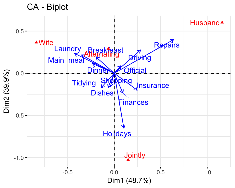
In the graph above, the position of the column profile points is unchanged relative to that in the conventional biplot. However, the distances of the row points from the plot origin are related to their contributions to the two-dimensional factor map.
The closer an arrow is (in terms of angular distance) to an axis the greater is the contribution of the row category on that axis relative to the other axis. If the arrow is halfway between the two, its row category contributes to the two axes to the same extent.
-
It is evident that row category Repairs have an important contribution to the positive pole of the first dimension, while the categories Laundry and Main_meal have a major contribution to the negative pole of the first dimension;
-
Dimension 2 is mainly defined by the row category Holidays.
-
The row category Driving contributes to the two axes to the same extent.
Dimension description
To easily identify row and column points that are the most associated with the principal dimensions, you can use the function dimdesc() [in FactoMineR]. Row/column variables are sorted by their coordinates in the dimdesc() output.
# Dimension description
res.desc <- dimdesc(res.ca, axes = c(1,2))
Description of dimension 1:
# Description of dimension 1 by row points
head(res.desc[[1]]$row, 4)
## coord
## Laundry -0.992
## Main_meal -0.876
## Dinner -0.693
## Breakfeast -0.509# Description of dimension 1 by column points
head(res.desc[[1]]$col, 4)## coord
## Wife -0.8376
## Alternating -0.0622
## Jointly 0.1494
## Husband 1.1609Description of dimension 2:
# Description of dimension 2 by row points
res.desc[[2]]$row
# Description of dimension 1 by column points
res.desc[[2]]$col
Supplementary elements
Data format
We’ll use the data set children [in FactoMineR package]. It contains 18 rows and 8 columns:
data(children)
# head(children)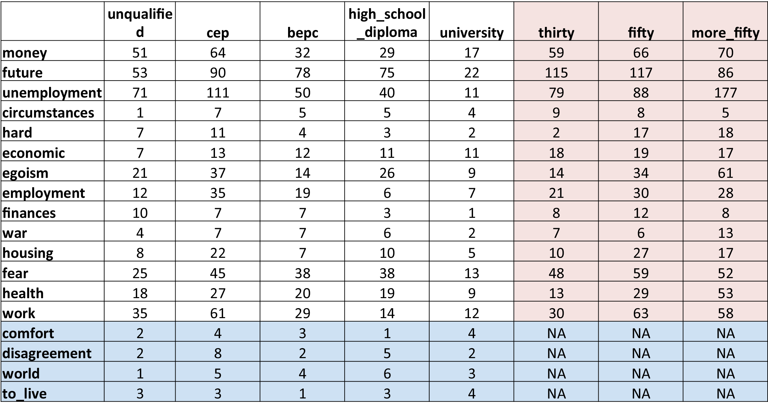
The data used here is a contingency table describing the answers given by different categories of people to the following question: What are the reasons that can make hesitate a woman or a couple to have children?
Only some of the rows and columns will be used to perform the correspondence analysis (CA). The coordinates of the remaining (supplementary) rows/columns on the factor map will be predicted after the CA.
In CA terminology, our data contains :
- Active rows (rows 1:14) : Rows that are used during the correspondence analysis.
- Supplementary rows (row.sup 15:18) : The coordinates of these rows will be predicted using the CA information and parameters obtained with active rows/columns
- Active columns (columns 1:5) : Columns that are used for the correspondence analysis.
- Supplementary columns (col.sup 6:8) : As supplementary rows, the coordinates of these columns will be predicted also.
Specification in CA
As mentioned above, supplementary rows and columns are not used for the definition of the principal dimensions. Their coordinates are predicted using only the information provided by the performed CA on active rows/columns.
To specify supplementary rows/columns, the function CA()[in FactoMineR] can be used as follow :
CA(X,  ncp = 5, row.sup = NULL, col.sup = NULL,
graph = TRUE)X: a data frame (contingency table)row.sup: a numeric vector specifying the indexes of the supplementary rowscol.sup: a numeric vector specifying the indexes of the supplementary columnsncp: number of dimensions kept in the final results.graph: a logical value. If TRUE a graph is displayed.
For example, type this:
res.ca <- CA (children, row.sup = 15:18, col.sup = 6:8,
              graph = FALSE)
Biplot of rows and columns
fviz_ca_biplot(res.ca, repel = TRUE)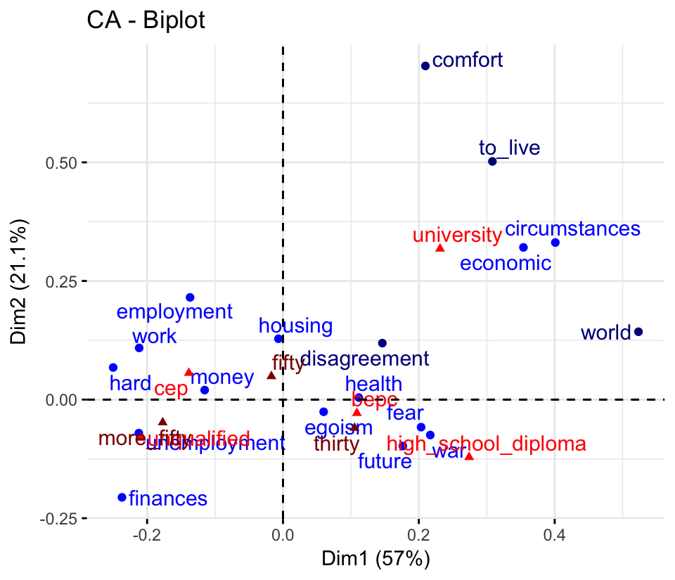
- Active rows are in blue
- Supplementary rows are in darkblue
- Columns are in red
- Supplementary columns are in darkred
It’s also possible to hide supplementary rows and columns using the argument invisible:
fviz_ca_biplot(res.ca, repel = TRUE,
               invisible = c("row.sup", "col.sup"))
Supplementary rows
Predicted results (coordinates and cos2) for the supplementary rows:
res.ca$row.sup## $coord
## Dim 1 Dim 2 Dim 3 Dim 4
## comfort 0.210 0.703 0.0711 0.307
## disagreement 0.146 0.119 0.1711 -0.313
## world 0.523 0.143 0.0840 -0.106
## to_live 0.308 0.502 0.5209 0.256
##
## $cos2
## Dim 1 Dim 2 Dim 3 Dim 4
## comfort 0.0689 0.7752 0.00793 0.1479
## disagreement 0.1313 0.0869 0.17965 0.6021
## world 0.8759 0.0654 0.02256 0.0362
## to_live 0.1390 0.3685 0.39683 0.0956Plot of active and supplementary row points:
fviz_ca_row(res.ca, repel = TRUE) 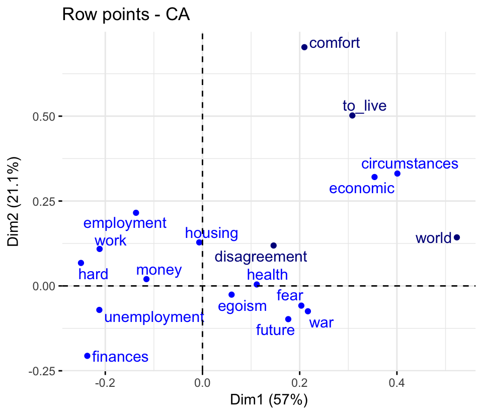
Supplementary rows are shown in darkblue color.
Supplementary columns
Predicted results (coordinates and cos2) for the supplementary columns:
res.ca$col.sup## $coord
## Dim 1 Dim 2 Dim 3 Dim 4
## thirty 0.1054 -0.0597 -0.1032 0.0698
## fifty -0.0171 0.0491 -0.0157 -0.0131
## more_fifty -0.1771 -0.0481 0.1008 -0.0852
##
## $cos2
## Dim 1 Dim 2 Dim 3 Dim 4
## thirty 0.1376 0.0441 0.13191 0.06028
## fifty 0.0109 0.0899 0.00919 0.00637
## more_fifty 0.2861 0.0211 0.09267 0.06620Plot of active and supplementary column points:
fviz_ca_col(res.ca, repel = TRUE) 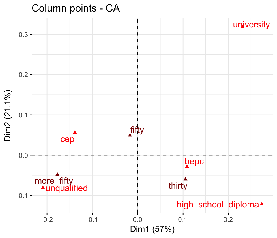
Supplementary columns are shown in darkred.
Filtering results
If you have many row/column variables, it’s possible to visualize only some of them using the arguments select.row and select.col.
select.col, select.row: a selection of columns/rows to be drawn. Allowed values are NULL or a list containing the arguments name, cos2 or contrib:
name: is a character vector containing column/row names to be drawncos2: if cos2 is in [0, 1], ex: 0.6, then columns/rows with a cos2 > 0.6 are drawnif cos2 > 1, ex: 5, then the top 5 active columns/rows and top 5 supplementary columns/rows with the highest cos2 are drawncontrib: if contrib > 1, ex: 5, then the top 5 columns/rows with the highest contributions are drawn
# Visualize rows with cos2 >= 0.8
fviz_ca_row(res.ca, select.row = list(cos2 = 0.8))
# Top 5 active rows and 5 suppl. rows with the highest cos2
fviz_ca_row(res.ca, select.row = list(cos2 = 5))
# Select by names
name <- list(name = c("employment", "fear", "future"))
fviz_ca_row(res.ca, select.row = name)
# Top 5 contributing rows and columns
fviz_ca_biplot(res.ca, select.row = list(contrib = 5),
               select.col = list(contrib = 5)) +
  theme_minimal()
Outliers
If one or more “outliers” are present in the contingency table, they can dominate the interpretation the axes (M. Bendixen 2003).
Outliers are points that have high absolute co-ordinate values and high contributions. They are represented, on the graph, very far from the centroïd. In this case, the remaining row/column points tend to be tightly clustered in the graph which become difficult to interpret.
In the CA output, the coordinates of row/column points represent the number of standard deviations the row/column is away from the barycentre (M. Bendixen 2003).
According to (M. Bendixen 2003):
Outliers are points that are are at least one standard deviation away from the barycentre. They contribute also, significantly to the interpretation to one pole of an axis.
There are no apparent outliers in our data. If there were outliers in the data, they must be suppressed or treated as supplementary points when re-running the correspondence analysis.
Exporting results
Export plots to PDF/PNG files
To save the different graphs into pdf or png files, we start by creating the plot of interest as an R object:
# Scree plot
scree.plot <- fviz_eig(res.ca)
# Biplot of row and column variables
biplot.ca <- fviz_ca_biplot(res.ca)
Next, the plots can be exported into a single pdf file as follow (one plot per page):
library(ggpubr)
ggexport(plotlist = list(scree.plot, biplot.ca),
         filename = "CA.pdf")
More options at: Chapter @ref(principal-component-analysis) (section: Exporting results).
Export results to txt/csv files
Easy to use R function: write.infile() [in FactoMineR] package:
# Export into a TXT file
write.infile(res.ca, "ca.txt", sep = "\t")
# Export into a CSV file
write.infile(res.ca, "ca.csv", sep = ";")
Summary
In conclusion, we described how to perform and interpret correspondence analysis (CA). We computed CA using the CA() function [FactoMineR package]. Next, we used the factoextra R package to produce ggplot2-based visualization of the CA results.
Other functions [packages] to compute CA in R, include:
- Using
dudi.coa()[ade4]
library("ade4")
res.ca <- dudi.coa(housetasks, scannf = FALSE, nf = 5)
Read more: http://www.sthda.com/english/wiki/ca-using-ade4
- Using
ca()[ca]
library(ca)
res.ca <- ca(housetasks)
Read more: http://www.sthda.com/english/wiki/ca-using-ca-package
- Using
corresp()[MASS]
library(MASS)
res.ca <- corresp(housetasks, nf = 3)
Read more: http://www.sthda.com/english/wiki/ca-using-mass
- Using
epCA()[ExPosition]
library("ExPosition")
res.ca <- epCA(housetasks, graph = FALSE)
No matter what functions you decide to use, in the list above, the factoextra package can handle the output.
fviz_eig(res.ca)     # Scree plot
fviz_ca_biplot(res.ca) # Biplot of rows and columns
Further reading
For the mathematical background behind CA, refer to the following video courses, articles and books:
- Correspondence Analysis Course Using FactoMineR (Video courses). https://goo.gl/Hhh6hC
- Exploratory Multivariate Analysis by Example Using R (book) (Husson, Le, and Pagès 2017).
- Principal component analysis (article). (Abdi and Williams 2010). https://goo.gl/1Vtwq1.
- Correspondence analysis basics (blog post). https://goo.gl/Xyk8KT.
- Understanding the Math of Correspondence Analysis with Examples in R (blog post). https://goo.gl/H9hxf9
References
Abdi, Hervé, and Lynne J. Williams. 2010. “Principal Component Analysis.” John Wiley and Sons, Inc. WIREs Comp Stat 2: 433–59. http://staff.ustc.edu.cn/~zwp/teach/MVA/abdi-awPCA2010.pdf.
Bendixen, Mike. 2003. “A Practical Guide to the Use of Correspondence Analysis in Marketing Research.” Marketing Bulletin 14. http://marketing-bulletin.massey.ac.nz/V14/MB_V14_T2_Bendixen.pdf.
Bendixen, Mike T. 1995. “Compositional Perceptual Mapping Using Chi‐squared Trees Analysis and Correspondence Analysis.” Journal of Marketing Management 11 (6): 571–81. doi:10.1080/0267257X.1995.9964368.
Gabriel, K. Ruben, and Charles L. Odoroff. 1990. “Biplots in Biomedical Research.” Statistics in Medicine 9 (5). Wiley Subscription Services, Inc., A Wiley Company: 469–85. doi:10.1002/sim.4780090502.
Greenacre, Michael. 2013. “Contribution Biplots.” Journal of Computational and Graphical Statistics 22 (1): 107–22. http://dx.doi.org/10.1080/10618600.2012.702494.
Husson, Francois, Sebastien Le, and Jérôme Pagès. 2017. Exploratory Multivariate Analysis by Example Using R. 2nd ed. Boca Raton, Florida: Chapman; Hall/CRC. http://factominer.free.fr/bookV2/index.html.
Nenadic, O., and M. Greenacre. 2007. “Correspondence Analysis in R, with Two- and Three-Dimensional Graphics: The ca Package.” Journal of Statistical Software 20 (3): 1–13. http://www.jstatsoft.org.